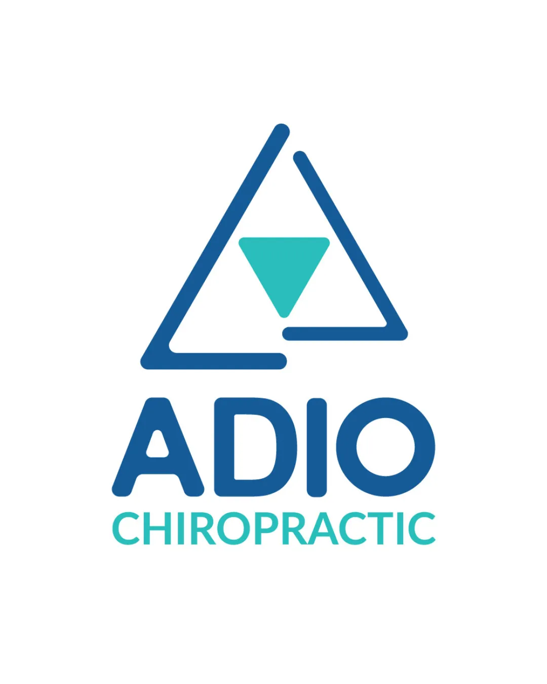
ADIO CHIROPRACTIC logo review
4/5
Logo score
Logo review of

Adio Chiropractic

A well-executed, modern, and relevant logo for a chiropractic practice that could benefit from minor adjustments for optimal scalability and greater distinction.

Combination Mark Modern Geometric Chiropractic
4.5/5
Legibility
3/5
Originality
4.5/5
Misread
4/5
Balance
4/5
Scale
Action plan

What to fix first

The most important fixes to handle before polishing the full presentation.

1

Slightly thicken the outer triangle lines or explore a bolder variation for tiny usage.

High priority

Thin lines may disappear when the logo is scaled down.

Impact: Improves Visibility And Recognition At Small Sizes. · Effort: Low

2

Tighten the letterspacing in 'CHIROPRACTIC' for improved small-text clarity.

Medium priority

Wide tracking could reduce legibility at reduced scales.

Impact: Enhances Tagline Readability In Print Or Digital Applications. · Effort: Low

3

Explore subtle integration of an alignment theme or motif into the wordmark, if additional distinction is desired.

Low priority

Current separation between mark and wordmark is functional but not distinctive.

Impact: Can Improve Originality And Reinforce Industry Concept. · Effort: Medium

Detailed review

Logo performance breakdown

4.5/5

Legibility

Checkmark icon Clear, bold, and readable text
Checkmark icon Strong distinction between ADIO and CHIROPRACTIC

Warning icon Letterspacing in 'CHIROPRACTIC' could be slightly tight for very small sizes

3/5

Originality

Checkmark icon Triangle approach references chiropractic alignment, and the isolated downward triangle adds distinction

Warning icon Triangle-within-triangle is a relatively common abstract therapy symbol

4.5/5

Color harmony

Checkmark icon Modern palette suits the health field
Checkmark icon Good readability and contrast

Blue
#1876AF

Teal
#29C3C9

Your palette is close. Refine the color roles and combinations before updating the logo.

Build brand colors
4/5

Balance alignment

Checkmark icon Mark and wordmark are visually balanced
Checkmark icon Layout is centered and harmonious

Warning icon Triangle symbol's negative space may feel slightly disconnected from logotype

logo 200x250 pixels scalability test alignment grid overlay
4/5

Scalability

Checkmark icon Simple forms and linework scale well
Checkmark icon Distinct shapes hold up at small sizes

Warning icon Thin triangle lines may lose impact on very small applications

logo 200x250 pixels scalability test

200x250 px

logo 100x125 pixels scalability test

100×125 px

logo 50x62 pixels scalability test

50×62 px

4.5/5

Misinterpretations

Checkmark icon No misleading or unsafe readings

4/5

Logo structure & brief match

Checkmark icon Color and geometric style are cohesive between mark and wordmark

Warning icon No direct visual motif from mark to type beyond color

Checkmark icon Industry Relevance: The geometric system symbolizes alignment and structure, connecting well to chiropractic themes.
Checkmark icon Trust And Professionalism: The color palette and clean forms project credibility and approachability.

3.5/5
Market fit

Category positioning

Performs well but does not break far from category norms.

The logo looks credible and suitable for chiropractic, with a modern twist. The triangle is on-trend but not highly distinctive, which risks blending in with similar practices.

1
Category Fit
Good fit

Very appropriate for chiropractic/healthcare visual language.

Conforms to expected style, so it’s reliably understood.

2
Differentiation Risk
Some overlap

Medium; abstract triangle concepts are prevalent in this field.

Brand may be confused with others using similar motifs.

3
Market Signal
Clear signal

Positive perception for healthcare, professionalism, and modern care.

No negative market associations visible.

How to stand out more
  • Consider a unique treatment, such as a subtle spinal motif in the triangle, to further separate from generic health triangles.
Real-world usage

Use-case readiness

Where the logo is ready to use, where it needs adjustment, and where it may break in real applications.

1

Social Media Icon

Needs Adjustment

Mark will need bolder lines or a simplified version for clarity.

3

Business Cards

Ready

Wordmark and tagline remain clear at standard sizes with slight spacing tweaks.

5

Website Header

Ready

Good horizontal stacking, strong digital presence.

2

Signage

Ready

Bold while maintaining professionalism; colors stand out.

4

Apparel Embroidery

Needs Adjustment

Symbol may require heavier lines and tagline may need omission.

Delivery checklist

Logo suite verification

A practical checklist of the logo versions to prepare before sending the final files to a client or team.

Detected in this upload

Already included

Visible

Primary logo lockup

A mark and wordmark are both visible in the uploaded asset.

Before delivery

Versions to remember

1

One-color logo version

High priority Recommended

Prepare a monochrome version for restricted print and production methods.

2

Reversed light logo version

Medium priority Recommended

Prepare a light version for dark brand backgrounds.

Presentation kit

Finalize and present this logo

Primary lockup

A geometric, outlined triangle with a solid teal downward triangle inside sits above the words 'ADIO CHIROPRACTIC' in clean sans-serif type, unifying mark and text in a professional, approachable presentation.

Wordmark

'ADIO' is set in bold blue, rounded sans-serif capitals, with 'CHIROPRACTIC' in lighter teal, uppercase, and tightly spaced beneath.

Monogram or Logomark

The main symbol is a blue, open triangle containing a downward-pointing teal triangle, evoking structure, balance, and subtle human form, symbolizing the chiropractic focus on alignment.

Color palette description

The logo uses a bright healthcare blue and a teal accent that conveys calmness, clarity, and vitality.

Positioning statement

A modern, approachable logo that inspires trust and visually cues alignment, making it ideal for a forward-thinking chiropractic brand.

Design rationale

Geometric triangle represents structural alignment central to chiropractic service.

Calm blue and teal colors convey health, balance, and professionalism.

Tips for the logo presentation

Mockup ideas
  • Window frosting or signage for a chiropractic clinic entrance.
  • Embroidered logo patch for staff uniforms or polo shirts.
  • Minimal business card design featuring the mark on one side and contact info on the other.
Possible objections
  • Triangle symbol feels generic or overused in therapy/health logos.
  • Readability of 'CHIROPRACTIC' in small uses.
Presentation tips
  • Show the logo at small and large sizes to reassure on visibility.
  • Compare with typical chiropractic logos to highlight unique palette and mark structure.
Try your own review

Wondering how your logo performs?

Get a clear logo score, key risks, and priority fix ideas before your client or audience sees it.

Review my logo