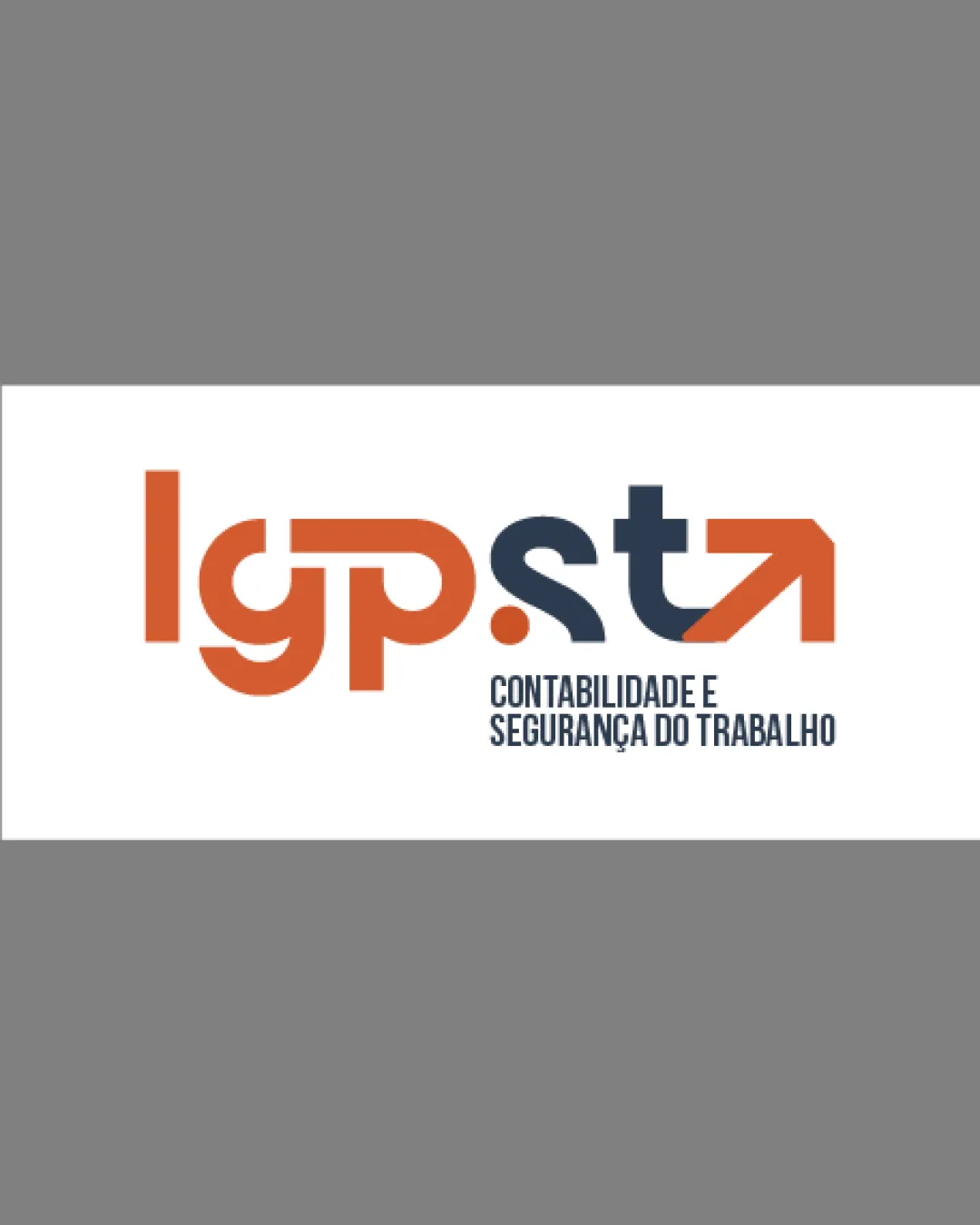
lgp.sta accounting wordmark logo review
2.8/5
Partial score Wordmark category

lgp.sta accounting wordmark

marcelovieirar Advanced logo review

A visually modern and relevant identity with potential but needs legibility refinements to ensure clarity across all uses.

This logo lockup has a workable foundation; improving text readability is the clearest next step; layout still needs assessment.

Wordmark Stylized Geometric Accounting
2/5
Legibility
3/5
Originality
3/5
Balance
3/5
Scale
4/5
Color
Your next steps

What to fix first

Focus on the changes that matter. Keep what makes the logo work.

1

main wordmark

Test alternate stylizations or slight spacing adjustments to improve instant legibility and recognition for non-acquainted viewers.

High priority Visible issue Medium effort

Highly stylized 'g', 'p', and 't' may challenge instant readability, especially the connected arrow t and the ambiguous forms in the left half.

See the category review
2

main wordmark

Test logo visibility at favicon and small print sizes to ensure arrow and characters remain clear.

Medium priority Worth testing Low effort

The combined arrow-and-letter form in the 't' may merge or lose detail at small sizes, risking function in smaller digital applications.

See the category review
Detailed review

Logo performance breakdown

4/5

Brief & logo match

The dynamic, arrow-based styling supports the accounting sector's growth message, but legibility compromises challenge clarity for a professional brand.

2/5

Legibility

  • Highly stylized 'g', 'p', and 't' may challenge instant readability, especially the connected arrow t and the ambiguous forms in the left half.

    Visible issue main wordmark

    Try: Test alternate stylizations or slight spacing adjustments to improve instant legibility and recognition for non-acquainted viewers.

3/5

Originality

  • Arrow as t adds some sector relevance and modernity.
  • Arrow as 't' is a familiar motif in growth and business brands; the interlocked style brings some freshness, but is not highly distinctive for the sector.

    Optional refinement main wordmark

    Try: Explore small refinements to increase memorability or introduce unique flourishes matching the brand's accounting focus.

    Check: Not urgent, but review competitor marks for more distinct positioning.

4/5

Color harmony

  • Orange and dark blue offer a strong, professional contrast.
Orange#E05D29
Dark Blue#273140

Estimated colors. Use the original design file for exact values.

Create a full color palette using these colors

Create new palette
3/5

Balance alignment

This review includes a score but no supporting explanation for this category.

Uploaded logoAlignment guide overlay

Inspect spacing with the guide. Optical balance may differ from geometric centering.

3/5

Scalability

  • The combined arrow-and-letter form in the 't' may merge or lose detail at small sizes, risking function in smaller digital applications.

    Worth testing main wordmark

    Try: Test logo visibility at favicon and small print sizes to ensure arrow and characters remain clear.

5/5

Misinterpretations

This review includes a score but no supporting explanation for this category.

3/5
Market fit

Category positioning

Typical for modern accounting and business brands, with moderate potential for confusion among competitors with similar arrow or geometric motifs.

1
Category Fit
Good fit

Relevant to accounting and professional services through upward/arrow and strong type cues.

2
Differentiation Risk
Some overlap

Arrow-as-t and geometric style are common, so the logo risks blending in among other business and accounting firms.

Brand impression

Logo personality

The impression your logo creates.

The logo projects a bold, modern and slightly playful presence paired with professionalism, using dynamic color and geometric forms to convey progress and trust.

AI interpretation of the visible design. These describe personality, not quality.

Presence

Leans bold

How strongly it attracts attention.

UnderstatedBold

Large, geometric letters and bold arrow motif create immediate visual impact.

Attitude

Mixed

How serious or lighthearted it feels.

SeriousPlayful

The arrow suggests positivity, but overall style remains businesslike and neutral.

Formality

Leans formal

How relaxed or formal it appears.

CasualFormal

Clean lines and uppercase forms suggest structure and professionalism over casualness.

Style

Leans contemporary

Heritage cues versus a current look.

ClassicContemporary

Contemporary geometric shaping and arrow detail give it a current look rather than classic heritage.

Emotional tone

Mixed

Its emotional feel, beyond colour temperature.

WarmCool

Orange introduces energy, while dark blue adds a grounding, professional feel, balancing warmth and coolness.

Positioning

Mixed

Everyday appeal versus luxury cues.

EverydayLuxury

Standard color choices and construction feel positioned for mainstream rather than luxury or discount—professional but not exclusive.

From design file to real use

Use-case readiness

See your logo in context, then check what needs attention before production. Settings use the colors detected in your logo where available.

  • 6 look suitable
  • 3 need adjustment

Website header

Ready

Desktop

Mobile

Favicon

Adjust first
Before you use it

Highly stylized and crowded details may not be clear at tiny sizes; consider a simplified variant.

Google search

Adjust first
Before you use it

Highly stylized and crowded details may not be clear at tiny sizes; consider a simplified variant.

Social media avatar

Ready

Business card

Ready

Signs & signage

Ready

Packaging & labels

Ready

Embroidery

Adjust first
Before you use it

Fine details in the arrow and type may not embroider cleanly; test with thicker lines for best results.

One-color printing

Ready
Delivery checklist

Logo delivery checklist

Format templates · Included versions and delivery checklist
Uploaded logo
Reviewed upload

Wordmark

Included

The uploaded asset includes a wordmark.

Standalone wordmark

High priority Recommended

Export the wordmark separately, without the symbol or tagline, for narrow placements and smaller sizes.

Wordmark with tagline

Medium priority Recommended

Prepare a separate wordmark with the existing tagline for larger placements. Keep the tagline-free wordmark for small sizes.

Standalone logomark or monogram

High priority Recommended

Prepare a compact mark for avatars, favicons, and restricted spaces.

One-color logo version

High priority Recommended

Prepare a monochrome version for restricted print and production methods.

Reversed light logo version

Medium priority Recommended

Prepare a light version for dark brand backgrounds.

Simplified small-size version

Medium priority Recommended

Use a responsive variant where fine details become fragile at small sizes.

Presentation kit

Logo presentation copy and mockup ideas

Logo presentation ideas

Hover over or select a slide to highlight its notes.

Slide 1

Positioning statement

A forward-looking wordmark using geometric styling and an arrow motif to signal progress in accounting and workplace safety.

Slide 2

Primary logotype

A geometric, stylized wordmark 'lgp.sta' in orange and dark blue, with an upward arrow forming the crossbar and stem of the 't', accompanied by the tagline 'CONTABILIDADE E SEGURANÇA DO TRABALHO' in a clean, modern sans-serif.

Slide 3 · Application idea

Mockup idea 1

Outdoor office signage with the arrow t as a dimensional accent.

Slide 4 · Application idea

Mockup idea 2

Business cards using the orange and blue split for a bold visual impact.

Slide 5 · Application idea

Mockup idea 3

Website hero banner with animated arrow emphasizing financial growth.

Slide 6

Design rationale

Orange suggests dynamism and approachability, while dark blue reinforces professionalism and trust.
The arrow integrated into the final 't' communicates upward movement and positive outcomes, which can align with the client's success through your services.

Try your own review

Wondering how your logo performs?

Get a clear logo score, key risks, and priority fix ideas before your client or audience sees it.

Review my logo