The Fruitful Bough Foundation logo review
3.2/5
Logo score Combination mark category

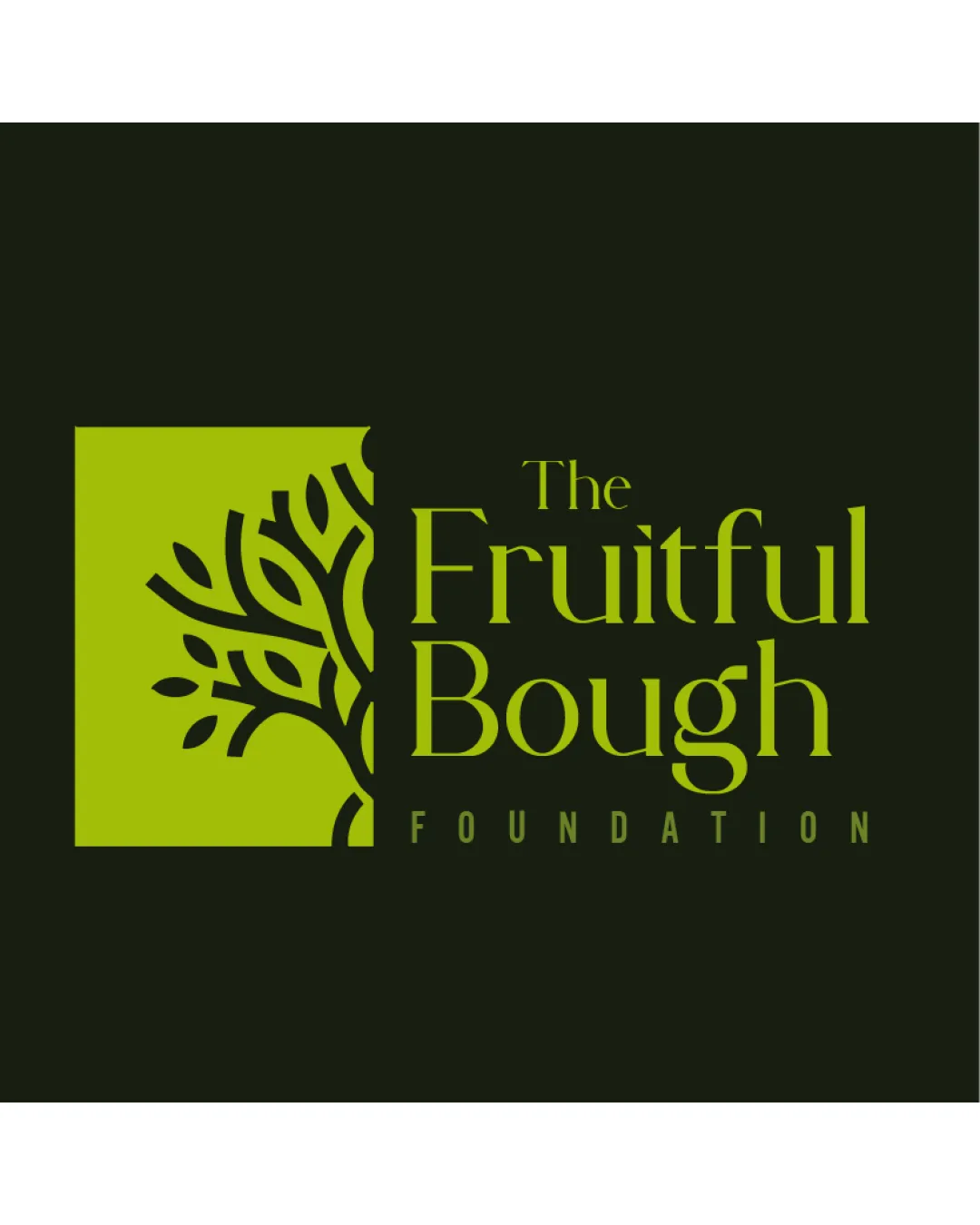
The Fruitful Bough Foundation

creative760179 Essential logo review

A visually pleasing, relevant logo for a foundation, with effective theme connection, strong readability, and room for improvement in balance and fine detail scalability.

This logo lockup has a workable foundation; improving visual balance is the clearest next step.

Combination Mark Modern, Stylized, Flat Charity/nonprofit
4/5
Legibility
3/5
Originality
3/5
Balance
3/5
Scale
4/5
Color
3/5
Style consistency
Your next steps

What to fix first

Focus on the changes that matter. Keep what makes the logo work.

1

overall spacing between mark and text

Slightly increase the visual weight or emphasis of the text or adjust spacing to improve balance.

Medium priority Visible issue Low effort

There is a slight imbalance caused by the visual weight of the tree mark on the left, making the overall composition feel left-heavy compared to the lighter text on the right.

See the category review


Detailed review

Logo performance breakdown

4/5

Brief & logo match

The logo clearly communicates a foundation/charity context through its tree motif and formal text, but would benefit from improved balance and better integration between mark and wording.

5/5

Misinterpretations

  • No evident unintended readings
4/5

Legibility

Wordmark 4/5 · Layout 4/5

  • Main brand name highly readable
  • Contrast between text and background supports legibility
4/5

Color harmony

Symbol 4/5 · Wordmark 4/5

  • Palette is harmonious and thematically appropriate
Olive Green#A1C038
Very Dark Green#161E13

Estimated colors. Use the original design file for exact values.

Create a full color palette using these colors

Create new palette
3/5

Originality

Symbol 3/5 · Wordmark 3/5

  • Tree metaphor is familiar but competently executed
3/5

Balance alignment

Symbol 3/5 · Wordmark 3/5 · Layout 3/5

  • Consistent vertical alignment between mark and text
  • There is a slight imbalance caused by the visual weight of the tree mark on the left, making the overall composition feel left-heavy compared to the lighter text on the right.

    Visible issue overall spacing between mark and text

    Try: Slightly increase the visual weight or emphasis of the text or adjust spacing to improve balance.

Uploaded logoAlignment guide overlay

Inspect spacing with the guide. Optical balance may differ from geometric centering.

3/5

Scalability

Symbol 3/5 · Wordmark 3/5 · Layout 3/5

Available in Advanced logo reviews
3/5

Style consistency

Available in Advanced logo reviews
Try your own review

Wondering how your logo performs?

Get a clear logo score, key risks, and priority fix ideas before your client or audience sees it.

Review my logo