Adverse Creative logo logo review
4.2/5
Logo score Combination mark (symbol + wordmark) category

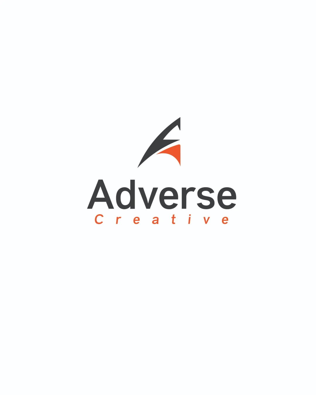
Adverse Creative logo

creative212574 Essential logo review

A strong, modern logo with creative edge; minor adjustments could yield even greater unity and versatility.

This logo lockup shows strong execution, supported by visual balance and text readability; improving distinctiveness is the clearest next step.

Combination Mark (symbol + Wordmark) Clean, Minimal, Geometric Creative/design/agency
5/5
Legibility
3.6/5
Originality
4.2/5
Balance
4.4/5
Scale
4/5
Color
4/5
Style consistency
Your next steps

What to fix first

Focus on the changes that matter. Keep what makes the logo work.

1

symbol and wordmark

Refine the proportions or adjust either the mark or wordmark to achieve slightly more cohesion in visual rhythm.

Medium priority Visible issue Low effort

The symbol is sharp and angular with a sense of movement, while the wordmark has a neutral geometric sans-serif; the visual language is compatible but the edge of the symbol slightly overpowers the softer tone of the wordmark.

How to check

Test color/weight adjustments to balance the dynamic symbol with the calm wordmark.

See the category review
Detailed review

Logo performance breakdown

4/5

Brief & logo match

Distinct symbol and stylish wordmark credibly fit a creative/design firm; symbol's edginess could be better echoed in the wordmark for perfect unity.

5/5

Legibility

Wordmark 5/5 · Layout 5/5

  • All text clear and easily read at presented size
5/5

Misinterpretations

  • No apparent unintended readings or misinterpretations
4.4/5

Scalability

Symbol 4/5 · Wordmark 5/5 · Layout 4/5

  • Simple forms and strong contrast support use across scales
  • The thin tip of the symbol may lose clarity at very small sizes.

    Worth testing symbol (upper band)
4.2/5

Balance alignment

Symbol 4/5 · Wordmark 4/5 · Layout 5/5

  • Well-centered and proportioned arrangement; minor tension between dynamic symbol and neutral type
Uploaded logoAlignment guide overlay

Inspect spacing with the guide. Optical balance may differ from geometric centering.

4/5

Color harmony

Symbol 4/5 · Wordmark 4/5

  • Cohesive minimal palette with strong contrast and accent control
  • The orange accent draws attention and distinguishes the creative subheading, but a small refinement of orange intensity or saturation may further harmonize the palette.

    Optional refinement overall
Charcoal#3A3A3A
Orange#F25C2C

Estimated colors. Use the original design file for exact values.

Create a full color palette using these colors

Create new palette
4/5

Style consistency

Available in Advanced logo reviews
3.6/5

Originality

Symbol 4/5 · Wordmark 3/5

Available in Advanced logo reviews
Try your own review

Wondering how your logo performs?

Get a clear logo score, key risks, and priority fix ideas before your client or audience sees it.

Review my logo