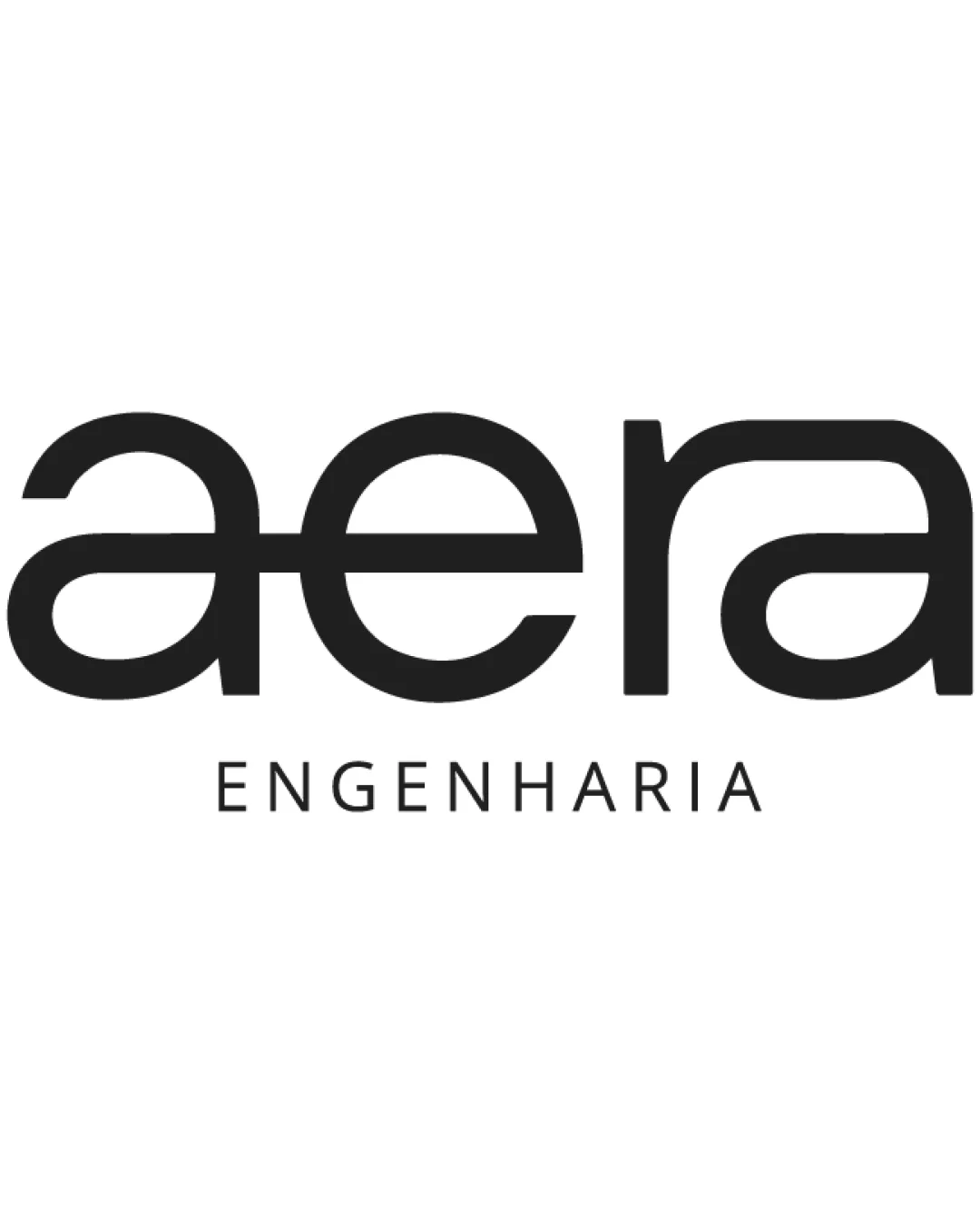
aera ENGENHARIA logo review
3.5/5
Logo score
Logo review of

Aera Engenharia

A clean and professional wordmark suitable for engineering that would benefit from a more distinctive typographic treatment and small-size testing.

Wordmark Modern Geometric Sans-serif Wordmark With Subtitle Engineering
4/5
Legibility
3/5
Originality
5/5
Misread
5/5
Balance
3/5
Scale
Your next steps

What to fix first

Focus on the changes that matter. Keep what makes the logo work.

1

aera (primary wordmark)

Test visibility at reduced sizes and in different media.

Worth testing High priority Low effort
Area to inspectApproximate location

Thin horizontal strokes in the custom a/e connection may lose clarity at small sizes or in lower-quality print.

How to check

Inspect legibility at below 2cm and in one-color reproduction.

See the category review
2

aera (primary wordmark)

Explore a subtle custom element or unique cut to add proprietary character to the wordmark.

Visible issue Medium priority Medium effort
Area to inspectApproximate location

Letter connections are visually pleasant but use familiar geometric forms, offering limited distinctiveness among engineering brands.

How to check

Compare with leading engineering wordmarks for overlap risk.

See the category review
Detailed review

Logo performance breakdown

4/5

Brief & logo match

Based on your brief
Compared with

Branding for an engineering firm, requiring a modern, technical, and professional impression.

Clear fit to engineering through explicit subtitle and modern geometry, but distinctiveness could be enhanced.

  • Engineering Association

    The inclusion of 'ENGENHARIA' clarifies the industry connection directly.

  • Modern Image

    Geometric forms and clean lines project a modern, technical impression aligning with engineering values.

4/5

Legibility

  • Main text is clear and easily read.
  • Subtitle is simple and spaced.
3/5

Originality

  • Smooth connections give some individual character.
  • Letter connections are visually pleasant but use familiar geometric forms, offering limited distinctiveness among engineering brands.

    Visible issue aera (primary wordmark)

    Try: Explore a subtle custom element or unique cut to add proprietary character to the wordmark.

    Check: Compare with leading engineering wordmarks for overlap risk.

    Area to inspectApproximate location
5/5

Balance alignment

  • Wordmark and tagline are well-aligned.
  • Letter spacing and weight feel even.
Uploaded logoAlignment guide overlay

Inspect spacing with the guide. Optical balance may differ from geometric centering.

3/5

Scalability

  • Solid forms overall.
  • Thin horizontal strokes in the custom a/e connection may lose clarity at small sizes or in lower-quality print.

    Worth testing aera (primary wordmark)

    Try: Test visibility at reduced sizes and in different media.

    Check: Inspect legibility at below 2cm and in one-color reproduction.
    Area to inspectApproximate location
Uploaded logo at 200 pixels wide
200 × 250 px
Uploaded logo at 100 pixels wide
100 × 125 px
Uploaded logo at 50 pixels wide
50 × 63 px

Compare the detail at different sizes. Labels show the full image dimensions.

5/5

Misinterpretations

  • No unintended readings found.

Black & white

Does the shape still work without color?

These tests are available only for logos uploaded in vector (SVG) format.

Background contrast

Find the surfaces where your logo stays clear.

These tests are available only for logos uploaded in vector (SVG) format.

Blur & silhouette

A 3px blur softens fine details so you can check whether the overall shape stays recognizable. If key gaps close or elements merge, the logo may rely too heavily on detail.

These tests are available only for logos uploaded in vector (SVG) format.

Try your own review

Wondering how your logo performs?

Get a clear logo score, key risks, and priority fix ideas before your client or audience sees it.

Review my logo