 View review
Logo score
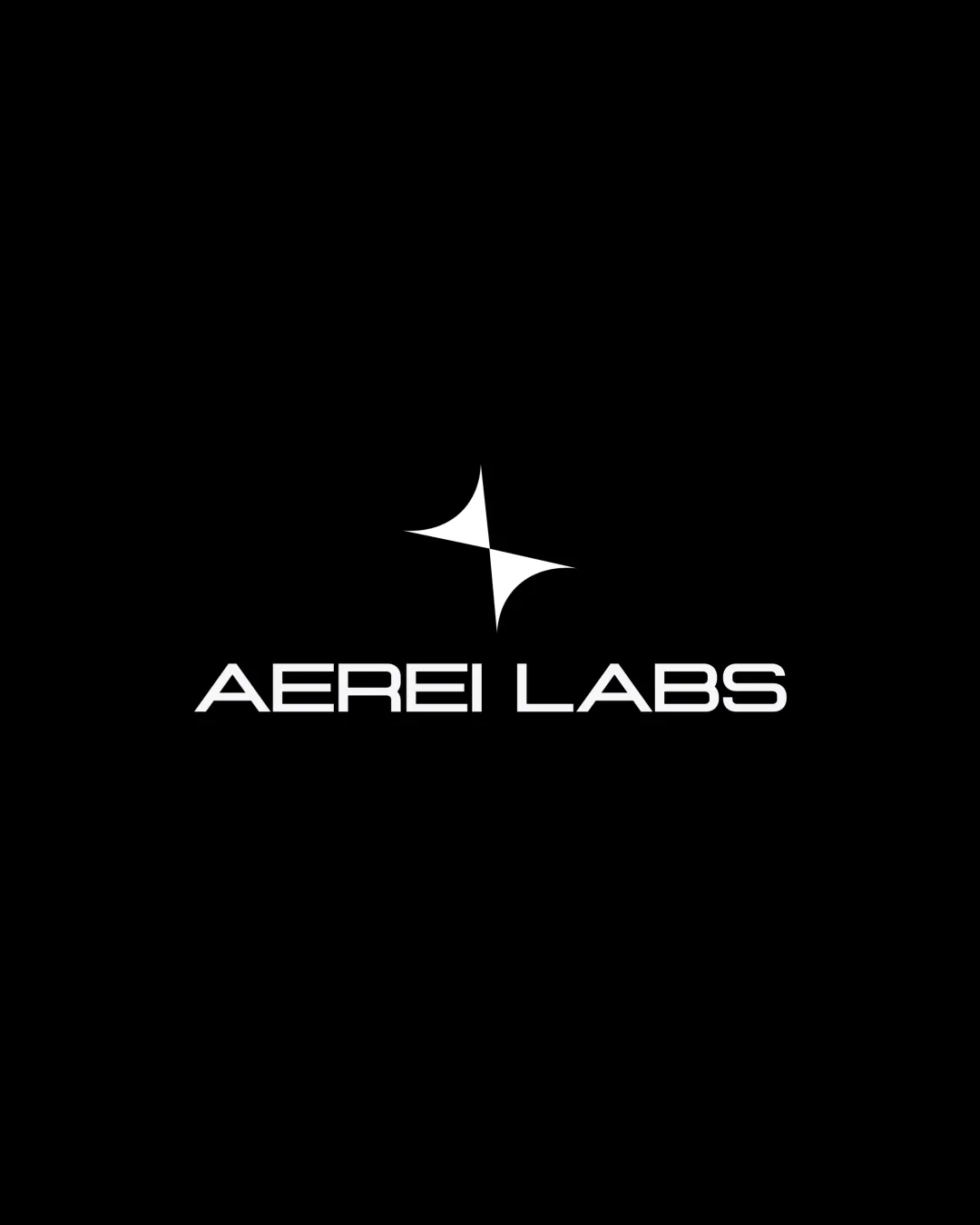
Logo review ofAerei Labs
Review the detailed scores below to see what is working and what should be refined first.
Legibility
Originality
Misread
Balance
Scale
Detailed review
Logo performance breakdown
Legibility
![]() Text is clear and easily readable in the presented color scheme.
Text is clear and easily readable in the presented color scheme.![]() Letterforms have a modern, geometric appeal that aligns with the brand.
Letterforms have a modern, geometric appeal that aligns with the brand.
![]() Spacing in 'AEREI LABS' is slightly tight, especially between 'E' and 'I', which could hinder clarity at very small sizes.
Spacing in 'AEREI LABS' is slightly tight, especially between 'E' and 'I', which could hinder clarity at very small sizes.
Originality
![]() Abstract star/spark mark feels unique compared to common tech symbols.
Abstract star/spark mark feels unique compared to common tech symbols.![]() Geometric approach to both symbol and typography provides distinctive character.
Geometric approach to both symbol and typography provides distinctive character.
![]() The body of the symbol is abstract but can loosely resemble generic star or sparkle motifs, diminishing uniqueness upon quick glance.
The body of the symbol is abstract but can loosely resemble generic star or sparkle motifs, diminishing uniqueness upon quick glance.
Color harmony
![]() Monochrome palette is versatile and universally applicable.
Monochrome palette is versatile and universally applicable.![]() No clashing or unnecessary color usage.
No clashing or unnecessary color usage.
White
#FFFFFF
Black
#000000
Balance alignment
![]() Good vertical alignment between symbol and wordmark.
Good vertical alignment between symbol and wordmark.![]() Logo feels cohesive and visually balanced overall.
Logo feels cohesive and visually balanced overall.
![]() Negative space between the logomark and wordmark may feel too large, potentially affecting unity.
Negative space between the logomark and wordmark may feel too large, potentially affecting unity.![]() The geometric shape sits slightly above the midpoint, possibly making the layout just a touch top-heavy.
The geometric shape sits slightly above the midpoint, possibly making the layout just a touch top-heavy.

Scalability
![]() Simplified symbol will scale decently to smaller applications like app icons or business cards.
Simplified symbol will scale decently to smaller applications like app icons or business cards.![]() Bold forms and high contrast ensure visibility on various backgrounds.
Bold forms and high contrast ensure visibility on various backgrounds.
![]() Fine lines in the wordmark may get lost in very small or embroidered contexts.
Fine lines in the wordmark may get lost in very small or embroidered contexts.![]() The abstract mark may lose recognition if used alone without text in certain mediums.
The abstract mark may lose recognition if used alone without text in certain mediums.
200x250 px
100×125 px
50×62 px
Misinterpretations
![]() No evident inappropriate or confusing secondary imagery present.
No evident inappropriate or confusing secondary imagery present.
Symbol & text fit
![]() The geometric style of the logomark complements the modern typeface well.
The geometric style of the logomark complements the modern typeface well.
![]() Both elements share similar weights and design philosophy.
Both elements share similar weights and design philosophy.
![]() Slight misalignment in the vertical axis might be improved for a tighter visual connection.
Slight misalignment in the vertical axis might be improved for a tighter visual connection.
Try your own review
Review my logo
Wondering how your logo performs?
Get a clear logo score, key risks, and priority fix ideas before your client or audience sees it.
Keep exploring


