View review
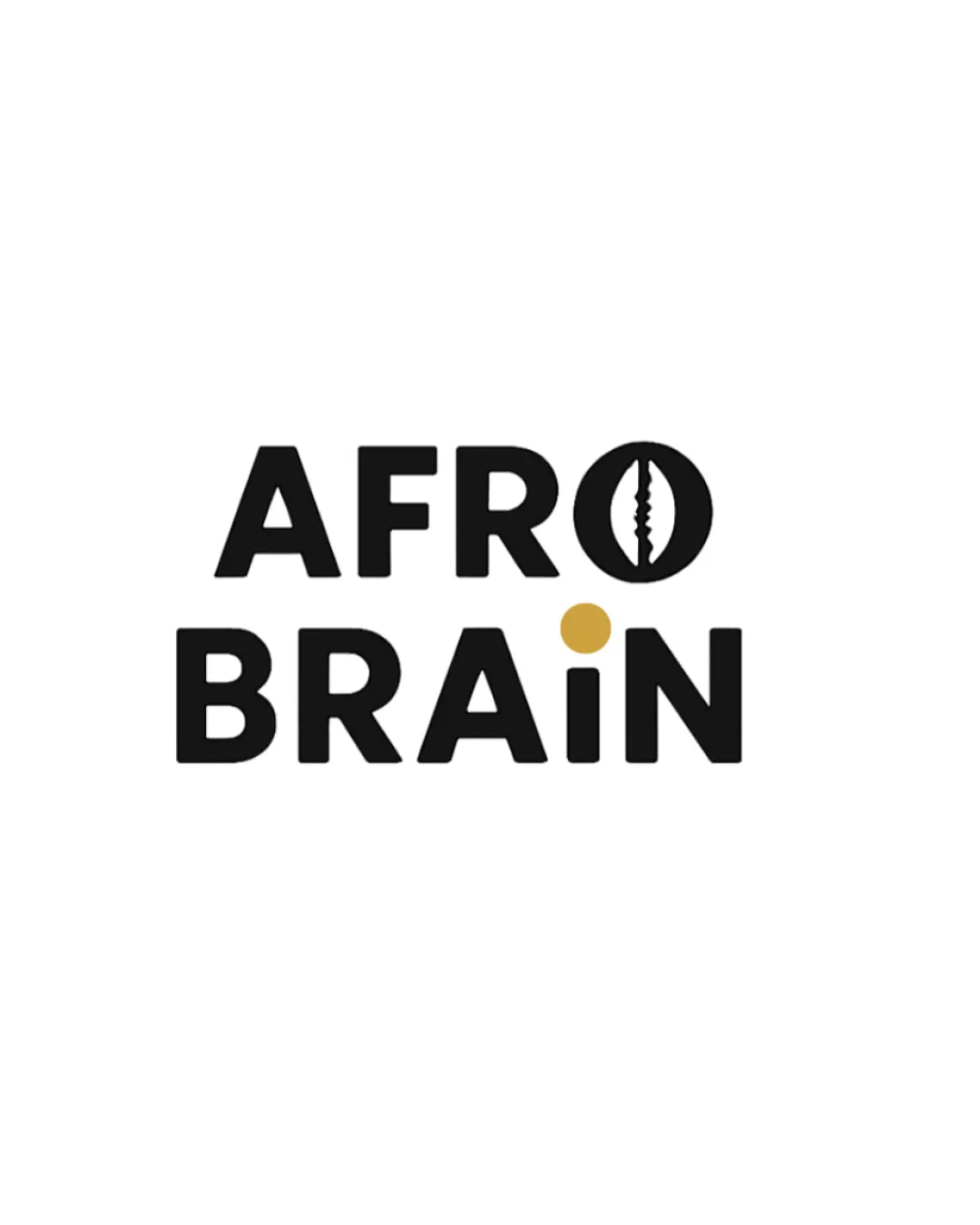
Afro Brain
Review the detailed scores below to see what is working and what should be refined first.
Objective AI feedback. Your creative decision.
Logo performance breakdown
Legibility
Text is highly readable with clear, bold sans-serif typography.
Good use of contrast enhances visibility.
Cowrie shell detail slightly complicates the 'O', but overall readability remains strong.
Gold dot over the 'i' is noticeable but might be less visible at extremely small sizes.

Originality
Innovative use of the cowrie shell as the letter 'O'—high cultural relevance.
Gold dot is a subtle stylistic choice adding a fresh, unique look.
Color harmony
Minimal color palette creates strong contrast and cohesion.
Gold accent complements the black and adds sophistication.
Black
#000000
Gold
#D1AA4F
White background
#FFFFFF
Balance alignment
Text alignment is tight and grid-based, providing a well-structured appearance.
The unique gold dot creates slight visual tension, which can be engaging.
Cowrie shell O is slightly heavier visually than other letters, creating a mild imbalance.
Scalability
Bold forms and minimalistic style ensure good scalability for most uses like digital, print, and large signage.
Distinct symbol aids recognition in different contexts.
Fine interior detail in the cowrie shell could be lost at favicon or embroidery scale.
Gold dot may lose impact on very small-scale mockups like pens or as an app icon.
200x250 px
100×125 px
50×62 px
Misinterpretations
Cowrie shell and dot symbolize cultural wisdom with no inappropriate visuals detected.
Wondering how your logo performs?
Get a clear logo score, key risks, and priority fix ideas before your client or audience sees it.