Wondering how your logo performs? 🧐
Get professional logo reviews in seconds and catch design issues in time.
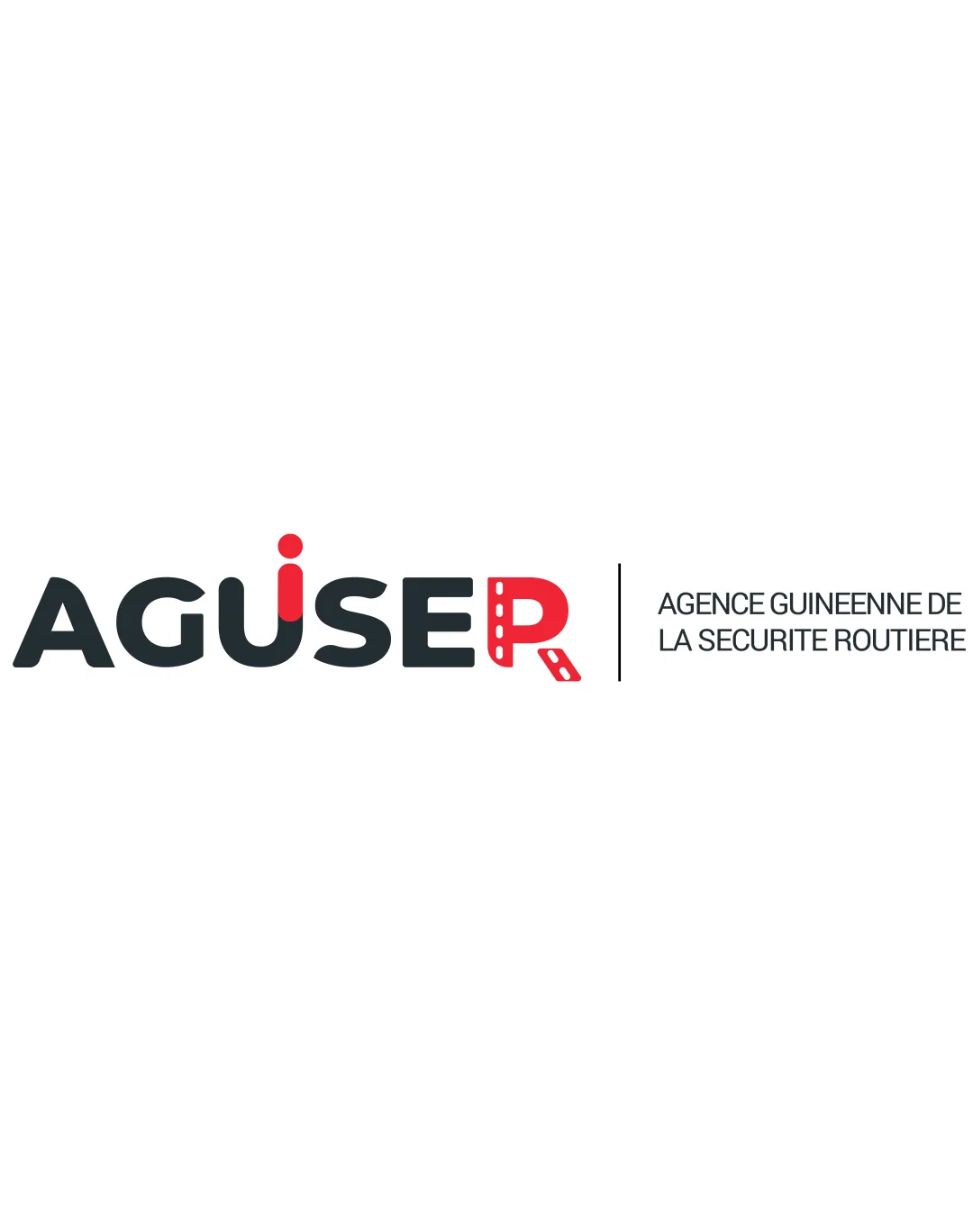
Try it Now!Logo review of AGUSER AGENCE GUINEENNE DE LA SECURITE ROUTIERE
 Logo analysis by AI
Recognized style:
Logo type:
Detected symbol:
Detected text:
Business industry:
Review requested by Mlmc
**If AI can recognize or misinterpret it, so can people.
Structured logo review
Legibility
![]() The business name AGUSER with the full description is clear.
The business name AGUSER with the full description is clear.
![]() The stylized 'R' may slightly affect immediate readability.
The stylized 'R' may slightly affect immediate readability.
Scalability versatility
![]() Bold design ensures clear reproduction at various sizes.
Bold design ensures clear reproduction at various sizes.
200x250 px
100×125 px
50×62 px
Balance alignment
![]() Well-balanced with consistent alignment between elements.
Well-balanced with consistent alignment between elements.

Originality
![]() The road-themed 'R' symbol adds uniqueness.
The road-themed 'R' symbol adds uniqueness.
![]() The rest of the text is fairly standard without unique elements.
The rest of the text is fairly standard without unique elements.
Logomark wordmark fit
![]() The symbol and wordmark are cohesive.
The symbol and wordmark are cohesive.
![]() The 'R' could be more proportionate to the other letters.
The 'R' could be more proportionate to the other letters.
Aesthetic look
![]() Professional and clean aesthetic.
Professional and clean aesthetic.
![]() The use of only two colors limits vibrancy.
The use of only two colors limits vibrancy.
Cultural sensitivity dual meaning
![]() No cultural sensitivity issues detected.
No cultural sensitivity issues detected.
Color harmony
![]() Limited color usage ensures simplicity and clarity.
Limited color usage ensures simplicity and clarity.
![]() More color variation could enhance branding impact.
More color variation could enhance branding impact.