 View review
Logo score
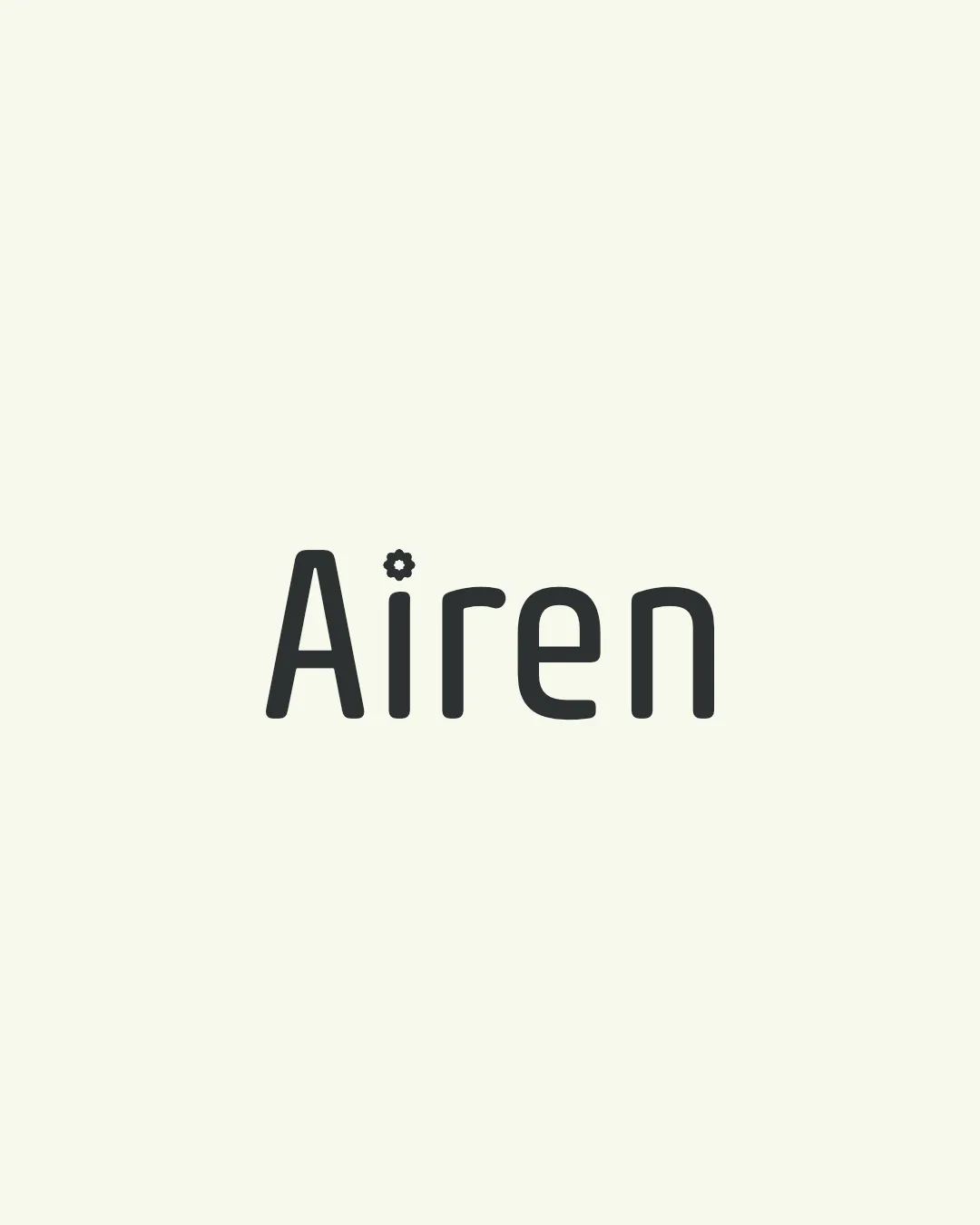
Logo review ofAiren
Review the detailed scores below to see what is working and what should be refined first.
Legibility
Originality
Misread
Balance
Scale
Detailed review
Logo performance breakdown
Legibility
![]() Typography is clear and easy to read.
Typography is clear and easy to read.![]() Single accent symbol (gear) does not disrupt word recognition.
Single accent symbol (gear) does not disrupt word recognition.
![]() Gear symbol may slightly distract from the simplicity and flow of the text, especially in small sizes.
Gear symbol may slightly distract from the simplicity and flow of the text, especially in small sizes.
Originality
![]() Gear as a dot on the 'i' is a clever, subtle integration that adds uniqueness.
Gear as a dot on the 'i' is a clever, subtle integration that adds uniqueness.![]() Avoids generic wordmark pitfalls.
Avoids generic wordmark pitfalls.
![]() Gear symbols are commonly used in tech and engineering logos, which can feel somewhat expected.
Gear symbols are commonly used in tech and engineering logos, which can feel somewhat expected.
Color harmony
![]() Excellent contrast between text and background.
Excellent contrast between text and background.![]() Monochrome palette ensures versatility.
Monochrome palette ensures versatility.
Sea Shell
#F0F1E8
Black Olive
#32342D
Balance alignment
![]() Good vertical and horizontal alignment of letters.
Good vertical and horizontal alignment of letters.![]() Weight of the gear symbol is appropriate relative to the font stroke.
Weight of the gear symbol is appropriate relative to the font stroke.
![]() The gear as a dot breaks the uniformity of the otherwise rounded, consistent typeface, slightly impacting harmony.
The gear as a dot breaks the uniformity of the otherwise rounded, consistent typeface, slightly impacting harmony.

Scalability
![]() Solid, bold letterforms aid in scaling for digital and most print use.
Solid, bold letterforms aid in scaling for digital and most print use.![]() Simple color scheme supports diverse applications.
Simple color scheme supports diverse applications.
![]() Gear detail above 'i' could become indistinct or muddy at smaller sizes—may be illegible in favicon or embroidery formats.
Gear detail above 'i' could become indistinct or muddy at smaller sizes—may be illegible in favicon or embroidery formats.
200x250 px
100×125 px
50×62 px
Misinterpretations
![]() No inappropriate, confusing, or ambiguous shapes present.
No inappropriate, confusing, or ambiguous shapes present.
Try your own review
Review my logo
Wondering how your logo performs?
Get a clear logo score, key risks, and priority fix ideas before your client or audience sees it.
Keep exploring


