1
Category Fit
Good fitMatches creative/design standards, fits expectations.
Visual style is appropriate and recognizable for the intended market.
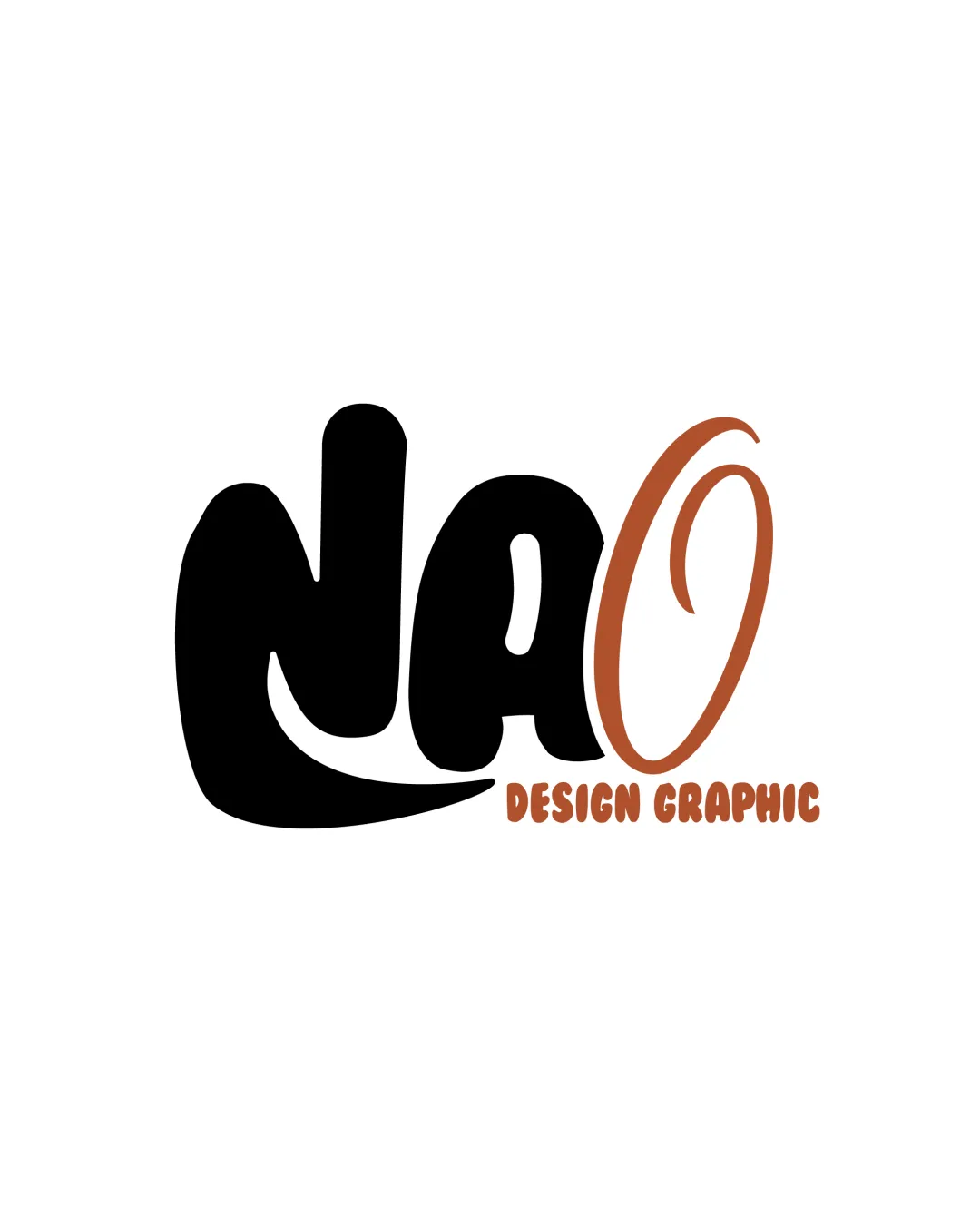
The logo is visually engaging for a creative studio but requires refinement in letter clarity and balance for professional and versatile application.
The most important fixes to handle before polishing the full presentation.
The current integration causes momentary confusion for new viewers.
Impact: Significantly Improves First-glance Readability And Professional Impression. · Effort: Medium
Minor adjustment to position or weight of 'O' will optimize logo flow.
Impact: Achieves A More Cohesive And Stable Composition. · Effort: Low
Fine lines and tagline may blur or disappear when scaled down.
Impact: Ensures Strong Brand Presence Across Digital And Print Use Cases. · Effort: Low
 Tagline is clear and readable Contrast between tagline and main letters
 'nAO' letter shapes are stylized and may be hard to read at first glance, especially the 'n' and 'A' merging
Custom playful letterforms, unique flair
The style, while lively, resembles some 70s/retro hand-lettering trends, so moderate risk of looking dated
Black and copper is a warm, clear two-tone palette
The copper tagline and 'O' could be difficult to reproduce in some printing situations
Black
#000000
Copper
#B86C3B
Your palette is close. Refine the color roles and combinations before updating the logo.
Build brand colors Good centering of main elements Consistent spacing between letters and tagline
'O' feels detached from 'nA' and creates an imbalance to the right side

Bold, simple silhouette for the main letters
Fine tagline and light lines on 'O' may lose clarity at small scale
200x250 px
100×125 px
50×62 px
No inappropriate or confusing alternate readings identified
Distinct separation between main name and descriptor/tagline
Tagline font and main letterform could feel more harmonized
Creative/design Industry: Playful, handcrafted letterforms and bold color choices align with the creative/design sector, but clarity could be improved for professional use.
Satisfactory fit for creative industry, but moderate differentiation.
The playful, hand-drawn style is broadly suitable for design studios but does not strongly differentiate from others in this sector.
Matches creative/design standards, fits expectations.
Visual style is appropriate and recognizable for the intended market.
Moderate risk due to trend-based script style.
Other studios may use similar 70s/retro approaches, lowering uniqueness.
Signals creative, energetic, and informal brand personality.
May be perceived as less formal for high-end clients.
Where the logo is ready to use, where it needs adjustment, and where it may break in real applications.
Strong presence, good boldness for web hero sections.
Thin lines and intricate shapes will not be legible in tiny formats.
Tagline and thin sections need simplification for stitching.
Letter clarity and tagline will not translate in small icon sizes.
Bold main forms will reproduce well, but tagline legibility may vary.
A practical checklist of the logo versions to prepare before sending the final files to a client or team.
Core usage across branding.
Essential for versatility and reproduction on various media.
Needed for avatars, favicons, and small merchandise.
Still required for some print and documentation use.
Suggested for digital branding consistency.
A playful, bold wordmark featuring custom 'nAO' lettering, with a large stylized copper 'O' and the tagline 'DESIGN GRAPHIC' in condensed rounded type below.
The main logo letters ‘nAO’ are rendered in chunky, energetic hand-drawn forms combining black and copper.
‘DESIGN GRAPHIC’ sits below the main name, in all-caps, using a rounded display font and a matching copper tone.
A playful, bold lettermark that signals creativity and personality, ideal for a design or creative studio.
Unique hand-drawn styles express originality and approachability.
The copper contrast color adds warmth and distinction.
Get a clear logo score, key risks, and priority fix ideas before your client or audience sees it.
More credits needed
Add credits to continue without losing your work.