Wondering how your logo performs? 🧐
Get professional logo reviews in seconds and catch design issues in time.
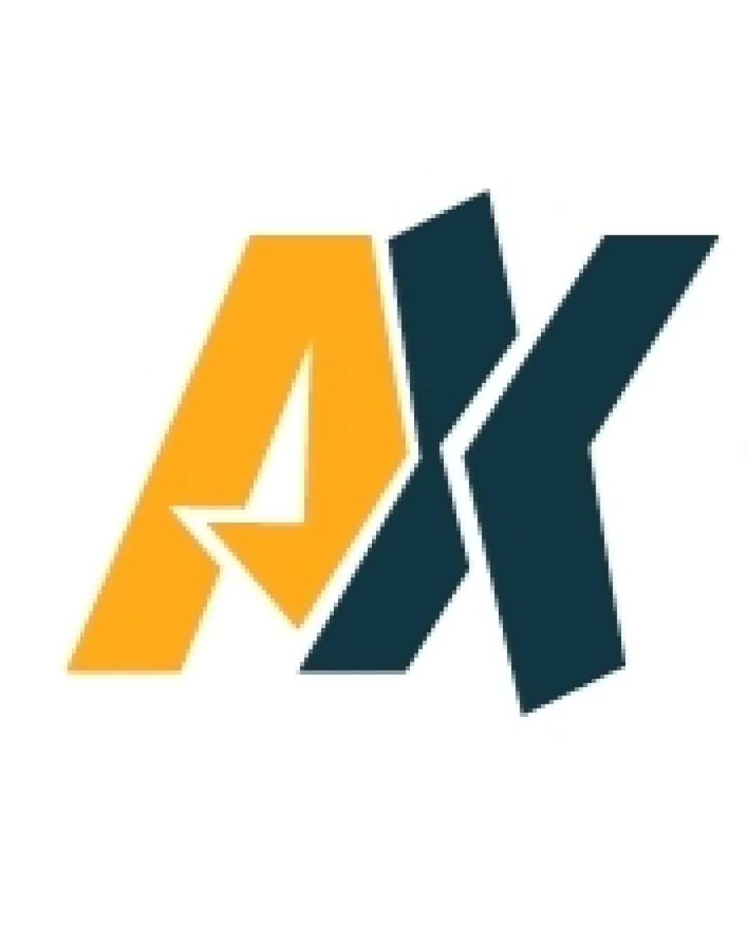
Try it Now!Logo review of AK
 Logo analysis by AI
Logo type:
Style:
Detected symbol:
Negative space:
Detected text:
Business industry:
Review requested by Mudassir
**If AI can recognize or misinterpret it, so can people.
Structured logo review
Legibility
![]() The AK letters are recognizable and prominent.
The AK letters are recognizable and prominent.![]() High contrast between the background and letters enhances readability.
High contrast between the background and letters enhances readability.
![]() The stylized cuts and overlap slightly hinder recognition, especially at small sizes or for unfamiliar viewers.
The stylized cuts and overlap slightly hinder recognition, especially at small sizes or for unfamiliar viewers.
Scalability versatility
![]() Bold shapes maintain clarity at medium to large sizes.
Bold shapes maintain clarity at medium to large sizes.
![]() Sharp angles and overlapping forms may lose definition when reduced to a favicon or small embroidery.
Sharp angles and overlapping forms may lose definition when reduced to a favicon or small embroidery.![]() Thin negative space elements risk filling in on small screens or poor-quality prints.
Thin negative space elements risk filling in on small screens or poor-quality prints.
200x250 px
100×125 px
50×62 px
Balance alignment
![]() Side-by-side positioning achieves some visual balance.
Side-by-side positioning achieves some visual balance.![]() Contrasting colors help delineate each letter.
Contrasting colors help delineate each letter.
![]() The overlap creates a visual pull to the center, disrupting left-to-right flow.
The overlap creates a visual pull to the center, disrupting left-to-right flow.![]() White negative space between letters appears uneven and creates imbalance.
White negative space between letters appears uneven and creates imbalance.

Originality
![]() Unique geometric rendering of AK stands out among typical lettermarks.
Unique geometric rendering of AK stands out among typical lettermarks.![]() Clever use of the arrow in negative space brings conceptual meaning.
Clever use of the arrow in negative space brings conceptual meaning.
![]() Letter stacking and stylization are not entirely unique within tech and sports branding.
Letter stacking and stylization are not entirely unique within tech and sports branding.
Aesthetic look
![]() Modern angular aesthetic with impactful color blocking.
Modern angular aesthetic with impactful color blocking.![]() Strong visual identity.
Strong visual identity.
![]() Some may find the harsh diagonal cuts visually jarring and aggressive.
Some may find the harsh diagonal cuts visually jarring and aggressive.![]() The composition feels busy due to overlapping forms and tight spacing.
The composition feels busy due to overlapping forms and tight spacing.
Dual meaning and misinterpretations
![]() Arrow-shaped negative space conveys forward movement, a positive implication.
Arrow-shaped negative space conveys forward movement, a positive implication.
![]() No inappropriate or accidental meanings detected.
No inappropriate or accidental meanings detected.
Color harmony
![]() Color pairing is bold and distinctive without being overwhelming.
Color pairing is bold and distinctive without being overwhelming.![]() Good contrast for most applications.
Good contrast for most applications.
![]() Yellow may lose vibrancy or legibility on certain backgrounds and needs careful handling in print.
Yellow may lose vibrancy or legibility on certain backgrounds and needs careful handling in print.
Yellow Orange
#FAB42C
Dark Blue
#173339
White
#FFFFFF