Wondering how your logo performs? 🧐
Get professional logo reviews in seconds and catch design issues in time.
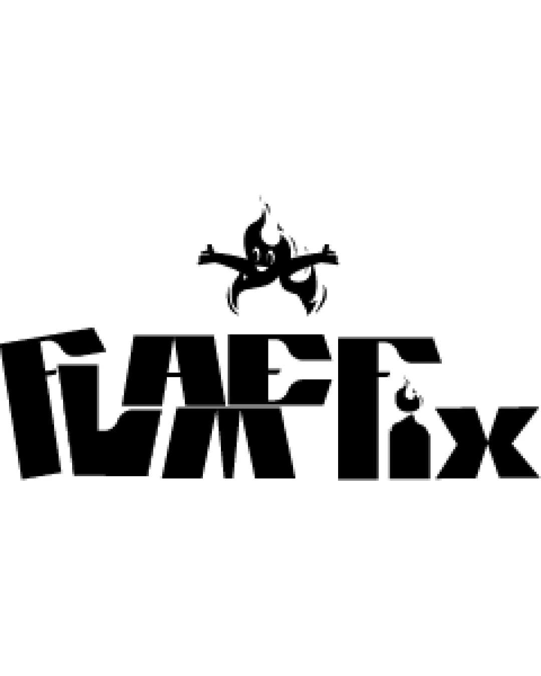
Try it Now!Logo review of FLARE Fix
 Logo analysis by AI
Logo type:
Style:
Detected symbol:
Negative space:
Detected text:
Business industry:
Review requested by NaheedRaheel
**If AI can recognize or misinterpret it, so can people.
Structured logo review
Legibility
![]() Bold letters provide strong presence.
Bold letters provide strong presence.![]() Unique shapes create visual intrigue.
Unique shapes create visual intrigue.
![]() Some letters are hard to distinguish, especially at smaller sizes.
Some letters are hard to distinguish, especially at smaller sizes.![]() Uneven spacing and fragmented geometric forms reduce readability.
Uneven spacing and fragmented geometric forms reduce readability.![]() 'F' and 'L' are especially hard to decipher without context.
'F' and 'L' are especially hard to decipher without context.
Scalability versatility
![]() Black-and-white color scheme translates well in most formats.
Black-and-white color scheme translates well in most formats.![]() High contrast works for print and digital.
High contrast works for print and digital.
![]() Excessive geometric fragmentation and detail will be lost on small applications like favicons, embroidery, or pens.
Excessive geometric fragmentation and detail will be lost on small applications like favicons, embroidery, or pens.![]() Logo will not be legible on small merchandise or product tags.
Logo will not be legible on small merchandise or product tags.
200x250 px
100×125 px
50×62 px
Balance alignment
![]() Centralized symbol above logotype draws initial eye focus.
Centralized symbol above logotype draws initial eye focus.![]() Baseline mostly aligns between letters.
Baseline mostly aligns between letters.
![]() Top-heavy due to the large symbol above the text.
Top-heavy due to the large symbol above the text.![]() Letter heights and widths are inconsistent, making the composition feel erratic.
Letter heights and widths are inconsistent, making the composition feel erratic.![]() No clear alignment between logomark and logotype.
No clear alignment between logomark and logotype.

Originality
![]() Anthropomorphic flame character is a distinctive touch.
Anthropomorphic flame character is a distinctive touch.![]() Fragmented, angular typeface is uncommon and memorable.
Fragmented, angular typeface is uncommon and memorable.
![]() Use of fire/flame motif is somewhat cliched in entertainment or high-energy industries.
Use of fire/flame motif is somewhat cliched in entertainment or high-energy industries.![]() Wordmark treatment is unique but bordered on illegibility.
Wordmark treatment is unique but bordered on illegibility.
Logomark wordmark fit
![]() Both symbol and wordmark share geometric sharpness.
Both symbol and wordmark share geometric sharpness.
![]() Character’s playful style feels disconnected from the blocky, aggressive typography.
Character’s playful style feels disconnected from the blocky, aggressive typography.![]() Sizing is unbalanced, with the symbol overpowering the wordmark.
Sizing is unbalanced, with the symbol overpowering the wordmark.![]() Visual style mismatch between organic flame figure and rigid text.
Visual style mismatch between organic flame figure and rigid text.
Aesthetic look
![]() Energetic and eye-catching presence.
Energetic and eye-catching presence.![]() Clever flame-themed integration.
Clever flame-themed integration.
![]() Busy and fractured visual impression.
Busy and fractured visual impression.![]() Overly aggressive geometry feels harsh and chaotic.
Overly aggressive geometry feels harsh and chaotic.![]() The fragmented structure detracts from unified brand recognition.
The fragmented structure detracts from unified brand recognition.
Dual meaning and misinterpretations
![]() No inappropriate or offensive hidden meanings detected.
No inappropriate or offensive hidden meanings detected.
![]() Anthropomorphic flame could be mistaken for unrelated cartoon mascots or figures at a glance.
Anthropomorphic flame could be mistaken for unrelated cartoon mascots or figures at a glance.![]() General abstraction could cause interpretive ambiguity for first-time viewers.
General abstraction could cause interpretive ambiguity for first-time viewers.
Color harmony
![]() Monochrome palette offers maximum contrast and clarity.
Monochrome palette offers maximum contrast and clarity.![]() No unnecessary color distractions.
No unnecessary color distractions.
Black
#000000
White
#FFFFFF