alba logo review
4.3 / 5
Logo score
Logo review of

Alba

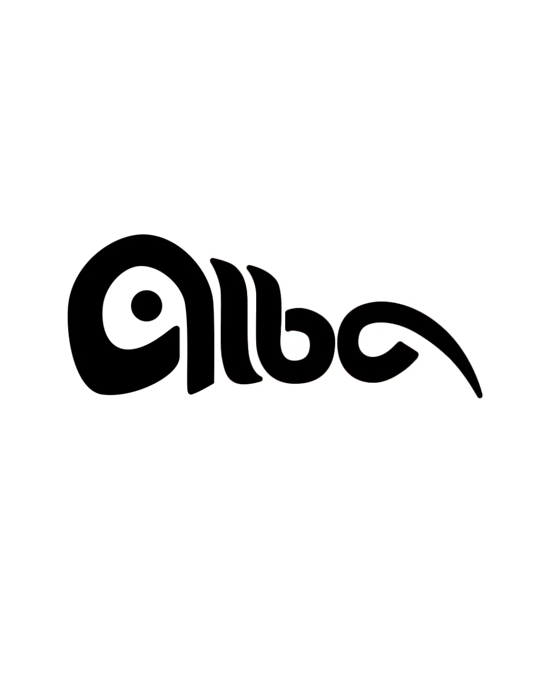
A distinctive, inventive wordmark that merges identity and symbol with flair. Minor refinements to the opening character would bring it to a fully exceptional level.

Objective AI feedback. Your creative decision.

Wordmark Playful Geometric Wordmark With Animal Integration Travel
4/5
Legibility
5/5
Originality
4.5/5
Misread
4/5
Balance
4/5
Scale
Action plan

What to fix first

The most important fixes to handle before polishing the full presentation.

1

Soften the transition between 'a' and 'l' for improved 'a' clarity, reducing potential for misreading as 'g'.

High priority

Refining letter distinction elevates usability without compromising concept.

Impact: Improves Instant Recognition And Accessibility Across Brand Touchpoints. · Effort: Medium

Detailed review

Logo performance breakdown

4/5

Legibility

Checkmark icon Text is generally readable as 'alba', especially at medium/large sizes

Warning icon First 'a' could be misread as a 'g' or abstract shape at a quick glance

5/5

Originality

Checkmark icon Distinctive integration of bird imagery into letterforms; avoids generic travel or bird logos

4/5

Balance alignment

Checkmark icon Well-composed, with visual balance across the wordmark and a pleasing rhythm in curves

Warning icon Slight imbalance created by the elongated beak; could feel left-heavy

logo 200x250 pixels scalability test alignment grid overlay
4/5

Scalability

Checkmark icon Bold, clean strokes scale well and retain detail at small sizes

Warning icon Beak flourish could lose sharpness at very small sizes or in low-res applications

logo 200x250 pixels scalability test

200x250 px

logo 100x125 pixels scalability test

100×125 px

logo 50x62 pixels scalability test

50×62 px

4.5/5

Misinterpretations

Checkmark icon Bird and word integration reads naturally, no clear harmful secondary symbols

Brief match

Checkmark icon Readability: Wordmark remains broadly readable and friendly, with only moderate risk of initial misread.
Checkmark icon Premium Yet Warm Personality: Bold monochrome and soft shapes balance premium and approachable, not cold or elitist.
Checkmark icon Adventurous And Intelligent Spirit: Creative morphing of text into an animal silhouette feels clever, active, and unique to the travel sector.

Try your own review

Wondering how your logo performs?

Get a clear logo score, key risks, and priority fix ideas before your client or audience sees it.

Review my logo