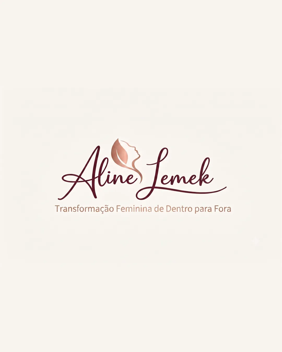
Aline Lemek Transformação Feminina de Dentro par.. logo review
4.3/5
Logo score
Logo review of

Aline Lemek Transformação Feminina De Dentro Par..

Strong, elegant, and resonant with the intended audience; highly effective for personal branding in the wellness or coaching sector.

Combination Mark Elegant, Feminine, Script Personal Development Or Coaching
4/5
Legibility
4/5
Originality
5/5
Misread
5/5
Balance
4/5
Scale
Action plan

What to fix first

The most important fixes to handle before polishing the full presentation.

1

Slightly simplify script details, especially the capital 'L', for better small-size readability.

Medium priority

Ensures logo maintains clarity and impact across more touchpoints.

Impact: Improves Legibility At Various Sizes Without Losing Style. · Effort: Medium

Detailed review

Logo performance breakdown

4/5

Legibility

Checkmark icon Script wordmark is decorative yet readable.
Checkmark icon Tagline has good contrast and clarity.

Warning icon Capital 'L' in 'Lemek' is slightly complex due to the script style.

4/5

Originality

Checkmark icon Female face integrated with a leaf is relevant and tastefully executed.

Warning icon The script and silhouette approach is somewhat common in the wellness industry.

4/5

Color harmony

Checkmark icon Earthy tones reinforce warmth and femininity.

Warning icon Could experiment with stronger contrast for enhanced impact.

Chestnut
#704442

Light Brown
#CFA388

Off
#F8F5EF

Your palette is close. Refine the color roles and combinations before updating the logo.

Build brand colors
5/5

Balance alignment

Checkmark icon Strong central alignment between symbol, wordmark, and tagline.
Checkmark icon Elegant flow links all elements harmoniously.

logo 200x250 pixels scalability test alignment grid overlay
4/5

Scalability

Checkmark icon Simple mark and distinct text enable moderate downscaling.
Checkmark icon Contrasting weights between mark and type support legibility.

Warning icon Script details could be lost at very small sizes.

logo 200x250 pixels scalability test

200x250 px

logo 100x125 pixels scalability test

100×125 px

logo 50x62 pixels scalability test

50×62 px

5/5

Misinterpretations

Checkmark icon No confusing negative spaces or awkward shapes.

5/5

Logo structure & brief match

Checkmark icon Mark and script work together visually and thematically.

Checkmark icon Brand Personality: Elegant, feminine, and nurturing impression is well-aligned with the likely target audience and field.
Checkmark icon Core Message: Symbol clearly reflects feminine transformation and growth as stated in the tagline.

Try your own review

Wondering how your logo performs?

Get a clear logo score, key risks, and priority fix ideas before your client or audience sees it.

Review my logo