Wondering how your logo performs? 🧐
Get professional logo reviews in seconds and catch design issues in time.
Try it Now!Logo review of ALIRA
 Logo analysis by AI
Logo type:
Style:
Detected symbol:
Detected text:
Business industry:
Review requested by Benny
**If AI can recognize or misinterpret it, so can people.
Structured logo review
Legibility
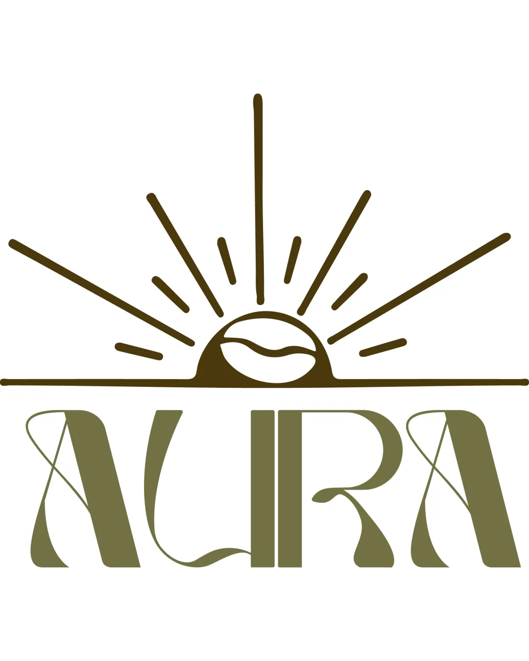
 The brand name 'ALIRA' is generally distinguishable. The font style adds unique character.
 Decorative flourishes within type occasionally interfere with quick readability. The stylized strokes of the 'A' and 'R' may confuse the eye, especially at small sizes.
Scalability versatility
Bold lines and integrated symbol would reproduce well in larger formats like packaging or signage. Single-color palette helps with basic reproduction.
Fine lines in the sun rays risk disappearing at small scales (e.g., on business cards or website favicons). Intricate letterforms of 'ALIRA' may lose definition in embroidery or tiny digital icons.
200x250 px
100×125 px
50×62 px
Balance alignment
Horizontal axis creates a grounded look. Radiating lines give symmetry above the wordmark.
Visual weight of the sunburst is much greater than the airy wordmark, creating a slight imbalance. The line beneath the sun doesn't perfectly anchor the overall logo. Letter proportions feel inconsistent due to decorative extensions.

Originality
Creative integration of sunrise and coffee bean is distinctive. Custom typography offers a unique twist on a classic serif style.
Sunburst motifs and coffee bean visuals are somewhat common in this industry. The core idea shows some industry tropes, though well executed.
Logomark wordmark fit
Both logomark and wordmark share a flowing, handcrafted feel. Color consistency helps unify the elements.
The organic and radiant energy of the symbol contrasts with the more formal, condensed typography. Disproportionate size between graphic and text; the symbol slightly overwhelms the logotype.
Aesthetic look
Visually striking and memorable style. Feels premium and artisanal, which could attract the target audience.
Almost too decorative for some contemporary applications. Decorative elements risk feeling dated if not deployed with restraint.
Dual meaning and misinterpretations
No inappropriate or suggestive forms detected. The imagery is clear and industry-appropriate.
Color harmony
Single-color design offers strong cohesion. Earthy olive tone is well-suited for food and beverage industry.
Olive
#76653C