Wondering how your logo performs? 🧐
Get professional logo reviews in seconds and catch design issues in time.
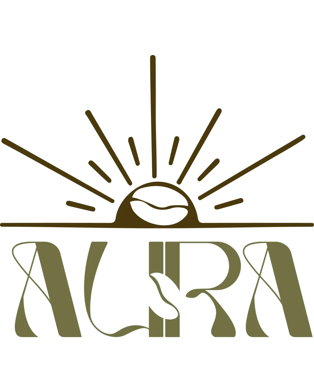
Try it Now!Logo review of ALIRA
 Logo analysis by AI
Logo type:
Style:
Detected symbol:
Negative space:
Detected text:
Business industry:
Review requested by Benny
**If AI can recognize or misinterpret it, so can people.
Structured logo review
Legibility
![]() Text is mostly readable with distinct custom typeface
Text is mostly readable with distinct custom typeface![]() Letterforms are unique and contribute to brand character
Letterforms are unique and contribute to brand character
![]() Decorative swashes and organic negative space motifs reduce instant legibility
Decorative swashes and organic negative space motifs reduce instant legibility![]() Letter 'U' and 'R' integrations could be confusing at small sizes
Letter 'U' and 'R' integrations could be confusing at small sizes
Scalability versatility
![]() Bold shapes provide some visual clarity at larger sizes
Bold shapes provide some visual clarity at larger sizes![]() Icon and text can potentially be used separately in branding
Icon and text can potentially be used separately in branding
![]() Fine sunray lines and thin details will likely disappear at small sizes, like business cards or social icons
Fine sunray lines and thin details will likely disappear at small sizes, like business cards or social icons![]() Intricate typographic flourishes could blur in embroidery or small print
Intricate typographic flourishes could blur in embroidery or small print![]() Complexity reduces versatility for single-color or minimal formats
Complexity reduces versatility for single-color or minimal formats
200x250 px
100×125 px
50×62 px
Balance alignment
![]() Centered layout provides foundational symmetry
Centered layout provides foundational symmetry![]() Horizontal axis between symbol and wordmark aligns reasonably
Horizontal axis between symbol and wordmark aligns reasonably
![]() Top-heavy with sunburst creating disproportionate visual weight
Top-heavy with sunburst creating disproportionate visual weight![]() Connection between the sun/bean symbol and the wordmark is tenuous
Connection between the sun/bean symbol and the wordmark is tenuous

Originality
![]() Creative use of a coffee bean as a sun, which visually supports a dual-meaning concept
Creative use of a coffee bean as a sun, which visually supports a dual-meaning concept![]() Custom letterforms stand out from generic type
Custom letterforms stand out from generic type![]() Organic negative space motifs are thoughtfully embedded
Organic negative space motifs are thoughtfully embedded
![]() Sunburst motif is somewhat common in food and beverage but handled with slightly more creativity here
Sunburst motif is somewhat common in food and beverage but handled with slightly more creativity here
Logomark wordmark fit
![]() Both the symbol and wordmark use organic, illustrative lines and curves
Both the symbol and wordmark use organic, illustrative lines and curves![]() Visual theme of nature and sunrise is consistent throughout
Visual theme of nature and sunrise is consistent throughout
![]() Symbol is somewhat more minimal compared to ornamental type, creating minor style mismatch
Symbol is somewhat more minimal compared to ornamental type, creating minor style mismatch
Aesthetic look
![]() Retro-modern look with a stylish organic feel fits current café/food trends
Retro-modern look with a stylish organic feel fits current café/food trends![]() Logo invokes warmth and natural vibes
Logo invokes warmth and natural vibes
![]() Typography could feel a bit overworked to some viewers, verging on busy
Typography could feel a bit overworked to some viewers, verging on busy
Dual meaning and misinterpretations
![]() Effective dual-meaning with literal and metaphorical sunrise/coffee bean
Effective dual-meaning with literal and metaphorical sunrise/coffee bean
Color harmony
![]() Restrained and harmonious color palette reflects organic/natural themes
Restrained and harmonious color palette reflects organic/natural themes![]() Good contrast between earthy green and white
Good contrast between earthy green and white
Olive Drab
#635F3B
White
#FFFFFF