Increase thickness of monogram lines for small-scale use
Thin lines may disappear in small-size reproductions.
Improves legibility and scalability across more applications
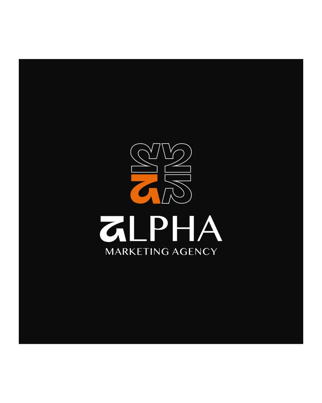
Strong modern design with character; needs modest tweaks for maximum practical impact.
Focus on the changes that matter. Keep what makes the logo work.
Thin lines may disappear in small-size reproductions.
Improves legibility and scalability across more applications
Stronger integration will reduce potential dominance of the mark.
Better visual harmony between mark and text enhances perceived quality
Represents marketing well via modern and geometric style, suggesting creativity and professionalism.
Estimated colors. Use the original design file for exact values.
Create a full color palette using these colors
Create new palette
Inspect spacing with the guide. Optical balance may differ from geometric centering.
Get a clear logo score, key risks, and priority fix ideas before your client or audience sees it.
More credits needed
Add credits to continue without losing your work.
Then $7/month. Cancel anytime.
Essential logo review with AI
Estimated progress