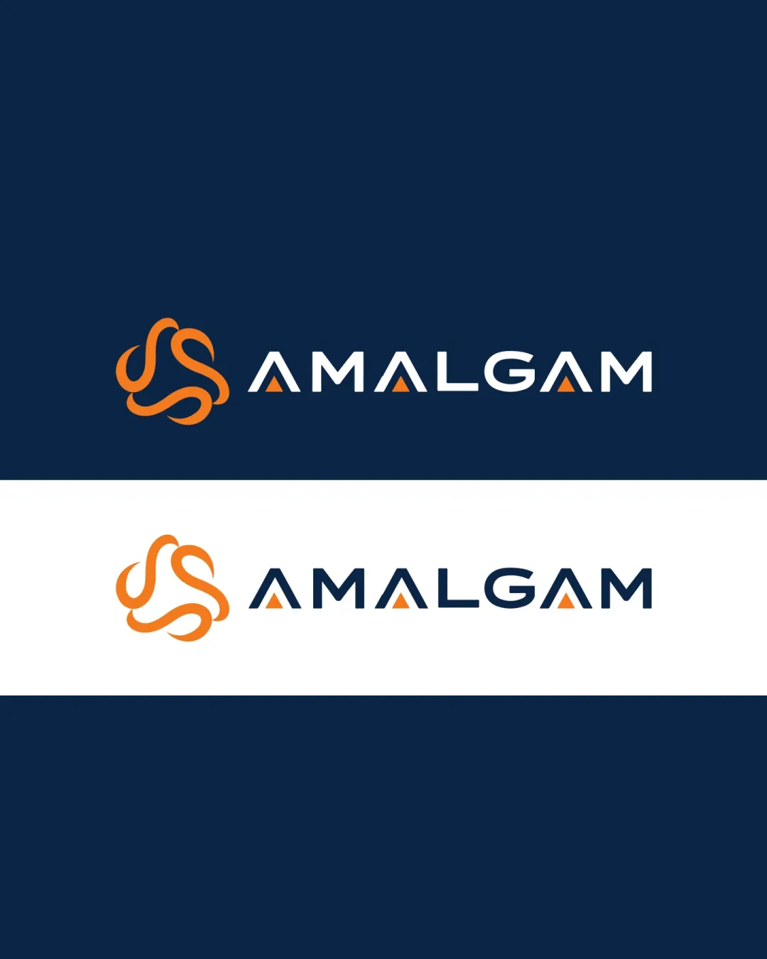
AMALGAM logo review
4.3 / 5
Logo score
Logo review of

Amalgam

A modern, visually strong logo that answers the brief on unity and professionalism for a signage business with high polish.

Objective AI feedback. Your creative decision.

Combination Mark Modern Geometric Minimalism Signage / Fabrication
4.5/5
Legibility
4/5
Originality
5/5
Misread
4.5/5
Balance
4/5
Scale
Action plan

What to fix first

The most important fixes to handle before polishing the full presentation.

1

Refine symbol line thickness for smaller applications or provide a simplified responsive version.

High priority

Ensures workability across various physical and print sizes.

Impact: Improves Clarity And Usability In All Signage Contexts, Preventing Loss Of Form At Reduced Scale. · Effort: Medium

Detailed review

Logo performance breakdown

4.5/5

Legibility

Checkmark icon Clear, bold sans-serif letters with creative triangle-A that is easily recognizable.

Warning icon The stylized 'A's may slightly challenge instant word recognition at small sizes.

4/5

Originality

Checkmark icon Three-loop mark feels ownable and conceptually appropriate.
Checkmark icon Wordmark integrates unique stylization without becoming generic.

Warning icon Abstract loop mark has some resemblance to common 'unity' iconography.

4.5/5

Color harmony

Checkmark icon Vivid orange stands out well against deep navy and white.
Checkmark icon Palette feels modern, professional, and highly visible.

Orange
#FF9000

Navy Blue
#182740

White
#FFFFFF

Your palette is close. Refine the color roles and combinations before updating the logo.

Build brand colors
4.5/5

Balance alignment

Checkmark icon Excellent left-to-right alignment between mark and wordmark.
Checkmark icon Optical weight is well managed for both logo versions.

logo 200x250 pixels scalability test alignment grid overlay
4/5

Scalability

Checkmark icon Symbol and wordmark both scale well.
Checkmark icon Limited detail ensures readability at most sizes.

Warning icon Very thin inner lines on the mark may lose clarity at very small sizes.

logo 200x250 pixels scalability test

200x250 px

logo 100x125 pixels scalability test

100×125 px

logo 50x62 pixels scalability test

50×62 px

5/5

Misinterpretations

Checkmark icon No plausible negative or confusing interpretations in mark or wordmark.

4.5 / 5

Logo structure & brief match

Checkmark icon Symbol and text harmonize in style and energy.
Checkmark icon Color and geometric choices tie both components together.

Checkmark icon Three Brothers Unified As One Company: The interlocking three-loop mark directly communicates unity and partnership, fitting the story.
Checkmark icon Sign Board Making, UAE: Bold typography and a clean, modern mark reinforce reliability and visibility suitable for signage.

Try your own review

Wondering how your logo performs?

Get a clear logo score, key risks, and priority fix ideas before your client or audience sees it.

Review my logo




