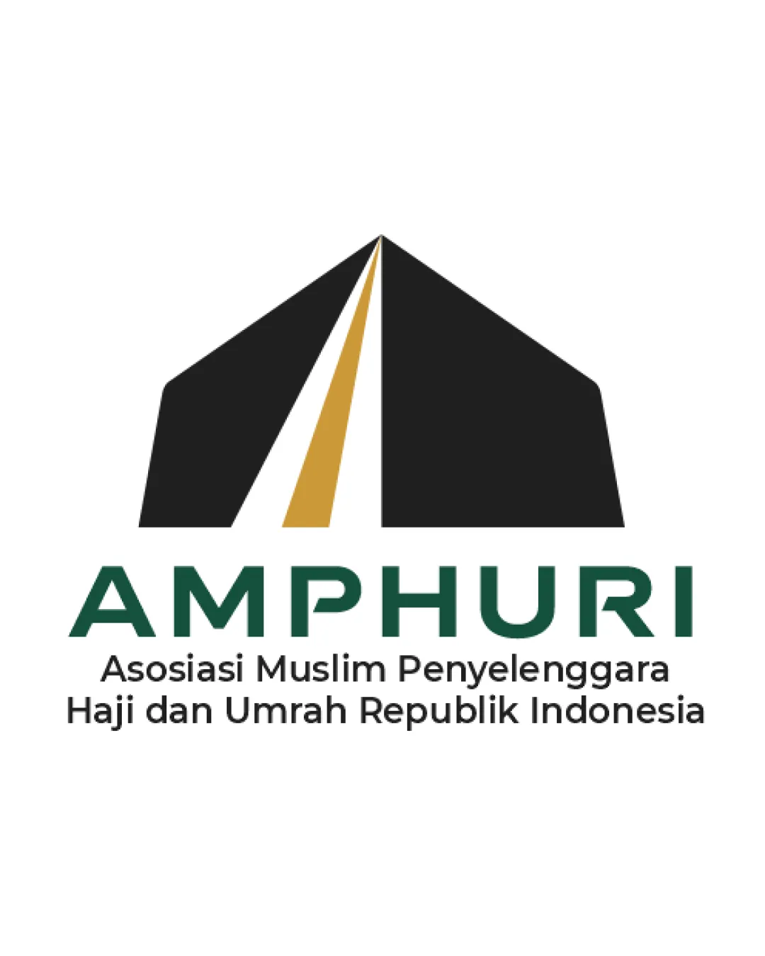
AMPHURI Asosiasi Muslim Penyelenggara Haji dan Umr.. logo review
4/5
Logo score Combination category

AMPHURI Asosiasi Muslim Penyelenggara Haji dan Umr..

creative249785 Essential logo review

A distinctive, mission-appropriate logo with strong symbolism; minor mark refinements will enhance versatility.

Combination Modern Geometric Emblem With Bold Sans-serif Wordmark Religious Association / Hajj And Umrah Services
5/5
Legibility
4/5
Originality
4/5
Balance
3.5/5
Scale
Your next steps

What to fix first

Focus on the changes that matter. Keep what makes the logo work.

1

Standalone mark

Test mark clarity at reduced scales; optimize line and gap widths as needed.

High priority Worth testing Medium effort

Very sharp mark apex and thin central gold line may blur or fill in at small sizes.

See the category review

2

Standalone mark

Fine-tune left/right edge thickness for enhanced optical balance.

Medium priority Optional refinement Low effort

The left diagonal black edge appears visually heavier than the right, creating slight asymmetry in the geometric mark.

See the category review
Detailed review

Logo performance breakdown

5/5

Brief & logo match

Logo convincingly embodies the pilgrimage theme with modern, professional style and clear adaptability.

5/5

Legibility

  • Strong legibility in both wordmark and tagline.
4/5

Originality

  • Geometric Kaaba-inspired mark feels distinctive for the purpose.
4/5

Color harmony

  • Classic gold, black, and green imply prestige and faith.
Black#212121
Gold#C49A3C
DarkGreen#247256
White#FFFFFF

Estimated colors. Use the original design file for exact values.

Create a full color palette using these colors

Create new palette
4/5

Balance alignment

  • Good vertical hierarchy; modern composition.
  • The left diagonal black edge appears visually heavier than the right, creating slight asymmetry in the geometric mark.

    Optional refinement Standalone mark

    Try: Fine-tune left/right edge thickness for enhanced optical balance.

Uploaded logoAlignment guide overlay

Inspect spacing with the guide. Optical balance may differ from geometric centering.

3.5/5

Scalability

  • Mark is simple and generally scalable.
  • Very sharp mark apex and thin central gold line may blur or fill in at small sizes.

    Worth testing Standalone mark

    Try: Test mark clarity at reduced scales; optimize line and gap widths as needed.

5/5

Misinterpretations

  • No plausible negative interpretations.
4/5

Symbol & text fit

  • Mark and type connect through color and cultural resonance.
Try your own review

Wondering how your logo performs?

Get a clear logo score, key risks, and priority fix ideas before your client or audience sees it.

Review my logo