View review
Logo score
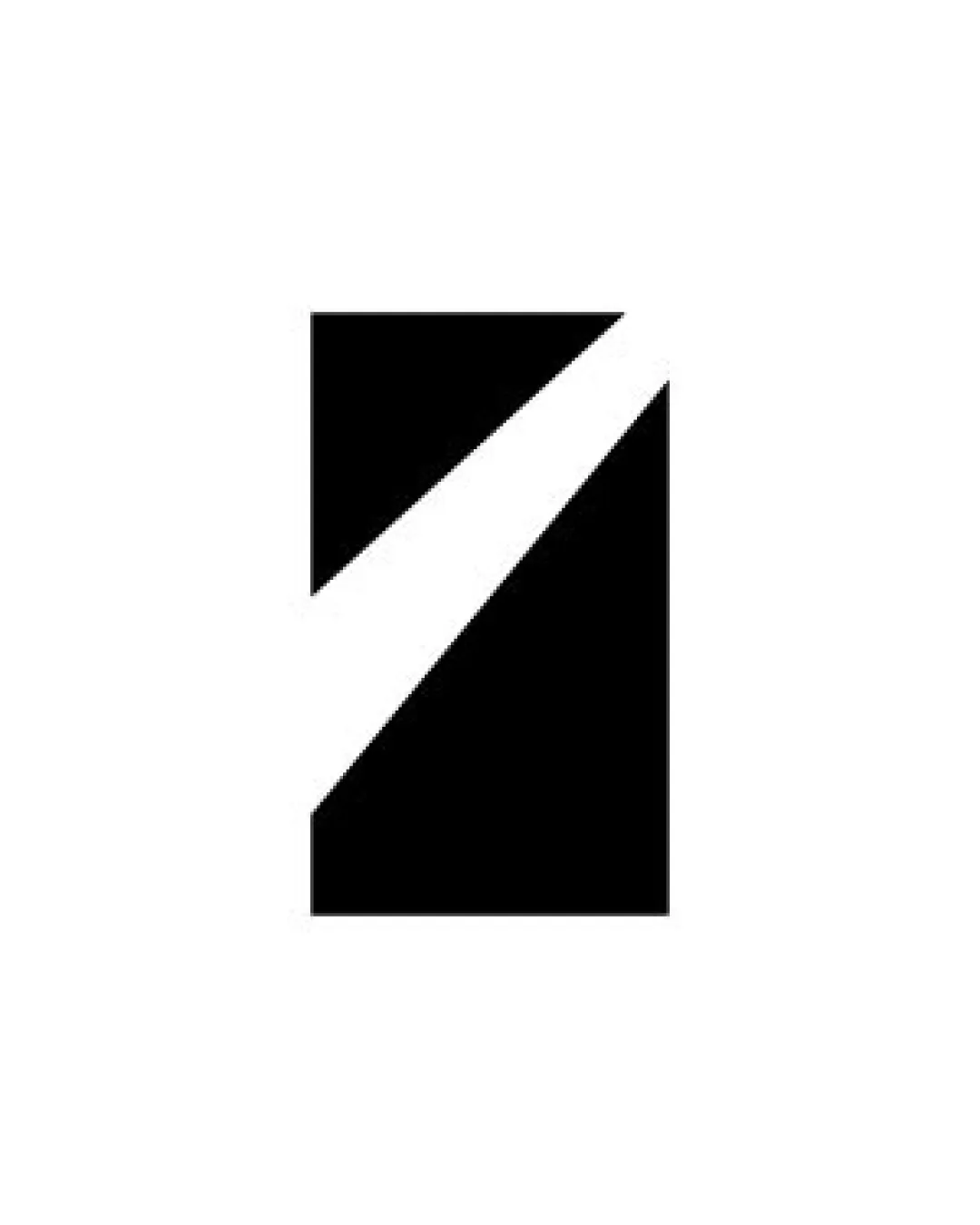
Logo review ofAngular Rectangle With A Diagonal White Slash
Review the detailed scores below to see what is working and what should be refined first.
Originality
Misread
Balance
Scale
Detailed review
Logo performance breakdown
Originality
![]() Minimalist approach with a dynamic diagonal makes it less generic than a basic rectangle.
Minimalist approach with a dynamic diagonal makes it less generic than a basic rectangle.![]() Diagonal negative space is visually engaging.
Diagonal negative space is visually engaging.
![]() Overall form is somewhat generic and could be confused with other tech or digital brands using minimal geometric abstractions.
Overall form is somewhat generic and could be confused with other tech or digital brands using minimal geometric abstractions.![]() Lacks a uniquely distinguishing element or clever visual metaphor.
Lacks a uniquely distinguishing element or clever visual metaphor.
Color harmony
![]() High contrast and a classic black-and-white palette guarantee strong visibility.
High contrast and a classic black-and-white palette guarantee strong visibility.![]() Versatile color scheme functions on light and dark backgrounds.
Versatile color scheme functions on light and dark backgrounds.
Black
#000000
White
#FFFFFF
Balance alignment
![]() Symmetrical and well-proportioned composition.
Symmetrical and well-proportioned composition.![]() Diagonal slash adds visual interest and tension.
Diagonal slash adds visual interest and tension.
![]() Diagonal slash may feel slightly unbalanced depending on context placement.
Diagonal slash may feel slightly unbalanced depending on context placement.

Scalability
![]() Simple geometric shapes ensure clarity at virtually any size.
Simple geometric shapes ensure clarity at virtually any size.![]() Solid contrast and bold lines are highly visible in small and large applications.
Solid contrast and bold lines are highly visible in small and large applications.![]() Works effectively as a social media avatar, app icon, or favicon.
Works effectively as a social media avatar, app icon, or favicon.
200x250 px
100×125 px
50×62 px
Misinterpretations
![]() No inappropriate or unintended dual imagery detected.
No inappropriate or unintended dual imagery detected.![]() Abstract style reduces risk of negative associations.
Abstract style reduces risk of negative associations.
Try your own review
Review my logo
Wondering how your logo performs?
Get a clear logo score, key risks, and priority fix ideas before your client or audience sees it.
Keep exploring