View review
Logo score
Logo review ofZipa
Review the detailed scores below to see what is working and what should be refined first.
Legibility
Originality
Misread
Balance
Scale
Detailed review
Logo performance breakdown
Legibility
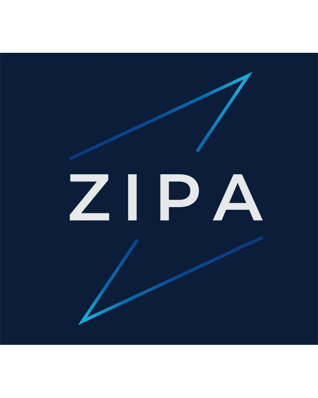
![]() Clear, sans-serif typography enhances readability.
Clear, sans-serif typography enhances readability.![]() Excellent color contrast between text and background.
Excellent color contrast between text and background.
Originality
![]() Diagonal arrow motif gives a sense of motion and speed fitting for tech or modern industries.
Diagonal arrow motif gives a sense of motion and speed fitting for tech or modern industries.
![]() Arrow/zig-zag motifs are quite common and do not offer a unique representation.
Arrow/zig-zag motifs are quite common and do not offer a unique representation.![]() Does not have a memorable or ownable form.
Does not have a memorable or ownable form.
Color harmony
![]() Palette is restrained and harmonious with a modern blue gradient.
Palette is restrained and harmonious with a modern blue gradient.![]() Excellent contrast assures readability and visual interest.
Excellent contrast assures readability and visual interest.
Ebony Clay
#13213C
Iron
#E4E4E4
Picton Blue
#1CB5E0
Balance alignment
![]() Text is centrally aligned between the arrow-like graphic elements, creating a harmonious look.
Text is centrally aligned between the arrow-like graphic elements, creating a harmonious look.
![]() The graphic elements are not perfectly symmetric and the dynamic lines pull the eye outward, causing slight visual imbalance.
The graphic elements are not perfectly symmetric and the dynamic lines pull the eye outward, causing slight visual imbalance.

Scalability
![]() Simple lines and bold text ensure visibility in a wide range of sizes.
Simple lines and bold text ensure visibility in a wide range of sizes.![]() Works well for digital applications, product packaging, and signage.
Works well for digital applications, product packaging, and signage.
![]() Thin lines in the symbol may lose clarity on very small applications such as favicons or embroidery.
Thin lines in the symbol may lose clarity on very small applications such as favicons or embroidery.
200x250 px
100×125 px
50×62 px
Misinterpretations
![]() No inappropriate dual meanings or unintended shapes.
No inappropriate dual meanings or unintended shapes.
Try your own review
Review my logo
Wondering how your logo performs?
Get a clear logo score, key risks, and priority fix ideas before your client or audience sees it.
Keep exploring