View review
Logo score
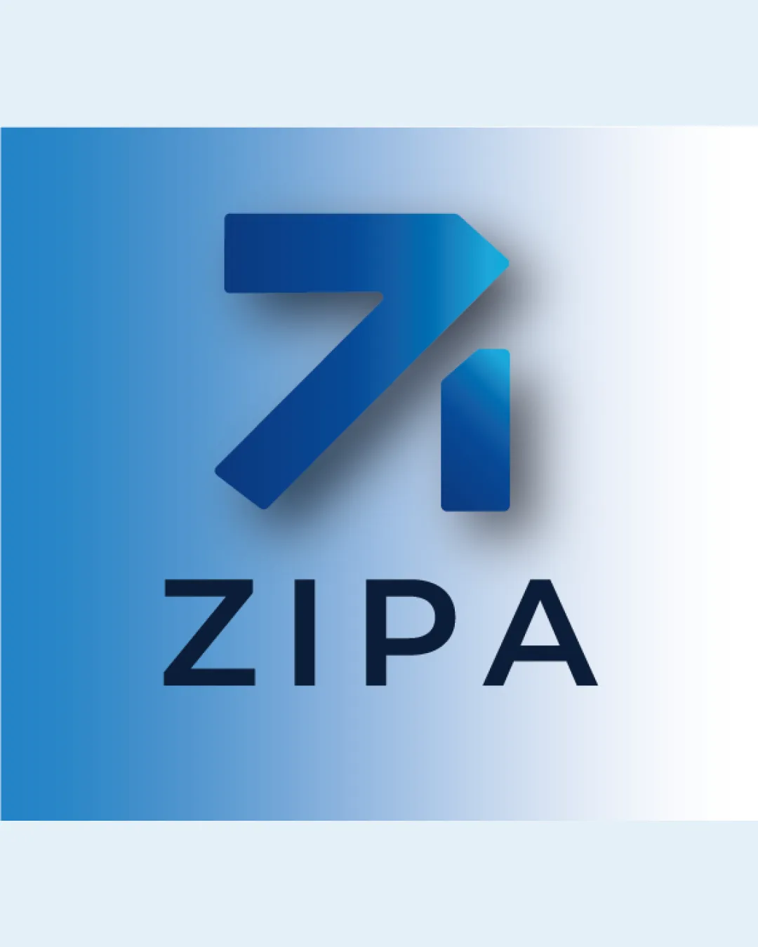
Logo review ofZipa
Review the detailed scores below to see what is working and what should be refined first.
Legibility
Originality
Misread
Balance
Scale
Detailed review
Logo performance breakdown
Legibility
![]() Letterforms are crisp and highly readable against the background.
Letterforms are crisp and highly readable against the background.![]() Simple geometric sans-serif font aids visibility even at smaller sizes.
Simple geometric sans-serif font aids visibility even at smaller sizes.
Originality
![]() Arrow-and-letter integration adds a layer of creativity and brand directionality.
Arrow-and-letter integration adds a layer of creativity and brand directionality.
![]() Arrow motifs are common in tech and finance, and the geometric style lacks distinctiveness.
Arrow motifs are common in tech and finance, and the geometric style lacks distinctiveness.![]() Abstract logomark could be perceived as generic in saturated tech industries.
Abstract logomark could be perceived as generic in saturated tech industries.
Color harmony
![]() Cool blue tones are harmonious and professional.
Cool blue tones are harmonious and professional.![]() Gradient adds depth without overwhelming the composition.
Gradient adds depth without overwhelming the composition.
![]() Gradient use may complicate reproduction on some print or merchandise formats.
Gradient use may complicate reproduction on some print or merchandise formats.
Prussian Blue
#1A365D
Cerulean Blue
#1E90D7
White Smoke
#F4FAFB
Balance alignment
![]() The logomark sits well above the wordmark, and the elements are generally coordinated.
The logomark sits well above the wordmark, and the elements are generally coordinated.![]() Consistent spacing between letters and symbol.
Consistent spacing between letters and symbol.
![]() Slight visual weight imbalance due to the thick, bold logomark compared to the lighter wordmark.
Slight visual weight imbalance due to the thick, bold logomark compared to the lighter wordmark.

Scalability
![]() Minimalist symbol can scale well to digital usage, such as app icons and websites.
Minimalist symbol can scale well to digital usage, such as app icons and websites.![]() Wordmark is legible at medium sizes, making it suitable for business cards.
Wordmark is legible at medium sizes, making it suitable for business cards.
![]() Gradient in logomark could result in clarity loss when scaled down or used in single-color applications.
Gradient in logomark could result in clarity loss when scaled down or used in single-color applications.![]() Shadow and color depth effects may not reproduce well in embroidery, stamps, or laser engraving.
Shadow and color depth effects may not reproduce well in embroidery, stamps, or laser engraving.
200x250 px
100×125 px
50×62 px
Misinterpretations
![]() No apparent inappropriate suggestive shapes or negative connotations.
No apparent inappropriate suggestive shapes or negative connotations.
Symbol & text fit
![]() Geometric style of the symbol complements the clean, sans-serif wordmark fonts.
Geometric style of the symbol complements the clean, sans-serif wordmark fonts.
![]() Color palette is shared, aiding cohesion.
Color palette is shared, aiding cohesion.
![]() The boldness of the logomark slightly overpowers the thin wordmark, impacting harmony.
The boldness of the logomark slightly overpowers the thin wordmark, impacting harmony.
Try your own review
Review my logo
Wondering how your logo performs?
Get a clear logo score, key risks, and priority fix ideas before your client or audience sees it.
Keep exploring