What to preserve
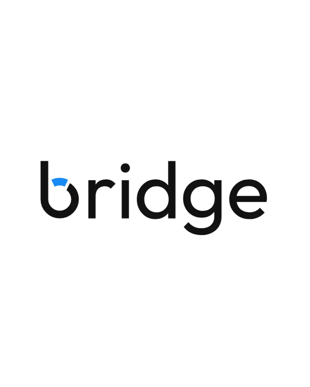
The logo integrates a visual bridge concept into the letter 'b', reinforcing the brand name with a creative touch.
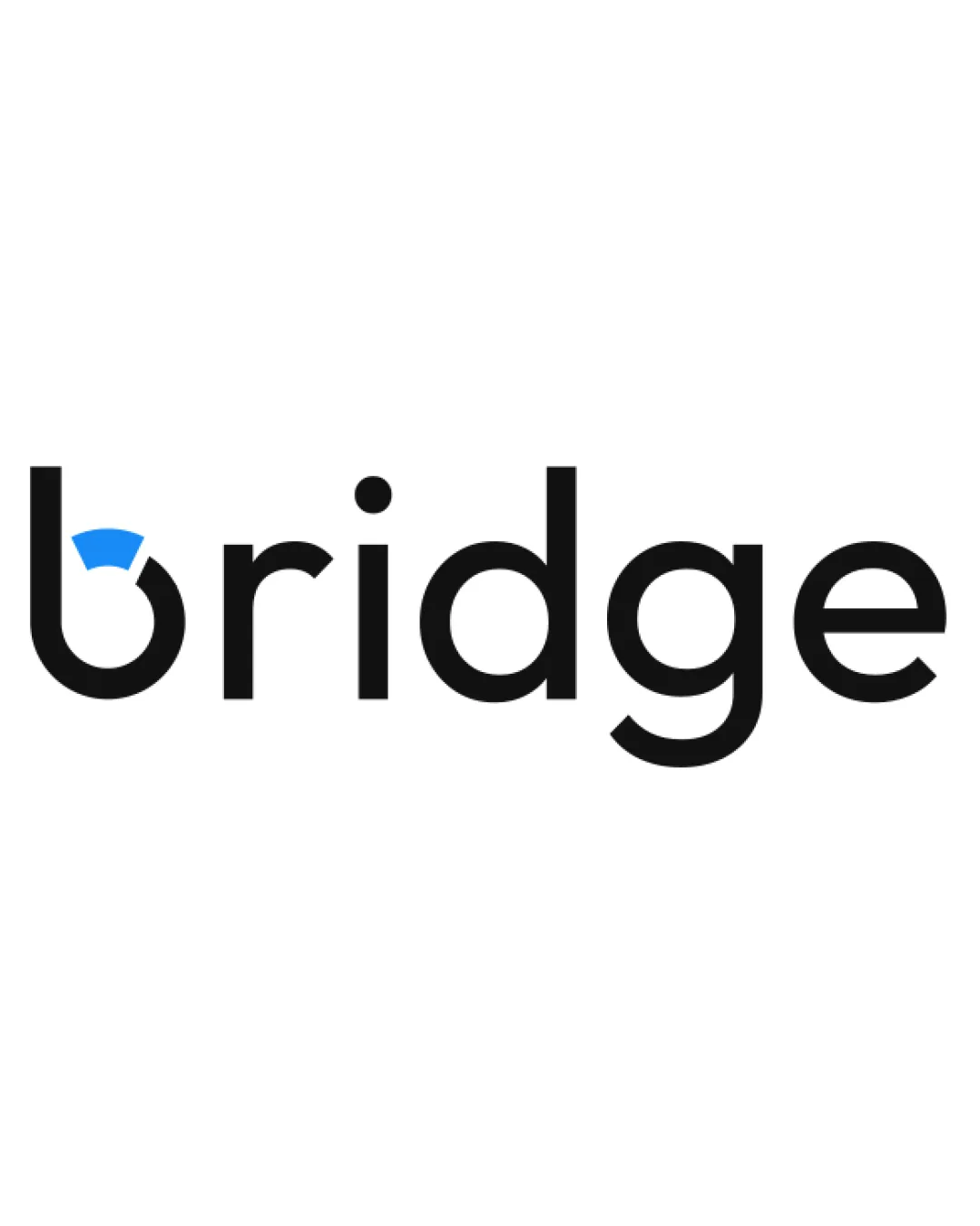
A clear, modern wordmark with a meaningful and integrated visual pun; highly effective with only minor polish needed for even stronger unity.
This wordmark shows strong execution, supported by text readability and distinctive construction.
Focus on the changes that matter. Keep what makes the logo work.
The logo integrates a visual bridge concept into the letter 'b', reinforcing the brand name with a creative touch.
Logo preview unavailable. The written feedback is still available on this card.
letter b
The blue arc in the 'b' breaks the counter's circle, slightly disrupting fluidity compared to the other clean, continuous letterforms.
See the category reviewThe logo creatively ties the 'bridge' concept into its wordmark, matching expected technology or platform themes; minor tweaks would help unity.
The bridge arc is a literal yet effective symbol; further abstraction or variation may increase distinctiveness.
Estimated colors. Use the original design file for exact values.
Create a full color palette using these colors
Create new paletteThe blue arc in the 'b' breaks the counter's circle, slightly disrupting fluidity compared to the other clean, continuous letterforms.
Try: Refine the arc's integration for smoother coherence with the letter.
Logo preview unavailable. The written feedback is still available on this card.

Inspect spacing with the guide. Optical balance may differ from geometric centering.
Get a clear logo score, key risks, and priority fix ideas before your client or audience sees it.
More credits needed
Add credits to continue without losing your work.
Then $7/month. Cancel anytime.
Essential logo review with AI
Estimated progress