Concept & direction
A bold sans-serif wordmark for a photography professional, featuring a minimal red accent on the 'i' for visual interest.
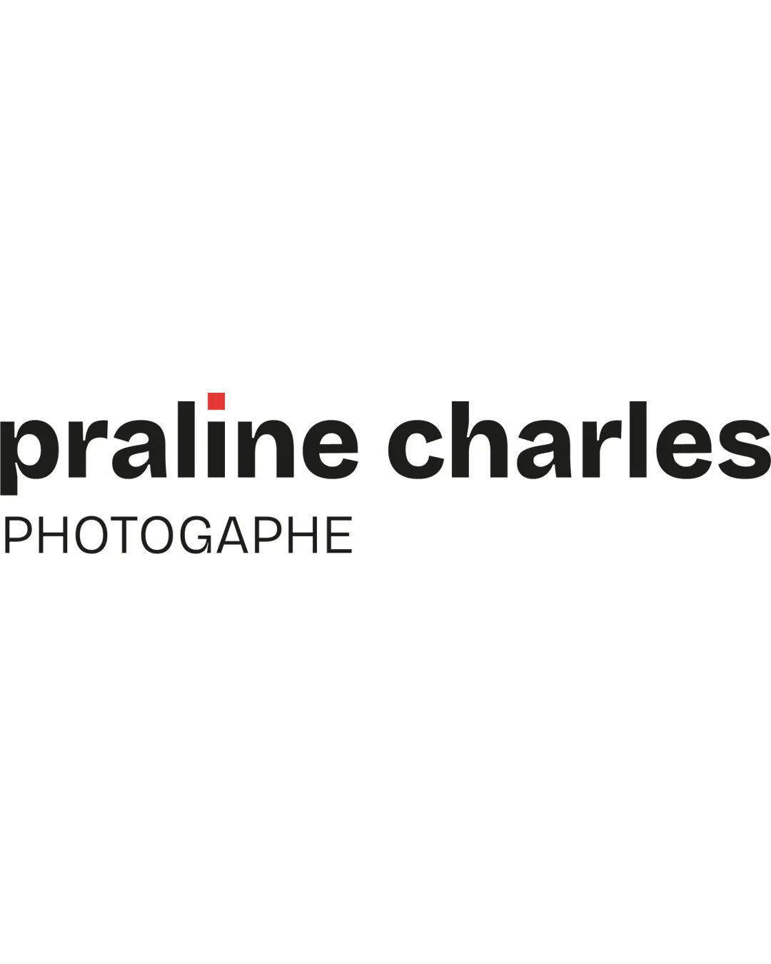
A solid, minimal wordmark with clear hierarchy and a simple accent, but limited distinctiveness and tagline scalability require attention.
This logo lockup shows solid execution, supported by text readability and visual balance; improving distinctiveness is the clearest next step.
Focus on the changes that matter. Keep what makes the logo work.
A bold sans-serif wordmark for a photography professional, featuring a minimal red accent on the 'i' for visual interest.
tagline
The tagline 'PHOTOGRAPHE' is thin and may lose clarity at smaller scales, especially in print or on social media avatars.
See the category reviewThe bold, modern wordmark and simple color accent fit the photography/social media context, but the logo risks getting lost among genre competitors and the tagline's thin style limits small-format readiness.
Wordmark 4/5 · Layout 5/5

Inspect spacing with the guide. Optical balance may differ from geometric centering.
Wordmark 4/5 · Layout 5/5
This review includes a score but no supporting explanation for this category.
The only unique element is the red dot on the 'i'; otherwise, the wordmark uses a standard bold sans-serif typeface with no distinct customizations.
The single red accent is visually effective, but its tone is slightly abrupt compared to the otherwise monochrome palette. This may draw disproportionate attention to the 'i' without deeper brand meaning.
Estimated colors. Use the original design file for exact values.
Create a full color palette using these colors
Create new paletteWordmark 3/5 · Layout 3/5
The tagline 'PHOTOGRAPHE' is thin and may lose clarity at smaller scales, especially in print or on social media avatars.
Try: Consider increasing weight or using a supporting version with a bolder tagline for small uses.
Get a clear logo score, key risks, and priority fix ideas before your client or audience sees it.
More credits needed
Add credits to continue without losing your work.
Then $7/month. Cancel anytime.
Essential logo review with AI
Estimated progress