Concept & direction
The logo creatively integrates the brand name into the shape of a padel racket, directly linking to the sports industry.
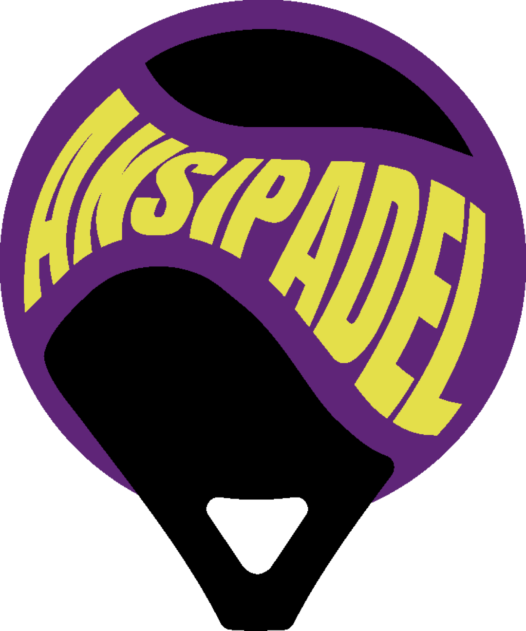
Distinctive emblem that ties well to padel, but impaired letterform readability is a critical usability concern.
This emblem has a workable foundation; improving clarity at smaller sizes is the clearest next step.
Focus on the changes that matter. Keep what makes the logo work.
The logo creatively integrates the brand name into the shape of a padel racket, directly linking to the sports industry.
text in upper half of emblem
Distorted, highly curved text in 'ANSIPÁDEL' impairs immediate legibility, especially at smaller scales or for new viewers.
See the category reviewThe padel racket shape and prominent text match the sports field well, but letter distortion reduces practical usability.
Estimated colors. Use the original design file for exact values.
Create a full color palette using these colors
Create new paletteThis review includes a score but no supporting explanation for this category.

Inspect spacing with the guide. Optical balance may differ from geometric centering.
This review includes a score but no supporting explanation for this category.
Distorted, highly curved text in 'ANSIPÁDEL' impairs immediate legibility, especially at smaller scales or for new viewers.
Try: Refine text curvature and spacing to improve readability while maintaining visual style.
Get a clear logo score, key risks, and priority fix ideas before your client or audience sees it.
More credits needed
Add credits to continue without losing your work.
Then $7/month. Cancel anytime.
Essential logo review with AI
Estimated progress