What to preserve
The logo combines a graceful, abstract woman’s figure in lingerie with a confident wordmark, directly supporting the lingerie/undergarments theme and aspirational messaging.
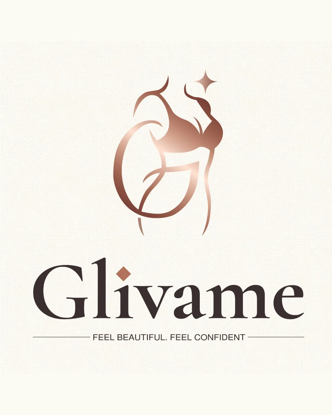
An elegant and targeted logo for a women’s lingerie brand, projecting beauty and confidence but should have its mark tested for small-scale clarity.
This logo lockup shows strong execution, supported by visual balance and distinctive construction; improving clarity at smaller sizes is the clearest next step.
Focus on the changes that matter. Keep what makes the logo work.
The logo combines a graceful, abstract woman’s figure in lingerie with a confident wordmark, directly supporting the lingerie/undergarments theme and aspirational messaging.
Logo preview unavailable. The written feedback is still available on this card.
Standalone mark (upper band)
The thin, soft gradient lines in the stylized figure could lose detail or contrast at very small sizes or on darker backgrounds.
See the category reviewThe logo blends an abstract feminine symbol and a refined wordmark, strongly expressing femininity, beauty, and confidence for a lingerie/undergarments business.
Wordmark 5/5 · Layout 5/5
Symbol 5/5 · Wordmark 5/5
Estimated colors. Use the original design file for exact values.
Create a full color palette using these colors
Create new paletteSymbol 4/5 · Wordmark 4/5
Symbol 4/5 · Wordmark 4/5 · Layout 4/5
The diamond above the 'i' is a unique accent but adds an asymmetrical emphasis to the left of the wordmark.

Inspect spacing with the guide. Optical balance may differ from geometric centering.
Symbol 3/5 · Wordmark 5/5 · Layout 4/5
The thin, soft gradient lines in the stylized figure could lose detail or contrast at very small sizes or on darker backgrounds.
Try: Test symbol visibility and legibility at small sizes.
Logo preview unavailable. The written feedback is still available on this card.
Get a clear logo score, key risks, and priority fix ideas before your client or audience sees it.
More credits needed
Add credits to continue without losing your work.
Then $7/month. Cancel anytime.
Essential logo review with AI
Estimated progress