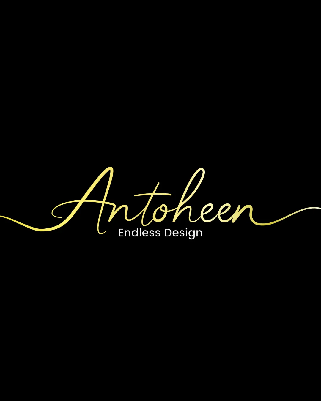
Antoheen Endless Design logo review
3.2 / 5
Logo score
Logo review of

Antoheen Endless Design

Functional and on-brand for creative fields, but not yet distinctive or robust enough for top-tier use; refinement required for broader application.

Objective AI feedback. Your creative decision.

Wordmark Modern Script With Minimalistic Tagline Creative/design
3.5/5
Legibility
3/5
Originality
4/5
Misread
3.5/5
Balance
3/5
Scale
Action plan

What to fix first

The most important fixes to handle before polishing the full presentation.

1

Simplify or clarify script elements, especially initial letter and flourishes.

High priority

Current flourishes, while elegant, impact clarity at smaller sizes and reduce versatility.

Impact: Improves Legibility And Scalability. · Effort: Medium

2

Develop a scale-optimized variant with reduced flourishes for small-format use.

Medium priority

Will ensure logo remains effective in diverse applications.

Impact: Enhances Usability Across Media. · Effort: Medium

Detailed review

Logo performance breakdown

3.5/5

Legibility

Checkmark icon Tagline is clear and easy to read.
Checkmark icon Script conveys elegance.

Warning icon Script font legibility is slightly reduced due to flourish, especially for letters like 'A' and 'h'.

3/5

Originality

Checkmark icon Elegant touch with continuous line represents 'endless' concept.

Warning icon Script and sans-serif combination is common in creative industries.
Warning icon Does not feel highly unique.

4/5

Color harmony

Checkmark icon Yellow on black creates strong contrast and energy.

Warning icon Single accent color limits adaptability if broader palette is needed.

Yellow
#FFF700

Black
#000000

Your palette is close. Refine the color roles and combinations before updating the logo.

Build brand colors
3.5/5

Balance alignment

Checkmark icon Horizontal symmetry with extended lines.
Checkmark icon Good vertical alignment between name and tagline.

Warning icon Large flourishes create uneven whitespace flanking the main text.

logo 200x250 pixels scalability test alignment grid overlay
3/5

Scalability

Checkmark icon Tagline remains clear in most sizes.

Warning icon Thin script lines risk loss of clarity at small sizes.
Warning icon Long flourishes could hinder vertical/horizontal lockups.

logo 200x250 pixels scalability test

200x250 px

logo 100x125 pixels scalability test

100×125 px

logo 50x62 pixels scalability test

50×62 px

4/5

Misinterpretations

Checkmark icon No visible risk of negative or confusing shapes.

Brief match

Checkmark icon Creative/brand Identity: The elegant script and continuous line fit a design-focused or creative brand, with the tagline reinforcing endless creativity.

Try your own review

Wondering how your logo performs?

Get a clear logo score, key risks, and priority fix ideas before your client or audience sees it.

Review my logo