 View review
Logo score
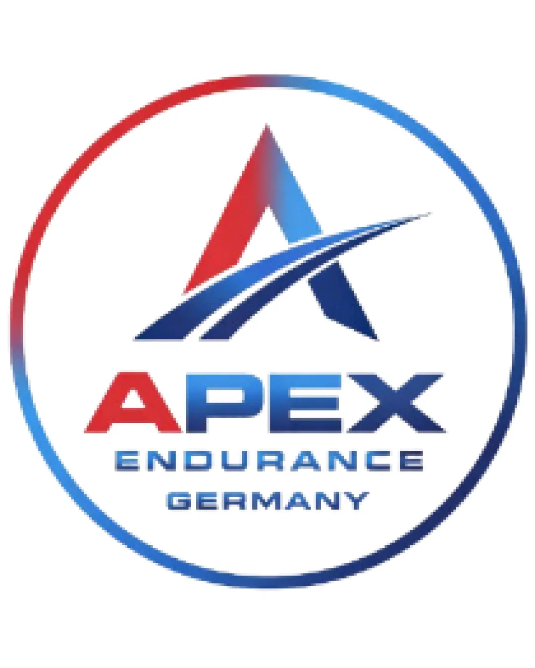
Logo review ofApex Endurance Germany
Well-composed and professional, but gradient/outline reliance and generic iconography keep it from being fully client-ready.
Legibility
Originality
Misread
Balance
Scale
Action plan
What to fix first
The most important fixes to handle before polishing the full presentation.
1
Simplify or flatten the gradient effects and outlines for better scalability and adaptation to single-color/monochrome use.
High priorityGradient and thin elements may disappear or degrade in different applications.
Impact: Improves Practical Use On Merchandise And Digital Platforms; Enhances Clarity At Various Sizes. · Effort: Medium
2
Strengthen originality by refining the 'A' symbol or adding a unique twist to set it apart from similar sports logos.
Medium priorityCurrent 'A with swoosh' approach, while effective, is common in the sector.
Impact: Boosts Brand Distinctiveness And Reduces Risk Of Generic Perception. · Effort: Medium
Detailed review
Logo performance breakdown
Legibility
![]() Primary 'APEX' text is large and clear
Primary 'APEX' text is large and clear![]() Hierarchy is good; 'ENDURANCE GERMANY' is readable
Hierarchy is good; 'ENDURANCE GERMANY' is readable
![]() Gradient and line thickness in 'A' symbol may affect clarity at small sizes
Gradient and line thickness in 'A' symbol may affect clarity at small sizes
Originality
![]() Dynamic swoosh adds motion to the 'A'
Dynamic swoosh adds motion to the 'A'
![]() 'A with swoosh' is fairly common in sports and endurance branding
'A with swoosh' is fairly common in sports and endurance branding
Color harmony
![]() Red/blue palette suits athletic/competitive energy
Red/blue palette suits athletic/competitive energy
![]() Gradient use is a bit dated and may reduce flexibility across media
Gradient use is a bit dated and may reduce flexibility across media
Red
#D62323
Navy
#1B3C78
Blue
#2373BC
White
#FFFFFF
Your palette is close. Explore sharper color combinations with Colorfly.design before updating the logo.
Explore palettesBalance alignment
![]() Symmetrical design with well-centered elements
Symmetrical design with well-centered elements
![]() Swoosh may make the top-heavy, slightly unbalanced overall
Swoosh may make the top-heavy, slightly unbalanced overall

Scalability
![]() Clean symbol and text allows for scaling
Clean symbol and text allows for scaling
![]() Gradient effects and thin outlines may not reproduce well in small or single-color formats
Gradient effects and thin outlines may not reproduce well in small or single-color formats
200x250 px
100×125 px
50×62 px
Misinterpretations
![]() No inappropriate or confusing visual readings present
No inappropriate or confusing visual readings present
Logo structure & brief match
![]() Mark and wordmark integrate smoothly; shared colors and style
Mark and wordmark integrate smoothly; shared colors and style
![]() Industry Alignment: Sports/fitness theme is visually reinforced by the dynamic symbol and bold typography.
Industry Alignment: Sports/fitness theme is visually reinforced by the dynamic symbol and bold typography.
Try your own review
Review my logo
Wondering how your logo performs?
Get a clear logo score, key risks, and priority fix ideas before your client or audience sees it.
Keep exploring


