Refine the red outline and color blending for better clarity and polish, especially at smaller sizes.
Current color effects could reduce reproduction quality and brand perception.
Improves professionalism and versatility.
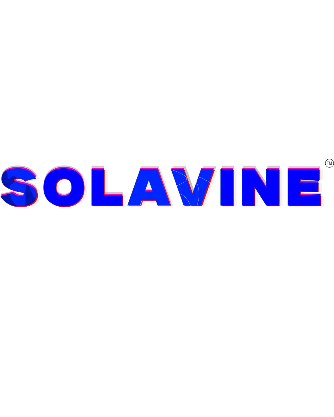
A solid foundation with good readability, but needs refinement in color treatment and originality to stand out in a competitive environment.
Focus on the changes that matter. Keep what makes the logo work.
Current color effects could reduce reproduction quality and brand perception.
Improves professionalism and versatility.
Subtly increasing the personality of the 'V' can help the logo stand out.
Improves uniqueness and memorability.
Estimated colors. Use the original design file for exact values.
Create a full color palette using these colors
Create new palette
Inspect spacing with the guide. Optical balance may differ from geometric centering.
Compare the detail at different sizes. Labels show the full image dimensions.
Does the shape still work without color?
Find the surfaces where your logo stays clear.
A 3px blur softens fine details so you can check whether the overall shape stays recognizable. If key gaps close or elements merge, the logo may rely too heavily on detail.
Get a clear logo score, key risks, and priority fix ideas before your client or audience sees it.
More credits needed
Add credits to continue without losing your work.
Then $7/month. Cancel anytime.