View review
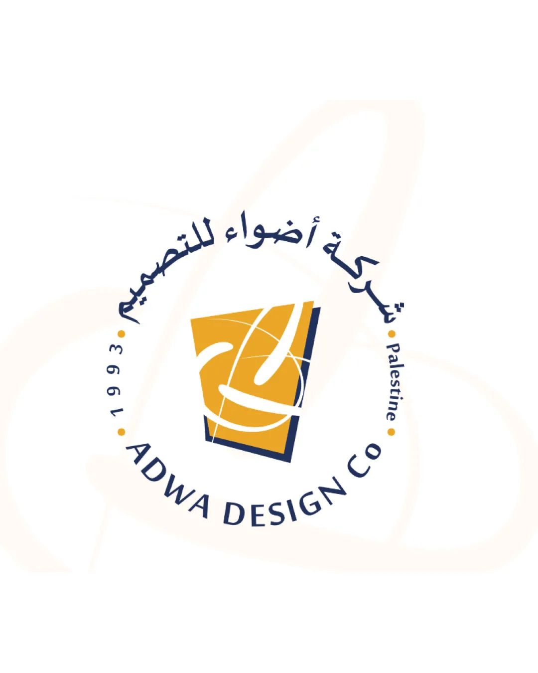
Adwa Design Co, Palestine, 1993
Distinctive, well-balanced, and professional; with minor improvements, it will fully support a premium, modern brand.
Objective AI feedback. Your creative decision.
What to fix first
The most important fixes to handle before polishing the full presentation.
Refine the scale and thickness of abstract lines and curved text for smaller applications.
High priorityLegibility and clarity may suffer at reduced sizes, affecting professional appearance.
Impact: Ensures Clear Reproduction On Business Cards, Stationery, And Promotional Items. · Effort: Medium
Harmonize mark and wordmark energy/style, possibly by adjusting color contrast or softening wordmark curves.
Medium priorityReduces minor style mismatch and further elevates the logo for upscale contexts.
Impact: Improves Visual Cohesion Across Logo Uses And Reinforces Premium Feel. · Effort: Medium
Logo performance breakdown
Legibility
English name and supporting details are very readable
Arabic text is clearly rendered
Curved arrangement of Arabic text may slightly affect immediate readability
Originality
Stylized abstract mark provides a unique signature
Arabic-English duality is distinctive
Abstract form could be generic without additional brand context
Color harmony
Yellow and dark blue provide strong contrast and modern appeal
Might benefit from a more premium accent or secondary shade
Yellow
#FBB829
Dark Blue
#222F47
White
#FFFFFF
Your palette is close. Refine the color roles and combinations before updating the logo.
Build brand colorsBalance alignment
Circular lockup is visually balanced
Wordmark and mark work well together
Slight heaviness on the bottom due to English text and dark shapes
Scalability
Main logo form is compact and maintains identity at moderate sizes
Abstract mark may lose some detail at very small scales
Curved text and thin marks could become less legible
200x250 px
100×125 px
50×62 px
Misinterpretations
No negative secondary readings observed
Logo structure & brief match
Mark and wordmark are integrated within the circular format
Slight mismatch in energy between playful mark and formal wordmarks
Modern: Upholds a clean, contemporary image with balanced composition.
Elegant: Formal typography and harmonious color pairing convey professionalism.
Premium: Mark and supporting words suggest established expertise, but could be further elevated with refinements.
Minimal: Main mark stays minimal, though curve text and elements introduce some visual complexity.
Versatile Professional Applications: Strong for print and signage, but should test legibility at small sizes and on branded items.
Wondering how your logo performs?
Get a clear logo score, key risks, and priority fix ideas before your client or audience sees it.