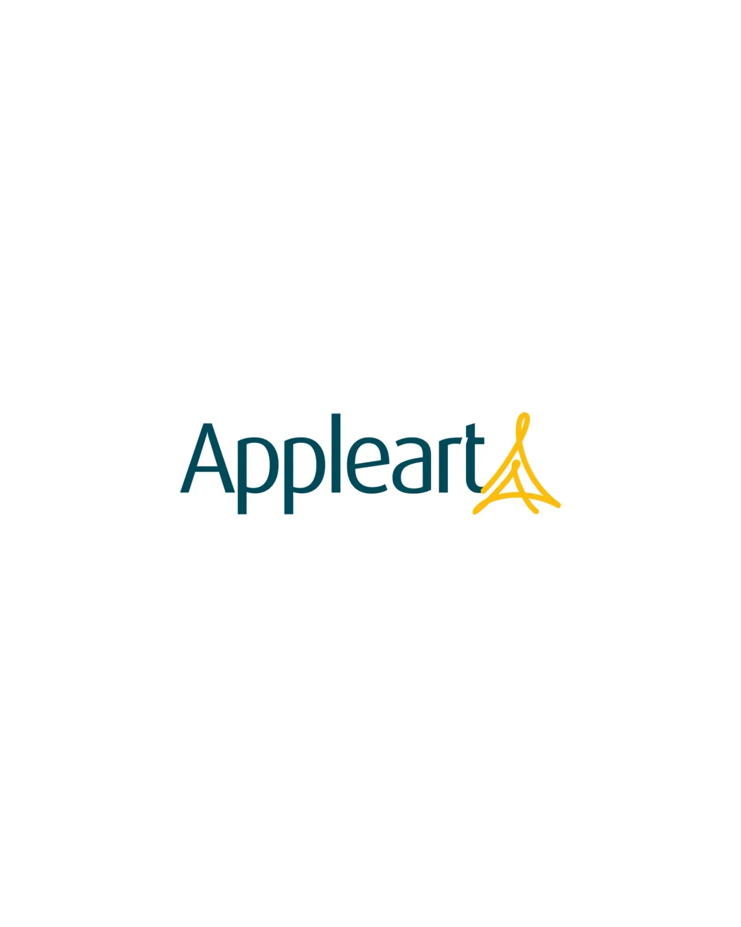
Appleart logo review
4/5
Logo score
Logo review of

Appleart

A strong, visually appealing identity that clearly signals creativity but could refine its symbol’s integration and scalability.

Combination Modern Minimal Branding/design Agency
5/5
Legibility
4/5
Originality
5/5
Misread
4/5
Balance
3/5
Scale
Your next steps

What to fix first

Focus on the changes that matter. Keep what makes the logo work.

1

Standalone mark

Test legibility and clarity of the symbol at various scales, especially in small formats.

Worth testing High priority Low effort
Area to inspectApproximate location

The yellow line symbol includes thin strokes and open forms that may become unclear or lose definition at small sizes.

How to check

Print or render at reduced size and inspect for stroke clarity.

See the category review
2

junction between 't' and mark

Refine the connection or spacing between the 't' and the symbol for a smoother integration.

Optional refinement Medium priority Low effort
Area to inspectApproximate location

The transition between the 't' and the abstract 'A' mark feels abrupt, which may weaken cohesion and flow between the wordmark and symbol.

How to check

Assess visual flow and relationship between the text and mark.

See the category review
Detailed review

Logo performance breakdown

4/5

Brief & logo match

Based on your brief
Compared with

We help ambitious organisations shape stronger brands, digital experiences and physical environments — from strategy and design to production and delivery.

Expresses creative expertise and brand-building ambition with a contemporary look, though symbol uniqueness and practical adjustment are areas for improvement.

  • Branding/agency Context

    The creative and art-inspired 'A' mark matches the agency’s focus on shaping brands and experiences.

  • Professional Ambition

    Clean, modern typography and unique color pairing support the aim of working with ambitious organizations.

5/5

Legibility

  • Clear, modern typeface with excellent readability.
4/5

Originality

  • Distinctive hand-drawn feel to the mark.
  • While expressive, the mark’s resemblance to an easel, 'A', or abstract art tool may not be immediately unique for a creative agency; further refinement could reinforce distinctiveness.

    Optional refinement Standalone mark

    Try: Explore subtle adjustments to enhance the mark’s original identity.

    Check: Compare with marks from direct competitors to ensure standout silhouette.

5/5

Color harmony

  • Strong contrast and pleasing color pairing.
Blue#15565B
Yellow#F4C441

Estimated colors. Use the original design file for exact values.

Create a full color palette using these colors

Create new palette
4/5

Balance alignment

  • Good vertical alignment and optical balance.
Uploaded logoAlignment guide overlay

Inspect spacing with the guide. Optical balance may differ from geometric centering.

3/5

Scalability

  • Simple color palette.
  • Strong wordmark construction.
  • The yellow line symbol includes thin strokes and open forms that may become unclear or lose definition at small sizes.

    Worth testing Standalone mark

    Try: Test legibility and clarity of the symbol at various scales, especially in small formats.

    Check: Print or render at reduced size and inspect for stroke clarity.

    Area to inspectApproximate location
Uploaded logo at 200 pixels wide
200 × 250 px
Uploaded logo at 100 pixels wide
100 × 125 px
Uploaded logo at 50 pixels wide
50 × 63 px

Compare the detail at different sizes. Labels show the full image dimensions.

5/5

Misinterpretations

  • No unintended readings or risks detected.
3/5

Symbol & text fit

  • Intentional integration with text; conceptually tied.
  • The transition between the 't' and the abstract 'A' mark feels abrupt, which may weaken cohesion and flow between the wordmark and symbol.

    Optional refinement junction between 't' and mark

    Try: Refine the connection or spacing between the 't' and the symbol for a smoother integration.

    Check: Assess visual flow and relationship between the text and mark.

    Area to inspectApproximate location

Black & white

Does the shape still work without color?

These tests are available only for logos uploaded in vector (SVG) format.

Background contrast

Find the surfaces where your logo stays clear.

These tests are available only for logos uploaded in vector (SVG) format.

Blur & silhouette

A 3px blur softens fine details so you can check whether the overall shape stays recognizable. If key gaps close or elements merge, the logo may rely too heavily on detail.

These tests are available only for logos uploaded in vector (SVG) format.

Try your own review

Wondering how your logo performs?

Get a clear logo score, key risks, and priority fix ideas before your client or audience sees it.

Review my logo