Arabic script logo review
4.0 / 5
Logo score

Logo review ofArabic Script

Review the detailed scores below to see what is working and what should be refined first.

Combination Mark Modern, Geometric, Minimalistic Education
3/5
Legibility
4/5
Originality
5/5
Misread
4/5
Balance
3/5
Scale
Review next
Detailed review

Logo performance breakdown

3/5

Legibility

Checkmark icon Arabic script is bold and distinct.
Checkmark icon Text color contrasts well with the background.

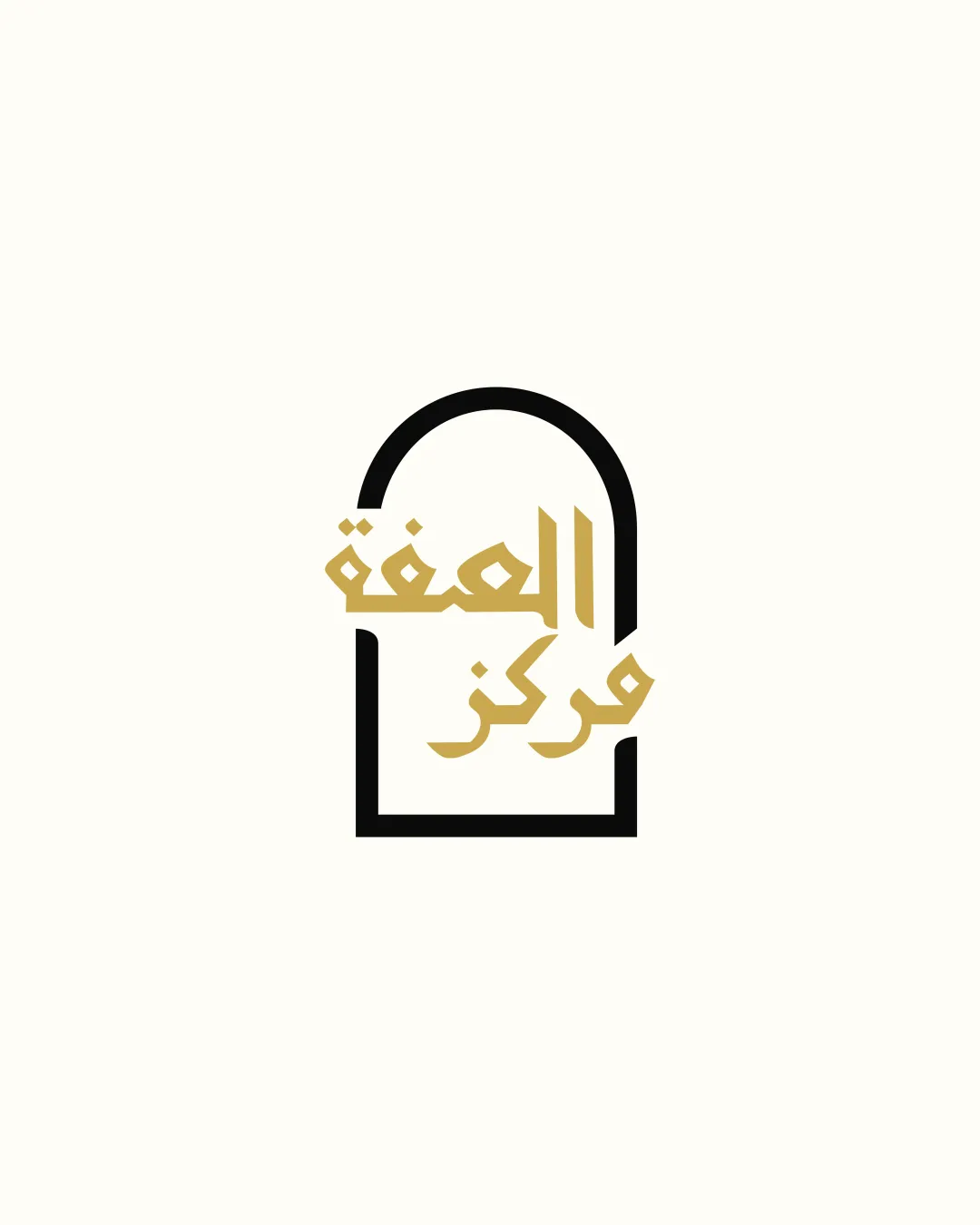
Warning icon Script overlays the symbol, causing partial obstruction and moderate legibility issues.
Warning icon Tight spacing decreases clarity, especially at smaller sizes.
4/5

Originality

Checkmark icon The fusion of Arabic script with a keyhole/doorway outline is culturally meaningful and creative.
Checkmark icon Abstract interpretation elevates uniqueness.

Warning icon Keyhole/doorway forms are somewhat common; further refinement could increase distinctiveness.

5/5

Color harmony

Checkmark icon Effective use of two colors for contrast and focus.
Checkmark icon Color pairing feels warm yet professional.

Teak
#B7996E

Karaka
#1E1302

Alabaster
#FAF9F6

4/5

Balance alignment

Checkmark icon Central alignment between symbol and text feels considered.
Checkmark icon Overall vertical symmetry is pleasing.

Warning icon Text placement within the shape pushes visual weight downward, making the top feel emptier.
Warning icon Gap inconsistency between the left and right sides of the logo frame due to text overlap.

logo 200x250 pixels scalability test alignment grid overlay
3/5

Scalability

Checkmark icon Simple color palette enhances reproduction versatility.
Checkmark icon Bold lines in the symbol increase clarity on medium/large applications such as brochures or signage.

Warning icon Interlocking text and symbol will be challenging to render at very small sizes (e.g., business cards, app icons).
Warning icon Overlapping elements are hard to embroider or engrave cleanly.

logo 200x250 pixels scalability test

200x250 px

logo 100x125 pixels scalability test

100×125 px

logo 50x62 pixels scalability test

50×62 px

5/5

Misinterpretations

Checkmark icon No negative or inappropriate connotations detected.
Checkmark icon Composition is culturally sensitive and abstract without suggestive forms.

4 / 5

Symbol & text fit

Checkmark icon Typography integrates harmoniously with the geometric frame.
Checkmark icon The color palette is consistently applied across both elements.

Warning icon Overlay causes moderate visual tension, reducing crisp separation between mark and text.

Try your own review

Wondering how your logo performs?

Get a clear logo score, key risks, and priority fix ideas before your client or audience sees it.

Review my logo




