1
Category Fit
Moderate fitWorks for fashion basics but lacks cultural or stylistic differentiation.
Risk of being confused with template or fast-fashion brands.
Serviceable as a placeholder, but weak on brand differentiation and cultural resonance for launch.
The most important fixes to handle before polishing the full presentation.
Current design is highly generic, missing opportunities to reflect brand story.
Impact: High · Effort: Medium
Text is likely to disappear at smaller sizes, affecting usability across digital and print platforms.
Impact: Medium · Effort: Low
Tighter leading and cramped layout may reduce perceived quality and clarity, especially on merch.
Impact: Medium · Effort: Low
![]() Primary ARI text is highly legible with strong contrast.
Primary ARI text is highly legible with strong contrast.
![]() Small supporting text like EST. 2026 and slogan may be hard to read at small sizes or low resolution.
Small supporting text like EST. 2026 and slogan may be hard to read at small sizes or low resolution.
![]() Confident use of a pure wordmark feels strong.
Confident use of a pure wordmark feels strong.
![]() Extremely generic execution; lacks unique visual element, symbol, or Armenian heritage reference.
Extremely generic execution; lacks unique visual element, symbol, or Armenian heritage reference.
![]() Simple monochrome palette works for fashion branding.
Simple monochrome palette works for fashion branding.
![]() Very neutral, may not stand out or reflect Armenian heritage or emotional cues beyond minimalism.
Very neutral, may not stand out or reflect Armenian heritage or emotional cues beyond minimalism.
Black
#000000
Alabaster
#F3EFE6
Your palette is close. Explore sharper color combinations with Colorfly.design before updating the logo.
Explore palettes![]() Central alignment and symmetrical proportions across the circle.
Central alignment and symmetrical proportions across the circle.
![]() Large ARI may feel vertically cramped, with tight spacing between the main wordmark and slogan, reducing breathing room.
Large ARI may feel vertically cramped, with tight spacing between the main wordmark and slogan, reducing breathing room.

![]() Bold typeface for ARI maintains form at small sizes.
Bold typeface for ARI maintains form at small sizes.
![]() Thin lines in supporting text and the fine circle border risk fading or blurring when scaled down; may need alternate lockup for small uses.
Thin lines in supporting text and the fine circle border risk fading or blurring when scaled down; may need alternate lockup for small uses.
200x250 px
100×125 px
50×62 px
![]() No obvious misinterpretations or inappropriate visual readings present.
No obvious misinterpretations or inappropriate visual readings present.
![]() Armenian Heritage And History: Logo does not visually reference Armenian motifs, symbols, or cultural cues; generic bold wordmark misses opportunity for heritage storytelling.
Armenian Heritage And History: Logo does not visually reference Armenian motifs, symbols, or cultural cues; generic bold wordmark misses opportunity for heritage storytelling.
![]() Clothing (fashion) Industry: Minimalist wordmark fits modern apparel branding but could benefit from added character to enhance memorability and premium appeal.
Clothing (fashion) Industry: Minimalist wordmark fits modern apparel branding but could benefit from added character to enhance memorability and premium appeal.
Lacks distinctiveness in fashion sector.
Logo is serviceable but generic; does not differentiate or embody Armenian heritage, resulting in weak category positioning and market recall.
Works for fashion basics but lacks cultural or stylistic differentiation.
Risk of being confused with template or fast-fashion brands.
High; lacks specific visual cues unique to Armenian theme or historical roots.
Could be mistaken for unrelated brands using bold wordmarks.
Projecting modern, minimal ethos but not premium or story-rich fashion.
Misses out on heritage-driven storytelling and emotional connection.
Where the logo is ready to use, where it needs adjustment, and where it may break in real applications.
Large ARI text displays well.
Only the ARI letters or a simplified mark should be used for clarity.
Strict monochrome ensures adaptability to one-color print processes.
Small text below ARI will be illegible at avatar sizes.
Bold primary text supports large format use.
A practical checklist of the logo versions to prepare before sending the final files to a client or team.
Required for general use.
Crucial for dark backgrounds and print flexibility.
Essential for flats, embroidery, and low-cost print.
Improves clarity for avatars, favicon, and tags.
Extends brand system and cultural richness.
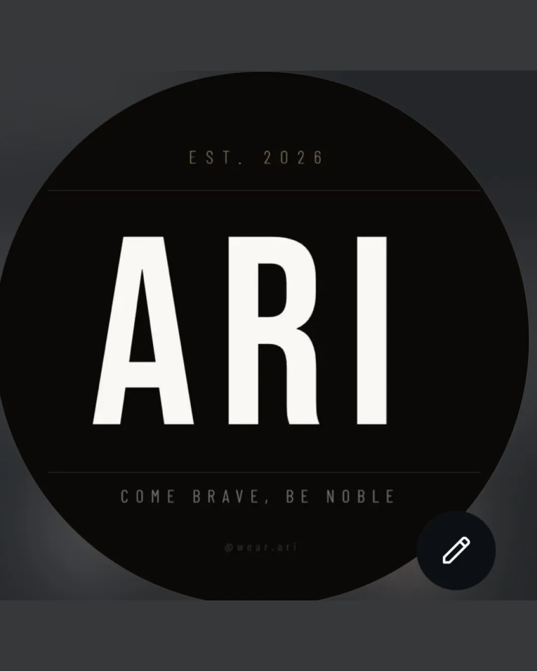
A strong, all-caps 'ARI' wordmark is centered within a solid black circular field, flanked above by 'EST. 2026' and below by a slogan in minimalist sans-serif.
The main 'ARI' text uses bold, tall letterforms for confident, modern appeal.
A monochrome palette of black and off-white supports versatility and timelessness, but lacks heritage reference.
A bold, minimal wordmark establishes a confident, modern foundation for the brand.
High-contrast sans-serif typography ensures immediate recognition and bold fashion presence.
Monochrome palette keeps the design versatile and apparel-friendly across diverse media.
Get a clear logo score, key risks, and priority fix ideas before your client or audience sees it.


