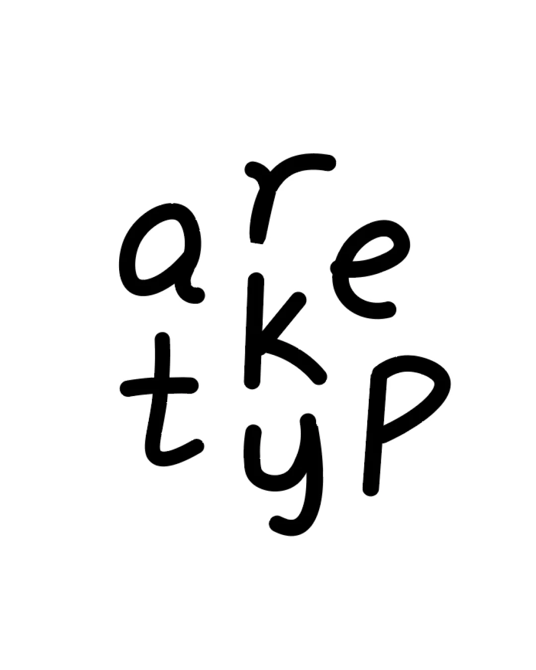
arketyp logo review
3/5
Logo score
Logo review of

Arketyp

Creative and visually engaging, but risks confusion about the brand name; should be tested and possibly clarified.

Wordmark Handwritten, Playful, Monoline Interior Design
2/5
Legibility
4/5
Originality
4/5
Misread
3/5
Balance
3/5
Scale
Your next steps

What to fix first

Focus on the changes that matter. Keep what makes the logo work.

1

entire wordmark

Test comprehension with potential clients to see if they recognize 'arketype' without prompting.

Visible issue High priority Medium effort
Area to inspectApproximate location

The clustered arrangement and the omission of the final 'e' in 'arketype' make the brand name ambiguous at a glance.

How to check

Show the logo in isolation and ask users to write down the brand name they see.

See the category review
2

entire wordmark

Mock up the logo at reduced scales for web/social icons to confirm stroke consistency and legibility.

Worth testing Medium priority Low effort
Area to inspectApproximate location

Thin, hand-drawn lines may lose clarity or appear uneven at very small sizes.

How to check

Create favicon and social avatar versions; assess stroke visibility at 16px-32px height.

See the category review
Detailed review

Logo performance breakdown

4/5

Brief & logo match

Based on your brief
Compared with

Interior design firm seeking a warm, enduring, simple wordmark with a conceptual letter twist.

The logo warmly interprets a simple logotype with a clever twist, but loses some immediate clarity due to the conceptual 'e' treatment.

  • Warmth And Personality

    The handwritten style gives a welcoming, human touch.

  • Enduring Simplicity

    Monoline strokes and basic letter forms keep the logo visually simple, though the arrangement complicates fast legibility.

2/5

Legibility

  • Distinct, hand-drawn character style gives warmth.
  • The clustered arrangement and the omission of the final 'e' in 'arketype' make the brand name ambiguous at a glance.

    Visible issue entire wordmark

    Try: Test comprehension with potential clients to see if they recognize 'arketype' without prompting.

    Check: Show the logo in isolation and ask users to write down the brand name they see.

    Area to inspectApproximate location
4/5

Originality

  • Unique clustered arrangement and playful construction.
3/5

Balance alignment

  • Playful, intentionally irregular arrangement fits brief.
Uploaded logoAlignment guide overlay

Inspect spacing with the guide. Optical balance may differ from geometric centering.

3/5

Scalability

  • Simple strokes are easy to reproduce.
  • Thin, hand-drawn lines may lose clarity or appear uneven at very small sizes.

    Worth testing entire wordmark

    Try: Mock up the logo at reduced scales for web/social icons to confirm stroke consistency and legibility.

    Check: Create favicon and social avatar versions; assess stroke visibility at 16px-32px height.

    Area to inspectApproximate location
Uploaded logo at 200 pixels wide
200 × 250 px
Uploaded logo at 100 pixels wide
100 × 125 px
Uploaded logo at 50 pixels wide
50 × 63 px

Compare the detail at different sizes. Labels show the full image dimensions.

4/5

Misinterpretations

  • No apparent negative secondary meaning.

Black & white

Does the shape still work without color?

These tests are available only for logos uploaded in vector (SVG) format.

Background contrast

Find the surfaces where your logo stays clear.

These tests are available only for logos uploaded in vector (SVG) format.

Blur & silhouette

A 3px blur softens fine details so you can check whether the overall shape stays recognizable. If key gaps close or elements merge, the logo may rely too heavily on detail.

These tests are available only for logos uploaded in vector (SVG) format.

Try your own review

Wondering how your logo performs?

Get a clear logo score, key risks, and priority fix ideas before your client or audience sees it.

Review my logo