 View review
Logo score
Logo review ofArsonus, Every Story Deserves A Sound
Review the detailed scores below to see what is working and what should be refined first.
Legibility
Originality
Misread
Balance
Scale
Detailed review
Logo performance breakdown
Legibility
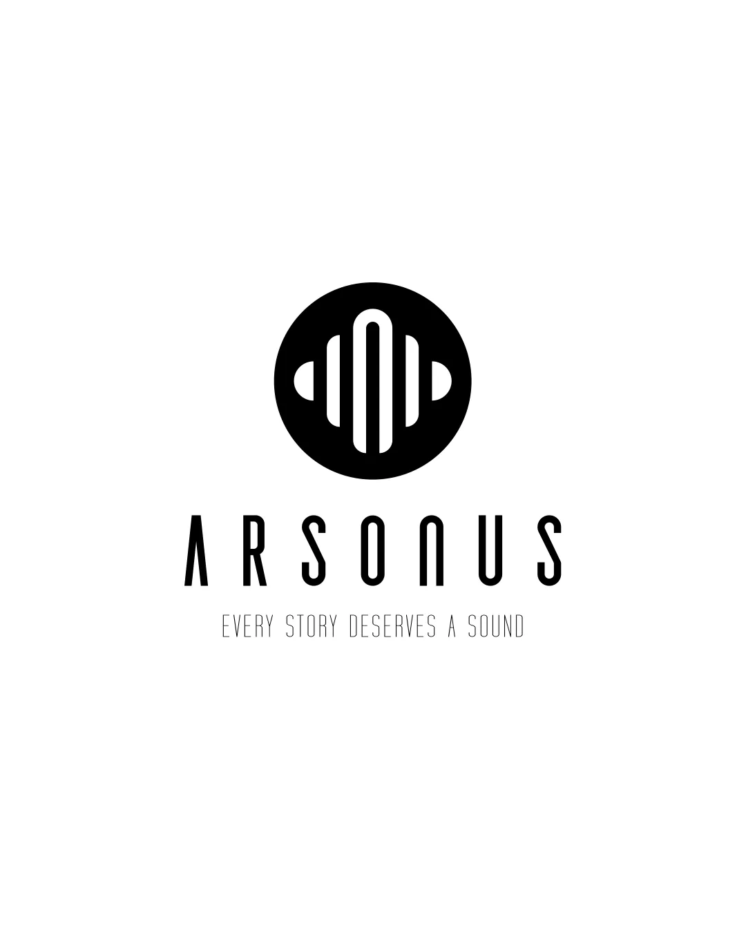
![]() The wordmark 'ARSONUS' is highly legible with good spacing.
The wordmark 'ARSONUS' is highly legible with good spacing.![]() Tagline is clean and readable at larger sizes.
Tagline is clean and readable at larger sizes.
Originality
![]() Abstract soundwave motif is somewhat distinctive for the industry.
Abstract soundwave motif is somewhat distinctive for the industry.![]() Modern typeface and symbol pairing is contemporary and avoids most clichés.
Modern typeface and symbol pairing is contemporary and avoids most clichés.
![]() Abstract soundwave in a circle is a fairly common approach for audio/tech brands—lacks truly unique twist.
Abstract soundwave in a circle is a fairly common approach for audio/tech brands—lacks truly unique twist.
Color harmony
![]() Classic black-and-white palette ensures versatility and timelessness.
Classic black-and-white palette ensures versatility and timelessness.![]() Strong contrast delivers optimal clarity on light backgrounds.
Strong contrast delivers optimal clarity on light backgrounds.
Black
#000000
White
#FFFFFF
Balance alignment
![]() Good centering and proportionality between logo mark, wordmark, and tagline.
Good centering and proportionality between logo mark, wordmark, and tagline.![]() Vertical alignment feels intentional and structured.
Vertical alignment feels intentional and structured.
![]() Minor visual weight disparity—logomark feels slightly heavier than the relatively light wordmark, which may affect harmony.
Minor visual weight disparity—logomark feels slightly heavier than the relatively light wordmark, which may affect harmony.

Scalability
![]() Logo is simple and works well at medium and large scales, such as website headers, merchandise, or signage.
Logo is simple and works well at medium and large scales, such as website headers, merchandise, or signage.![]() Mark remains identifiable even at small sizes due to bold elements.
Mark remains identifiable even at small sizes due to bold elements.
![]() Very fine tagline text may become illegible on small applications like business cards or favicons.
Very fine tagline text may become illegible on small applications like business cards or favicons.![]() Thin lines in the logomark could lose definition in embroidery or tiny applications.
Thin lines in the logomark could lose definition in embroidery or tiny applications.
200x250 px
100×125 px
50×62 px
Misinterpretations
![]() No inappropriate shapes or accidental symbolisms detected.
No inappropriate shapes or accidental symbolisms detected.
Symbol & text fit
![]() Both logomark and wordmark use geometric/rounded features for visual consistency.
Both logomark and wordmark use geometric/rounded features for visual consistency.
![]() Logomark's opacity and boldness slightly outweigh the thin wordmark; adjusting thickness could improve match.
Logomark's opacity and boldness slightly outweigh the thin wordmark; adjusting thickness could improve match.
Try your own review
Review my logo
Wondering how your logo performs?
Get a clear logo score, key risks, and priority fix ideas before your client or audience sees it.
Keep exploring


