ART VERSE logo logo review
3.3/5
Logo score Wordmark with box accent category

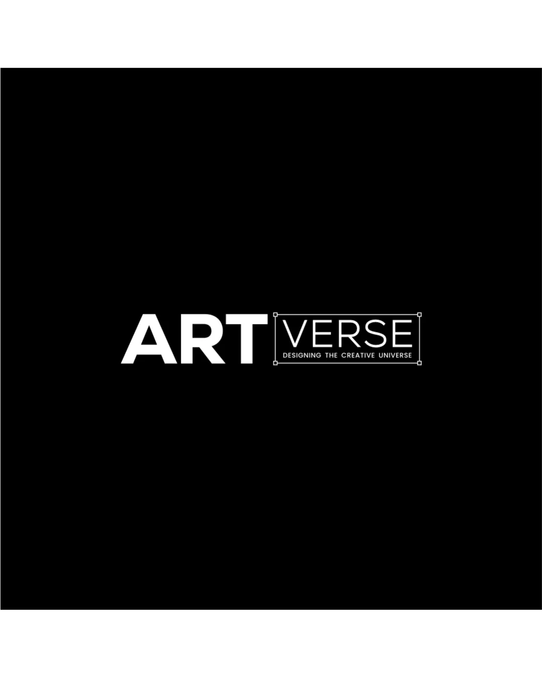
ART VERSE logo

creative523362 Essential logo review

The logo is functional and clear, aligned with luxury minimalism, but needs rebalancing between its parts for a more cohesive high-end impact.

This logo lockup has a workable foundation; improving distinctiveness is the clearest next step.

Wordmark With Box Accent Minimalist Graphic Design / Creative Studio
4/5
Legibility
3/5
Originality
3/5
Balance
3/5
Scale
3/5
Style consistency
Your next steps

What to fix first

Focus on the changes that matter. Keep what makes the logo work.

Concept & direction

The wordmark divides 'ART' and 'VERSE' with a minimalist, boxed treatment, projecting clarity and sophistication for a graphic design studio.

Spelling & grammar

No obvious issue found

All text handles capitalization and spacing clearly; tagline is fully readable.

1

lockup

Refine the weight or spatial relationship between 'ART' and 'VERSE' to achieve a more unified premium appearance.

High priority Visible issue Low effort

The heavier 'ART' contrasts with the lighter, boxed 'VERSE', creating slight visual imbalance.

See the category review
Detailed review

Logo performance breakdown

4/5

Brief & logo match

The minimalist, high-contrast type reflects the brief's luxury and simplicity but needs fine-tuning in hierarchy to fully convey premium visual cohesion.

5/5

Misinterpretations

  • No unintended negative shapes or readings present.
4/5

Legibility

Wordmark 4/5 · Layout 4/5

  • Main brand name 'ART VERSE' is highly legible in current size.
3/5

Originality

This review includes a score but no supporting explanation for this category.

3/5

Balance alignment

Wordmark 3/5 · Layout 3/5

  • The heavier 'ART' contrasts with the lighter, boxed 'VERSE', creating slight visual imbalance.

    Visible issue lockup

    Try: Refine the weight or spatial relationship between 'ART' and 'VERSE' to achieve a more unified premium appearance.

Uploaded logoAlignment guide overlay

Inspect spacing with the guide. Optical balance may differ from geometric centering.

3/5

Scalability

Wordmark 3/5 · Layout 3/5

  • Wordmark and box approach is generally scalable.
  • The tagline 'DESIGNING THE CREATIVE UNIVERSE' is quite small and may be illegible at reduced sizes.

    Worth testing tagline
3/5

Style consistency

This review includes a score but no supporting explanation for this category.

Try your own review

Wondering how your logo performs?

Get a clear logo score, key risks, and priority fix ideas before your client or audience sees it.

Review my logo