 View review
Logo score
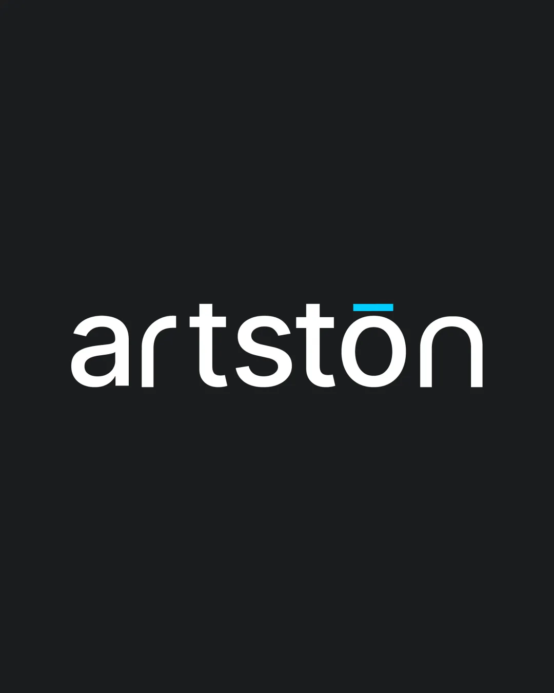
Logo review ofArtstōn
Review the detailed scores below to see what is working and what should be refined first.
Legibility
Originality
Misread
Balance
Scale
Detailed review
Logo performance breakdown
Legibility
![]() All characters are highly readable and clear.
All characters are highly readable and clear.![]() Ample spacing ensures no crowding between letters.
Ample spacing ensures no crowding between letters.
Originality
![]() The macron (ū) in the 'o' creates a subtle but distinct character accent.
The macron (ū) in the 'o' creates a subtle but distinct character accent.![]() Modern, clean style avoids generic clichés.
Modern, clean style avoids generic clichés.
![]() The wordmark concept and font choice are not exceedingly unique in the industry.
The wordmark concept and font choice are not exceedingly unique in the industry.![]() The only distinctive element is the macron above the 'o', which is subtle.
The only distinctive element is the macron above the 'o', which is subtle.
Color harmony
![]() Color scheme uses only two primary colors plus white for the wordmark and accent, achieving strong visual harmony.
Color scheme uses only two primary colors plus white for the wordmark and accent, achieving strong visual harmony.![]() Accent color is used sparingly for emphasis, which is effective.
Accent color is used sparingly for emphasis, which is effective.
White
#FFFFFF
Ebony
#202020
Vivid Sky Blue
#00C3FF
Balance alignment
![]() Text alignment is precise and even across the baseline.
Text alignment is precise and even across the baseline.![]() Symmetrical spacing and glyph consistency provide visual stability.
Symmetrical spacing and glyph consistency provide visual stability.

Scalability
![]() Bold sans-serif typography retains clarity at small sizes.
Bold sans-serif typography retains clarity at small sizes.![]() Suitable for a variety of applications such as business cards, signage, and digital platforms.
Suitable for a variety of applications such as business cards, signage, and digital platforms.![]() Flat design and single weight make it embroidery-friendly and screen-print compatible.
Flat design and single weight make it embroidery-friendly and screen-print compatible.
200x250 px
100×125 px
50×62 px
Misinterpretations
![]() No inappropriate shapes or accidental imagery detected.
No inappropriate shapes or accidental imagery detected.![]() No confusing or misleading elements present.
No confusing or misleading elements present.
Try your own review
Review my logo
Wondering how your logo performs?
Get a clear logo score, key risks, and priority fix ideas before your client or audience sees it.
Keep exploring


