What to preserve
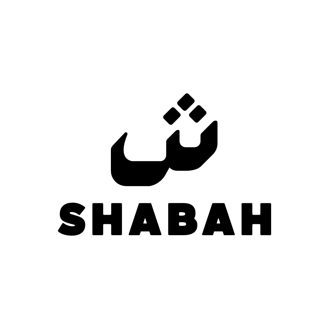
A geometric, stylized approach integrates the 'A' motif across the wordmark to emphasize identity and creativity.
Distinctive, creative execution with a compelling visual motif, but the outsized initial symbol creates a noticeable imbalance that distracts from professional unity.
This wordmark shows solid execution, supported by distinctive construction and text readability; improving visual balance is the clearest next step.
Focus on the changes that matter. Keep what makes the logo work.
A geometric, stylized approach integrates the 'A' motif across the wordmark to emphasize identity and creativity.
Logo preview unavailable. The written feedback is still available on this card.
wordmark left edge
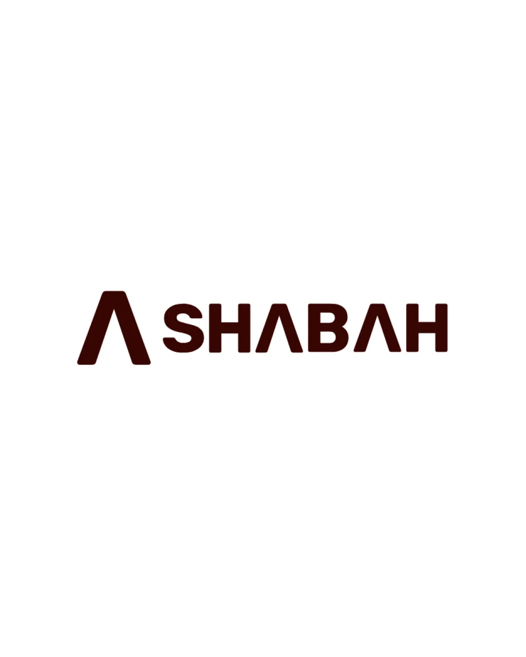
Oversized initial 'A' symbol compared to the rest of the wordmark creates a sense of imbalance in horizontal weight distribution.
See the category reviewThe inventive geometric letterforms and bold presence suit a creative designer and visual director, though visual balance requires refinement for optimal brand impression.
Multiple uses of the stylized 'A' motif add unique character, but similarity in all 'A's and the symbol makes the approach slightly repetitive.
Oversized initial 'A' symbol compared to the rest of the wordmark creates a sense of imbalance in horizontal weight distribution.
Try: Adjust the initial symbol's scale or spacing to better balance with the rest of the wordmark.
Logo preview unavailable. The written feedback is still available on this card.

Inspect spacing with the guide. Optical balance may differ from geometric centering.
Does the shape still work without color?
Find the surfaces where your logo stays clear.
Compare the mark and lettering on each surface.
Shows the lower-contrast areas of the logo (5th percentile). Tiny details may have lower contrast. Good ≥ 4.5:1 · Medium ≥ 3:1 · Bad < 3:1. A visual guide, not an accessibility rating.
A 3px blur softens fine details so you can check whether the overall shape stays recognizable. If key gaps close or elements merge, the logo may rely too heavily on detail.
Look for clear separation between shapes and a distinctive outline.
Get a clear logo score, key risks, and priority fix ideas before your client or audience sees it.
More credits needed
Add credits to continue without losing your work.
Then $7/month. Cancel anytime.
Essential logo review with AI
Estimated progress