What to preserve
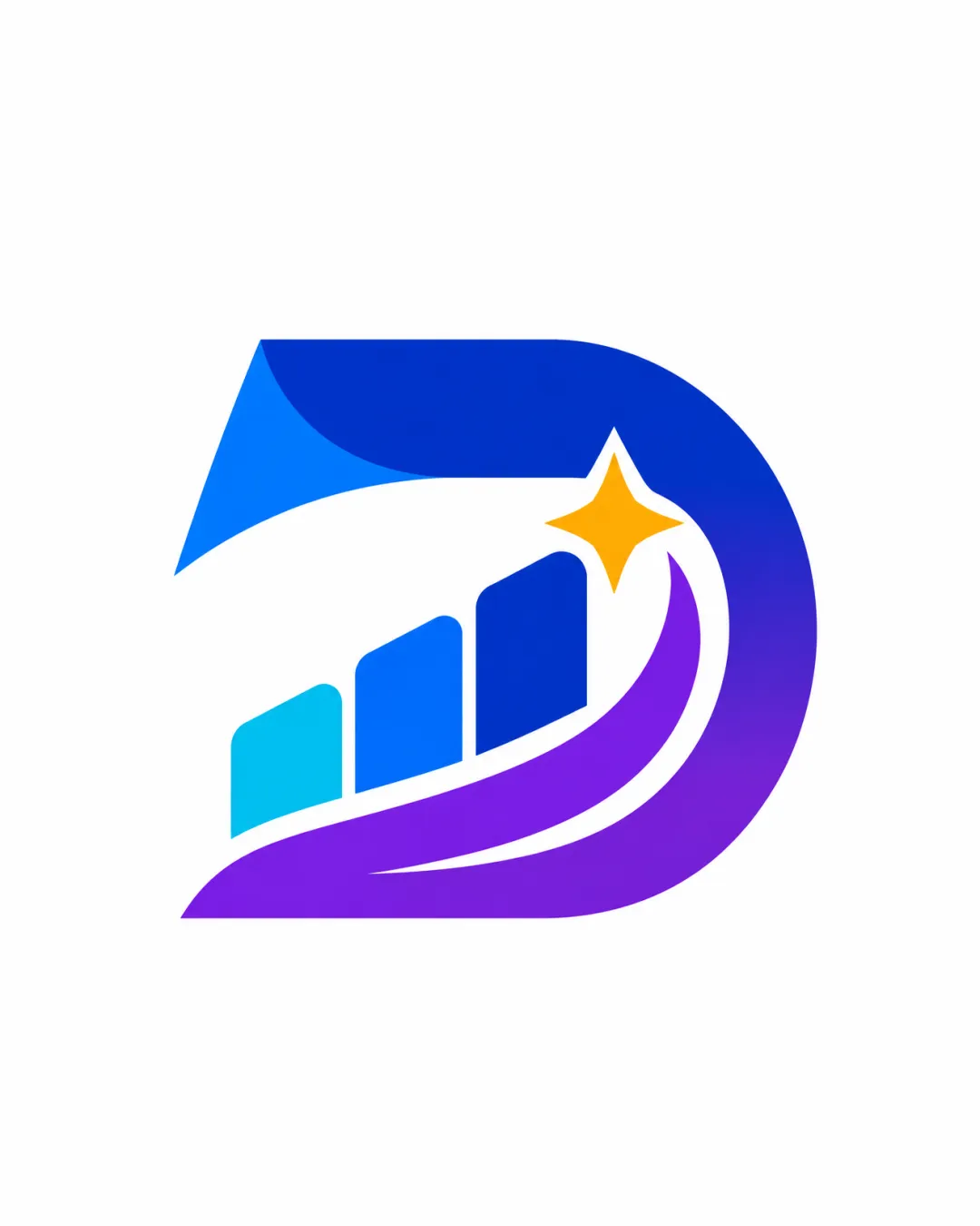
A stylized 'D' contains rising bars and a spark, visually representing innovation, growth, and transformation in a modern, scalable form for a tech R&D context.

Modern, memorable icon aligns strongly with innovation and transformation goals, with only minor considerations for small-scale clarity.
This logomark shows strong execution, supported by distinctive construction and visual balance.
Focus on the changes that matter. Keep what makes the logo work.
A stylized 'D' contains rising bars and a spark, visually representing innovation, growth, and transformation in a modern, scalable form for a tech R&D context.
Logo preview unavailable. The written feedback is still available on this card.
artwork
The yellow spark element is small relative to the icon and may become indistinct at smaller sizes.
See the category reviewDistinctive, gradient stylized 'D' icon embodies innovation, creativity, and transformation for an AI/software R&D team, with only minor challenges in small scale clarity.
Vivid blue, cyan, and purple gradients reinforce a futuristic feel and are accented by a gold spark, providing contrast and focus.
Estimated colors. Use the original design file for exact values.
Create a full color palette using these colors
Create new paletteThe icon is well-centered with smooth, even margins, and dynamic upward motion; no obvious imbalance is detected.

Inspect spacing with the guide. Optical balance may differ from geometric centering.
The yellow spark element is small relative to the icon and may become indistinct at smaller sizes.
Try: Test icon legibility at favicon and mobile-app sizes; thicken spark if needed.
Logo preview unavailable. The written feedback is still available on this card.
Get a clear logo score, key risks, and priority fix ideas before your client or audience sees it.
More credits needed
Add credits to continue without losing your work.
Then $7/month. Cancel anytime.
Essential logo review with AI
Estimated progress