What to preserve
A stylized 'W' icon and clean sans-serif wordmark communicate a modern, tech-savvy identity for a web-focused company.
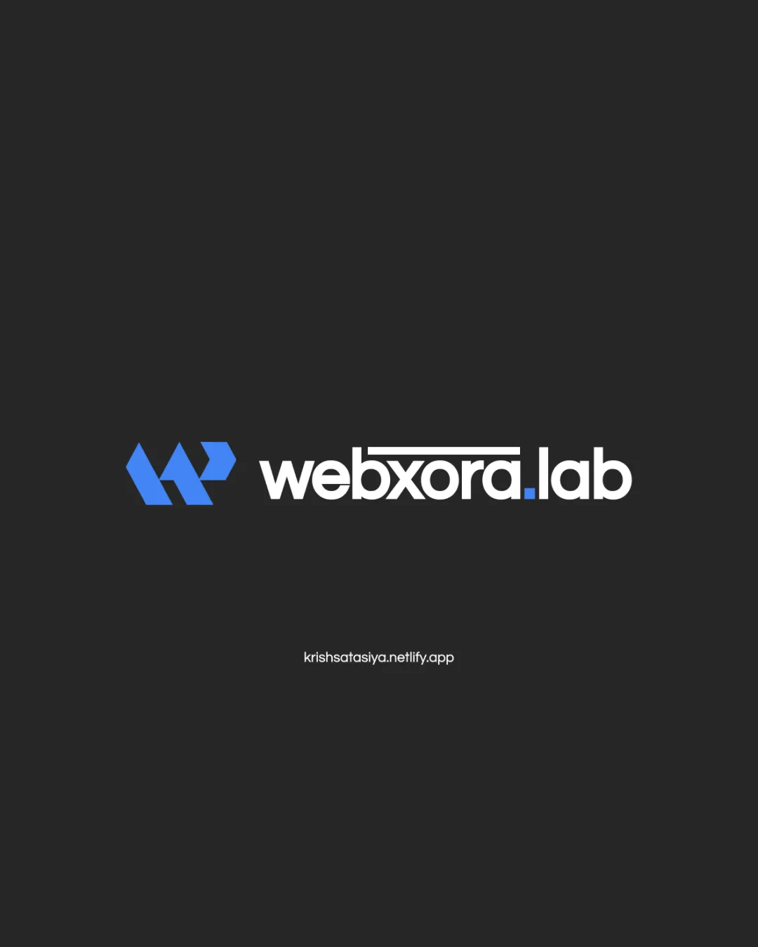
Modern, professional design with strong tech cues, but mark-to-wordmark harmony and tiny-scale clarity could be further optimized.
This logo lockup shows solid execution, supported by visual balance and distinctive construction; improving style consistency is the clearest next step.
Focus on the changes that matter. Keep what makes the logo work.
A stylized 'W' icon and clean sans-serif wordmark communicate a modern, tech-savvy identity for a web-focused company.
combination
The geometric mark uses bold angles and blue, while the wordmark is smooth, round, and in white with a touch of blue for color echo. The connection is based on proximity and shared blue, but the contrast between angular and round forms could be better unified visually.
Check if the visual dissonance is noticeable in practical use or mockups.
The abstract W-mark and contemporary wordmark fit well for a tech/web brand, capturing a digital-forward and distinctive essence with minor room for visual unity improvement.
Wordmark 4/5 · Layout 4/5
'xora' features a lined accent (likely representing digital/tech themes). The element is mostly clear, but at very small sizes, the lines could visually crowd the internal forms.
Symbol 4/5 · Wordmark 4/5
Symbol 4/5 · Wordmark 4/5
Estimated colors. Use the original design file for exact values.
Create a full color palette using these colors
Create new paletteSymbol 4/5 · Wordmark 4/5 · Layout 4/5

Inspect spacing with the guide. Optical balance may differ from geometric centering.
Symbol 4/5 · Wordmark 4/5 · Layout 4/5
The mark's negative space and fine angles appear relatively robust but may lose some clarity at favicon or very small sizes.
The geometric mark uses bold angles and blue, while the wordmark is smooth, round, and in white with a touch of blue for color echo. The connection is based on proximity and shared blue, but the contrast between angular and round forms could be better unified visually.
Try: Explore subtle harmonization between the mark and name, such as introducing shared angles or type tweaks.
Check: Check if the visual dissonance is noticeable in practical use or mockups.
Get a clear logo score, key risks, and priority fix ideas before your client or audience sees it.
More credits needed
Add credits to continue without losing your work.
Then $7/month. Cancel anytime.
Essential logo review with AI
Estimated progress