 View review
Logo score
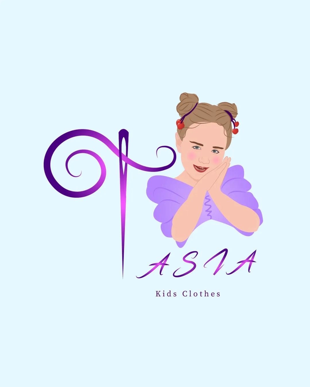
Logo review ofAsia
Review the detailed scores below to see what is working and what should be refined first.
Legibility
Originality
Misread
Balance
Scale
Detailed review
Logo performance breakdown
Legibility
 Text is readable with decorative elements. Contrasting colors help legibility.
 Script font style may be hard to read at smaller sizes.
Originality
Unique combination of illustration and text.
Color harmony
Colors are harmonious and appropriate for target audience.
Your palette is close. Explore sharper color combinations with Colorfly.design before updating the logo.
Explore palettesBalance alignment
Elements are roughly balanced in layout.
The illustration may overshadow the text, disrupting balance.

Scalability
Color contrast works well on larger formats.
Illustration detail may be lost at smaller sizes. Complexity reduces versatility for different formats.
200x250 px
100×125 px
50×62 px
Misinterpretations
Try your own review
Review my logo
Wondering how your logo performs?
Get a clear logo score, key risks, and priority fix ideas before your client or audience sees it.
Keep exploring