 View review
Logo score
Logo review of
Atalanta 1907
Review the detailed scores below to see what is working and what should be refined first.
Objective AI feedback. Your creative decision.
Legibility
Originality
Misread
Balance
Scale
Detailed review
Logo performance breakdown
Legibility
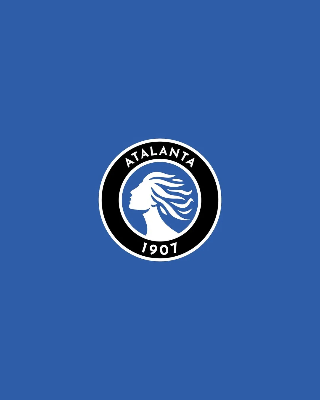
 The text 'ATALANTA 1907' is clear and easily readable. High contrast between the white text and black ring provides immediate clarity.
Originality
The flowing hair and female profile stand out among typical sports logo motifs, providing a unique historical/conceptual reference. Emblem approach is classic for sports but the specific execution with the profile and hair is distinctive.
 Circular badge and text arrangement are broadly common within this industry, reducing some originality.
Color harmony
Strong, limited palette delivers uniformity and high visual impact. Blue, white, and black offer great contrast and align with traditional sports branding aesthetics.
Blue
#3169AC
White
#FFFFFF
Black
#000000
Balance alignment
Excellent geometric alignment; the symbol is centered perfectly within the circular badge. Text is evenly spaced and curves cleanly along the top and bottom.

Scalability
Simple shapes and strong contours will translate well to large formats such as stadium signage or merchandise. Logo remains identifiable at smaller scales, e.g., digital avatars or sports apparel patches.
Intricate hair details may become less distinct or lost at very small sizes, such as embroidered patches or tiny web icons.
200x250 px
100×125 px
50×62 px
Misinterpretations
No inappropriate or misleading shapes present; woman's profile and hair are instantly recognizable and appropriate.
Symbol & text fit
Wordmark and logomark are integrated seamlessly within the badge.
Typography and iconography feel consistent and harmonious.
Try your own review
Review my logo
Wondering how your logo performs?
Get a clear logo score, key risks, and priority fix ideas before your client or audience sees it.
Keep exploring


