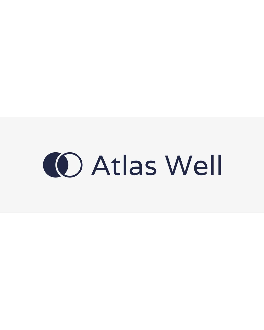
Atlas Well logo review
4.5 / 5
Logo score
Logo review of

Atlas Well

Review the detailed scores below to see what is working and what should be refined first.

Objective AI feedback. Your creative decision.

Combination Mark Minimalist, Modern Wellness
5/5
Legibility
3/5
Originality
5/5
Misread
5/5
Balance
4/5
Scale
Detailed review

Logo performance breakdown

5/5

Legibility

Checkmark icon Typography is clean and highly legible.
Checkmark icon Excellent contrast between text and background.
3/5

Originality

Checkmark icon Use of crescent overlap is mildly interesting visually.
Checkmark icon Minimalist approach is clean.

Warning icon Overlapping circles are a common, generic visual device and not highly distinctive.
Warning icon Symbol does not strongly reinforce unique brand attributes or deeply connect to the name Atlas Well without further context.

5/5

Color harmony

Checkmark icon Excellent use of a single, deep navy color for high-class and trustworthy tone.
Checkmark icon Contrast ensures maximum visibility and legibility.

Cinder
#232B42

White
#FFFFFF

5/5

Balance alignment

Checkmark icon Good proportion and spacing between symbol and wordmark.
Checkmark icon Horizontally balanced and visually pleasing composition.

logo 200x250 pixels scalability test alignment grid overlay
4/5

Scalability

Checkmark icon Simple icon and wordmark will scale well on business cards, letterheads, digital avatars.
Checkmark icon Minimal detail makes for good readability at small sizes and for embroidery applications.

Warning icon Thin stroke of outlined circle could become less visible at extremely small sizes or on textured backgrounds.

logo 200x250 pixels scalability test

200x250 px

logo 100x125 pixels scalability test

100×125 px

logo 50x62 pixels scalability test

50×62 px

5/5

Misinterpretations

Checkmark icon No inappropriate dual meanings or confusing imagery detected.

4 / 5

Symbol & text fit

Checkmark icon Both logomark and wordmark share a modern, minimal aesthetic.
Checkmark icon Styles are cohesive with similar line weights.

Warning icon Logomark, while visually compatible, does not reinforce or elaborate on meaning of the wordmark, missing a strong conceptual synergetic link.

Try your own review

Wondering how your logo performs?

Get a clear logo score, key risks, and priority fix ideas before your client or audience sees it.

Review my logo