AURA LANES logo logo review
3.6/5
Logo score Combination mark (symbol + wordmark + tagline) category

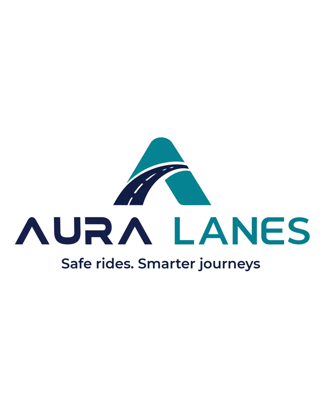
AURA LANES logo

creative179157 Essential logo review

A strong, clear transportation logo with harmonious symbolism and typography—distinctive execution of a familiar idea, but minor style refinement and distinctiveness validation are advised.

This logo lockup shows solid execution, supported by clarity at smaller sizes and text readability; improving distinctiveness is the clearest next step.

Combination Mark (symbol + Wordmark + Tagline) Geometric, Modern, Two-tone Transportation/mobility
4/5
Legibility
3/5
Originality
3.5/5
Balance
4.4/5
Scale
4/5
Color
4/5
Style consistency
Your next steps

What to fix first

Focus on the changes that matter. Keep what makes the logo work.

1

Standalone mark

Verify against leading transportation brands for distinctiveness.

Medium priority Worth testing Medium effort

The abstract 'A' with a road is a familiar transportation concept, though the execution is crisp and distinctive for this context. Potential risk of similarity with other transport or navigation logos.

How to check

Conduct a visual search for similar geometric 'A road' logos within the industry.
See the category review
Detailed review

Logo performance breakdown

4/5

Brief & logo match

Clearly expresses transportation and safety through the 'A' road mark and tagline, though the abstract approach is familiar in the field.

5/5

Misinterpretations

  • No evident risk of dual meanings or unintended associations.
4.4/5

Scalability

Symbol 5/5 · Wordmark 4/5 · Layout 4/5

  • Bold, simple forms and limited detail ensure clarity at various sizes.
4/5

Legibility

Wordmark 4/5 · Layout 4/5

  • Strong clarity in both mark and wordmark; tagline readable but could use more contrast.
4/5

Color harmony

Symbol 4/5 · Wordmark 4/5

  • Navy and teal provide professional, trustworthy contrast with good accessibility.
Navy#013A57
Teal#19A7B5

Estimated colors. Use the original design file for exact values.

Create a full color palette using these colors

Create new palette
4/5

Style consistency

  • Mark and name share geometric rigor and scale well together.
  • The mark-to-wordmark scale and the geometric style are harmonious, but the word 'AURA' is more stylized than 'LANES,' creating a mild style disconnect.

    Optional refinement combination arrangement
3.5/5

Balance alignment

Symbol 4/5 · Wordmark 3/5 · Layout 3/5

Available in Advanced logo reviews
3/5

Originality

Symbol 3/5 · Wordmark 3/5

Available in Advanced logo reviews
Try your own review

Wondering how your logo performs?

Get a clear logo score, key risks, and priority fix ideas before your client or audience sees it.

Review my logo