What to preserve
The logo creatively integrates a stylized bird into the letter 'A', conveying advancement and agility.
Spelling & grammar
No obvious issue foundNo spelling or text clarity errors detected.
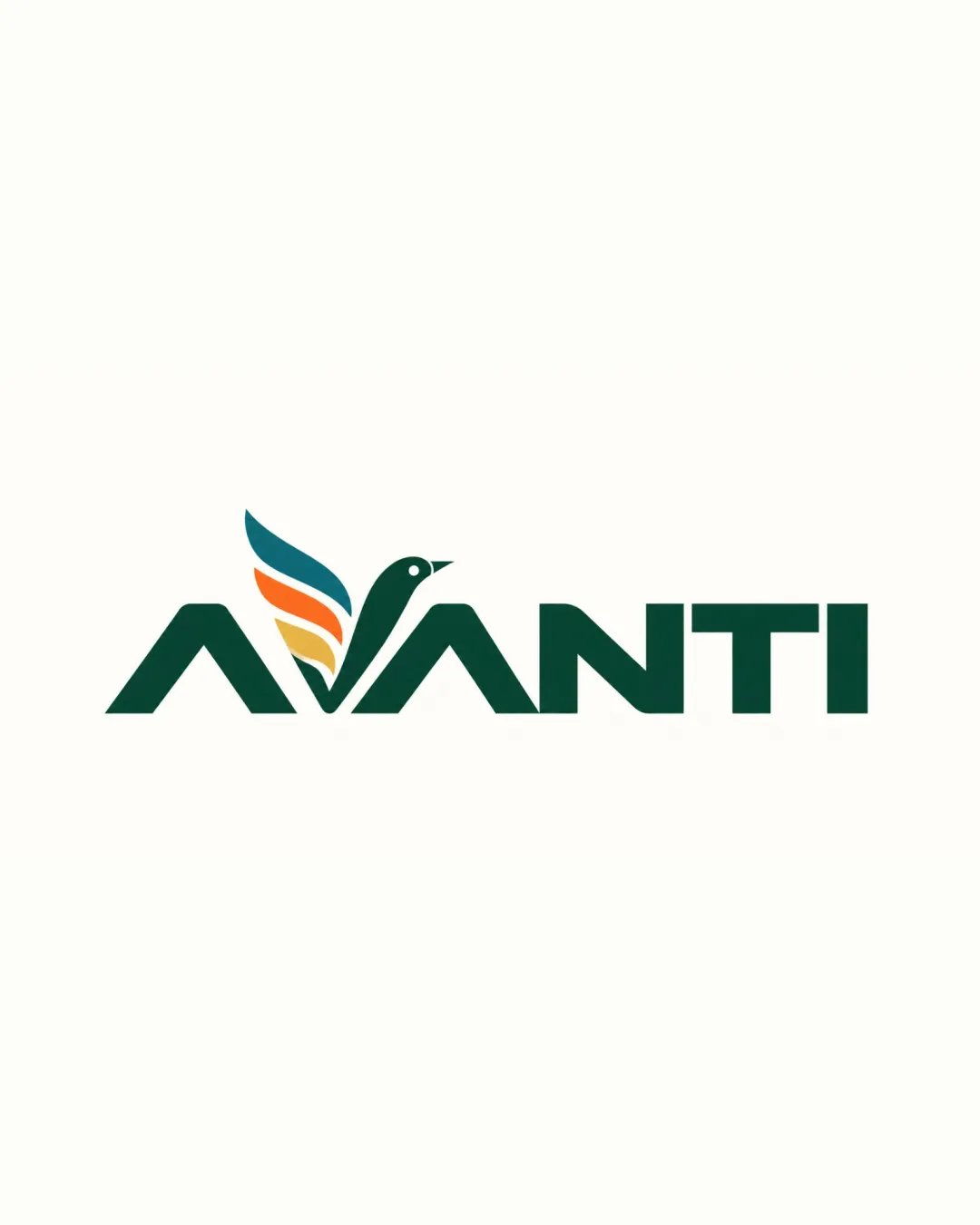
Inventive and professional combination mark with agency appeal, but would benefit from scalability testing and a hint more mark distinctiveness.
Focus on the changes that matter. Keep what makes the logo work.
The logo creatively integrates a stylized bird into the letter 'A', conveying advancement and agility.
No spelling or text clarity errors detected.
Logo preview unavailable. The written feedback is still available on this card.
Standalone mark (bird/feathers)
Multi-segment feather shapes with thin negative spaces may degrade at small sizes.
See the category reviewLogo preview unavailable. The written feedback is still available on this card.
Standalone mark/wordmark integration
Bird motif is well integrated but built from typical geometric feather shapes that carry some predictability.
Present refinements to a peer group to gauge recall and distinctiveness.
Logo expresses an agency identity with clarity and energy, though its bird motif feels somewhat familiar.
Multi-segment feather shapes with thin negative spaces may degrade at small sizes.
Try: Test mark at favicon and social avatar size for feature loss.
Logo preview unavailable. The written feedback is still available on this card.
Bird motif is well integrated but built from typical geometric feather shapes that carry some predictability.
Try: Explore subtle customizations to the feather or bird head to push distinctiveness.
Check: Present refinements to a peer group to gauge recall and distinctiveness.
Logo preview unavailable. The written feedback is still available on this card.
Estimated colors. Use the original design file for exact values.
Create a full color palette using these colors
Create new palette
Inspect spacing with the guide. Optical balance may differ from geometric centering.
Get a clear logo score, key risks, and priority fix ideas before your client or audience sees it.
More credits needed
Add credits to continue without losing your work.
Then $7/month. Cancel anytime.
Essential logo review
Usually takes under a minute