Avistra Leonhart logo review
3.9/5
Logo score

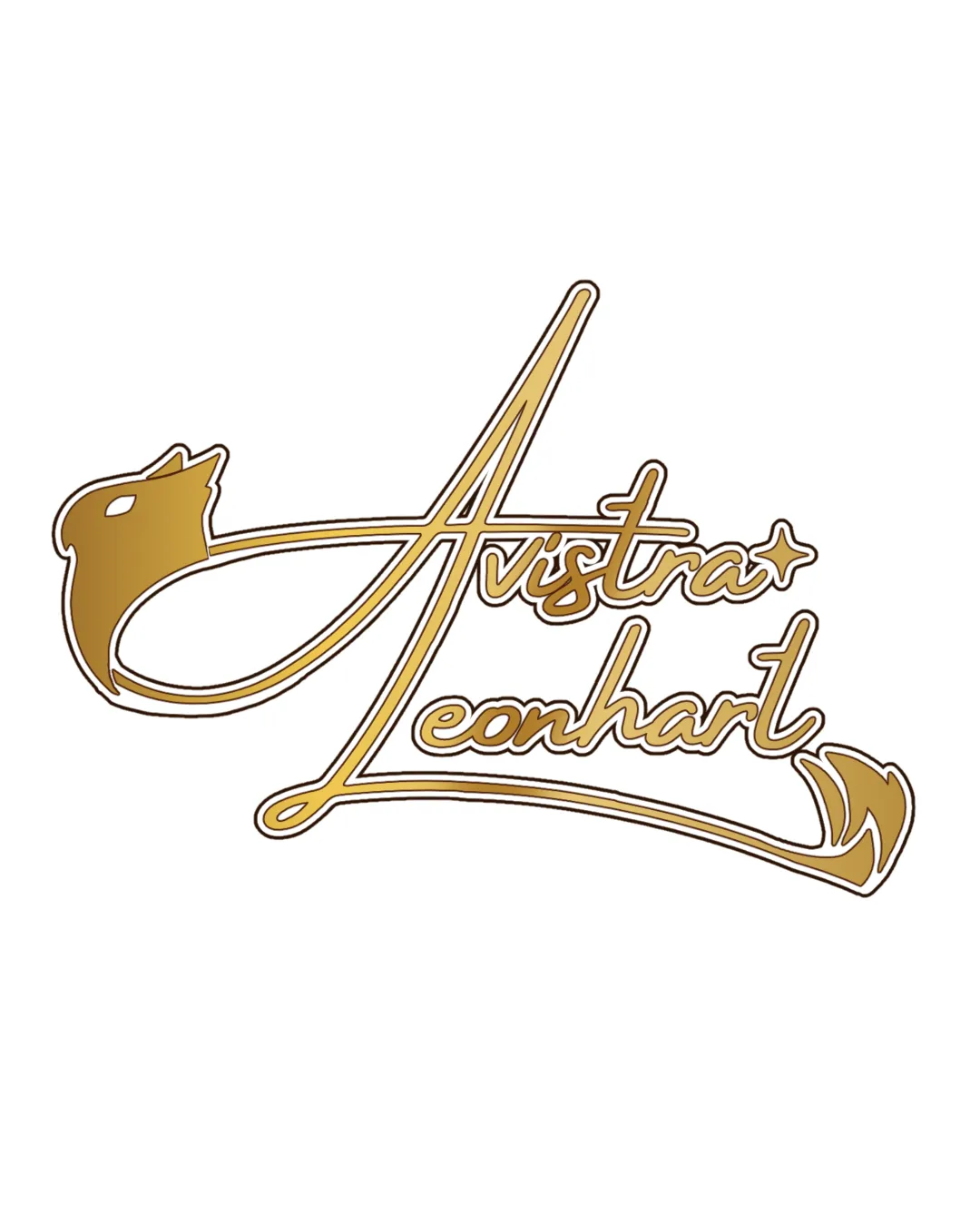
Avistra Leonhart

Review the detailed scores below to see what is working and what should be refined first.

Wordmark With Symbol Script Lettering Art Or Design
3/5
Legibility
3/5
Originality
4/5
Balance
3/5
Scale
Detailed review

Logo performance breakdown

3/5

Legibility

  • Elegant script style adds character.
  • Script can be challenging to read quickly.
3/5

Originality

  • Unique integration of bird shape.
  • Bird symbol is somewhat common in logos.
5/5

Color harmony

  • Harmonious use of gold and white.
4/5

Balance alignment

  • The flowing script maintains a graceful balance.
Uploaded logoAlignment guide overlay

Inspect spacing with the guide. Optical balance may differ from geometric centering.

3/5

Scalability

  • Stylistic script adds uniqueness.
  • Complex curves may not print well at smaller sizes, such as on business cards.
5/5

Misinterpretations

  • No inappropriate symbols detected.
Try your own review

Wondering how your logo performs?

Get a clear logo score, key risks, and priority fix ideas before your client or audience sees it.

Review my logo




