What to preserve
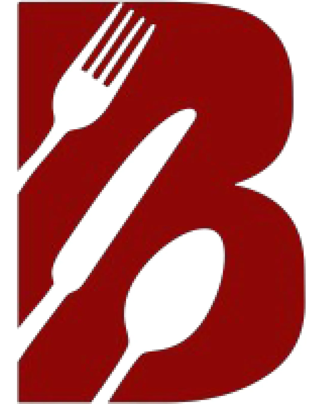
The logo cleverly combines eating utensils within the shape of the letter 'B', efficiently capturing a food-related theme and initial.
A visually appealing and relevant food brand monogram, with strong integration of theme but minor risks in fine details at reduced sizes.
This monogram shows solid execution, supported by visual balance and letter recognition; improving distinctiveness is the clearest next step.
Focus on the changes that matter. Keep what makes the logo work.
The logo cleverly combines eating utensils within the shape of the letter 'B', efficiently capturing a food-related theme and initial.
monogram (fine details of fork/knife)
The thin prongs of the fork and slim knife shape may lose clarity at very small sizes, impacting quick recognition.
See the category reviewThe utensils-in-'B' monogram captures a food concept clearly for public audiences, though its approach is familiar, and fine detail may limit smallest applications.

Inspect spacing with the guide. Optical balance may differ from geometric centering.
Estimated colors. Use the original design file for exact values.
Create a full color palette using these colors
Create new paletteThe fork, knife, and spoon motif within the letter 'B' is effective but similar negative-space device is common in food branding.
The thin prongs of the fork and slim knife shape may lose clarity at very small sizes, impacting quick recognition.
Try: Test how the monogram reproduces at business card or favicon scale and refine thin elements if needed.
Get a clear logo score, key risks, and priority fix ideas before your client or audience sees it.
More credits needed
Add credits to continue without losing your work.
Then $7/month. Cancel anytime.
Essential logo review with AI
Estimated progress