What to preserve
The mark cleverly merges pet visuals into the brand name, instantly signaling a pet-focused lifestyle brand.
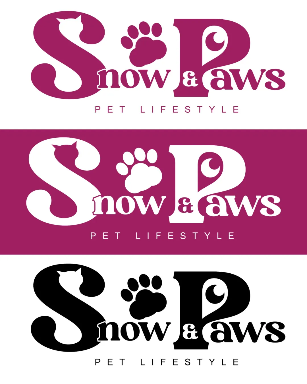
A lively, industry-appropriate logo that uses playful typographic motifs; test at small sizes to ensure clarity and consider further distinction.
The AI response was incomplete or inconsistent, so we couldn't calculate reliable scores. Your available feedback is saved below.
Focus on the changes that matter. Keep what makes the logo work.
The mark cleverly merges pet visuals into the brand name, instantly signaling a pet-focused lifestyle brand.
Large S, paw, and P ensemble
The large 'S', paw print, and 'P' create a dramatic contrast with the smaller 'now & aws', which could appear unbalanced at smaller sizes.
See the category reviewPet silhouettes and paw print integrally communicate the pet lifestyle focus in a playful, memorable layout, with main size/balance risks solvable for the context.
The concept uses familiar pet motifs in an imaginative lockup, but these motifs are somewhat common and might not set the brand apart in a crowded pet industry.
Estimated colors. Use the original design file for exact values.
Create a full color palette using these colors
Create new paletteThe large 'S', paw print, and 'P' create a dramatic contrast with the smaller 'now & aws', which could appear unbalanced at smaller sizes.
Try: Test legibility and balance at reduced sizes.

Inspect spacing with the guide. Optical balance may differ from geometric centering.
Paw print as 'o' may lose definition or legibility when scaled down, affecting readability.
Get a clear logo score, key risks, and priority fix ideas before your client or audience sees it.
More credits needed
Add credits to continue without losing your work.
Then $7/month. Cancel anytime.
Essential logo review with AI
Estimated progress