What to preserve
The mark combines health (apple/heart) and travel (airplane) symbols into a cohesive visual for health tourism.
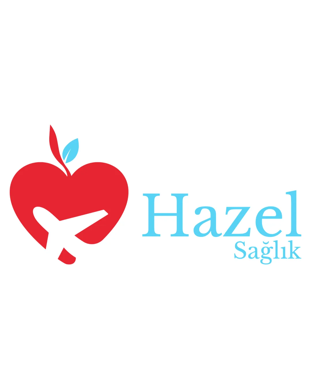
A relevant and visually effective health tourism logo that would benefit from stronger stylistic unity between the symbol and the wordmark.
This logo lockup shows solid execution, supported by visual balance and text readability; improving distinctiveness is the clearest next step.
Focus on the changes that matter. Keep what makes the logo work.
The mark combines health (apple/heart) and travel (airplane) symbols into a cohesive visual for health tourism.
Logo preview unavailable. The written feedback is still available on this card.
mark and wordmark relationship
The playful curvature and thickness of the apple-airplane mark do not fully match the thin, formal serif type of the wordmark, leading to a slightly fragmented impression rather than a unified style.
Confirm stylistic cohesion and unity between mark and logotype at typical logo sizes.
Strongly signals health tourism by combining apple/heart and airplane imagery, though the style mismatch modestly reduces brand cohesion.
Wordmark 5/5 · Layout 5/5
Symbol 4/5 · Wordmark 4/5
Estimated colors. Use the original design file for exact values.
Create a full color palette using these colors
Create new paletteSymbol 4/5 · Wordmark 4/5 · Layout 4/5

Inspect spacing with the guide. Optical balance may differ from geometric centering.
Symbol 4/5 · Wordmark 4/5 · Layout 4/5
The playful curvature and thickness of the apple-airplane mark do not fully match the thin, formal serif type of the wordmark, leading to a slightly fragmented impression rather than a unified style.
Try: Refine the typeface or adjust the mark's stroke style to better harmonize with the image.
Check: Confirm stylistic cohesion and unity between mark and logotype at typical logo sizes.
Logo preview unavailable. The written feedback is still available on this card.
Symbol 3/5 · Wordmark 2/5
Get a clear logo score, key risks, and priority fix ideas before your client or audience sees it.
More credits needed
Add credits to continue without losing your work.
Then $7/month. Cancel anytime.
Essential logo review with AI
Estimated progress