Wondering how your logo performs? 🧐
Get professional logo reviews in seconds and catch design issues in time.
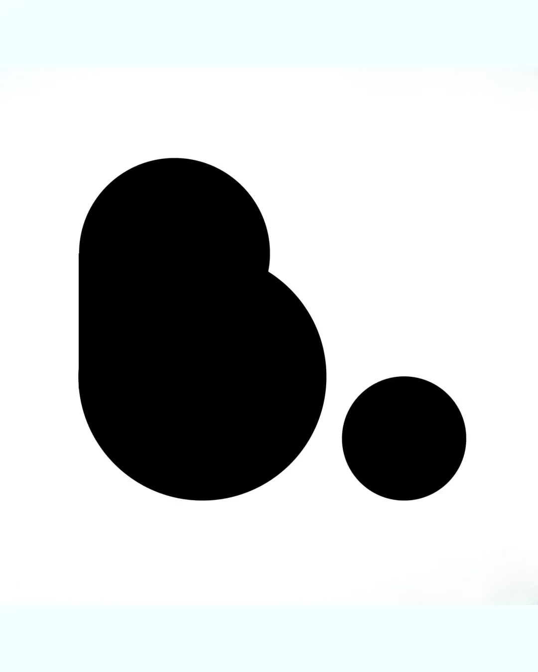
Try it Now!Logo review of b.
 Logo analysis by AI
Logo type:
Style:
Detected symbol:
Detected text:
Business industry:
Review requested by AlexandraCardoso
**If AI can recognize or misinterpret it, so can people.
Structured logo review
Scalability versatility
![]() Bold, simple geometry ensures clarity at all sizes.
Bold, simple geometry ensures clarity at all sizes.![]() Design works well for icons, favicons, and physical applications (embroidery, signage, app icon).
Design works well for icons, favicons, and physical applications (embroidery, signage, app icon).
200x250 px
100×125 px
50×62 px
Balance alignment
![]() Symmetrical and balanced composition with even weight distribution.
Symmetrical and balanced composition with even weight distribution.
![]() The placement of the dot could feel slightly disconnected from the main letterform at larger scales.
The placement of the dot could feel slightly disconnected from the main letterform at larger scales.

Originality
![]() Distinct geometric style applied to the letter 'b' creates a strong and memorable mark.
Distinct geometric style applied to the letter 'b' creates a strong and memorable mark.
![]() The logomark concept is fairly common—a basic letter and dot with no unique twist or inventive negative space.
The logomark concept is fairly common—a basic letter and dot with no unique twist or inventive negative space.
Aesthetic look
![]() Clean, minimalist look with a bold visual presence.
Clean, minimalist look with a bold visual presence.![]() No unnecessary ornamentation for a modern appeal.
No unnecessary ornamentation for a modern appeal.
![]() Could be perceived as overly simplistic or generic without additional branding context.
Could be perceived as overly simplistic or generic without additional branding context.
Dual meaning and misinterpretations
![]() No inappropriate or misleading symbolism present.
No inappropriate or misleading symbolism present.
Color harmony
![]() Timeless monochrome palette works across media and backgrounds.
Timeless monochrome palette works across media and backgrounds.
Black
#000000
White
#FFFFFF


